
Identifying highly connected sites for risk-based surveillance and control of cucurbit downy mildew in the eastern United States
- Published
- Accepted
- Received
- Academic Editor
- Marwa Fayed
- Subject Areas
- Computational Biology, Ecology, Parasitology, Plant Science
- Keywords
- Centrality measures, Disease monitoring, Infection frequency, Network analysis, Scale-free network
- Copyright
- © 2024 Ojwang’ et al.
- Licence
- This is an open access article distributed under the terms of the Creative Commons Attribution License, which permits using, remixing, and building upon the work non-commercially, as long as it is properly attributed. For attribution, the original author(s), title, publication source (PeerJ) and either DOI or URL of the article must be cited.
- Cite this article
- 2024. Identifying highly connected sites for risk-based surveillance and control of cucurbit downy mildew in the eastern United States. PeerJ 12:e17649 https://doi.org/10.7717/peerj.17649
Abstract
Objective
Surveillance is critical for the rapid implementation of control measures for diseases caused by aerially dispersed plant pathogens, but such programs can be resource-intensive, especially for epidemics caused by long-distance dispersed pathogens. The current cucurbit downy mildew platform for monitoring, predicting and communicating the risk of disease spread in the United States is expensive to maintain. In this study, we focused on identifying sites critical for surveillance and treatment in an attempt to reduce disease monitoring costs and determine where control may be applied to mitigate the risk of disease spread.
Methods
Static networks were constructed based on the distance between fields, while dynamic networks were constructed based on the distance between fields and wind speed and direction, using disease data collected from 2008 to 2016. Three strategies were used to identify highly connected field sites. First, the probability of pathogen transmission between nodes and the probability of node infection were modeled over a discrete weekly time step within an epidemic year. Second, nodes identified as important were selectively removed from networks and the probability of node infection was recalculated in each epidemic year. Third, the recurring patterns of node infection were analyzed across epidemic years.
Results
Static networks exhibited scale-free properties where the node degree followed a power-law distribution. Betweenness centrality was the most useful metric for identifying important nodes within the networks that were associated with disease transmission and prediction. Based on betweenness centrality, field sites in Maryland, North Carolina, Ohio, South Carolina and Virginia were the most central in the disease network across epidemic years. Removing field sites identified as important limited the predicted risk of disease spread based on the dynamic network model.
Conclusions
Combining the dynamic network model and centrality metrics facilitated the identification of highly connected fields in the southeastern United States and the mid-Atlantic region. These highly connected sites may be used to inform surveillance and strategies for controlling cucurbit downy mildew in the eastern United States.
Introduction
Dispersal properties of a pathogen are fundamental to the development of epidemics at different spatial scales that can range from local to the landscape level. The transmission of invasive plant pathogens and the spread of resultant epidemics influences essential ecosystem services, including biodiversity and food production in agricultural systems (Brown & Hovmøller, 2002; Crowl et al., 2008). Measures that might involve containment and eradication programs can be implemented to reduce the potential impact of these epidemics. However, the planning and implementation of any specific control measure requires an understanding of the mechanics of invasions and the ecological consequences, risks, and dynamics of disease spread. Such control efforts can benefit greatly from epidemic records within a region as they enable an analysis of the overall structure of pathogen dispersal. Information from such analyses can inform the design of control programs for disease epidemics and risk-based surveillance. For example, timely recording of animal movements was fundamental in the containment of the 2011 foot and mouth disease epidemic in the UK, for which retrospective analyses demonstrated that initial spread was influenced by the frequency of animal movement (Ferguson, Donnelly & Anderson, 2001; Kao et al., 2006).
One approach to understand pathogen dispersal and the spread of resultant epidemics is through network analysis, a method that is becoming increasingly popular but still has limited application in plant disease epidemiology (Garrett et al., 2018; Xing et al., 2020). Networks consist of ‘nodes’ and ‘links’, where nodes are the entities of interest (e.g., individual fields or observed sites of disease outbreak), while links connect nodes in various ways, for example, the potential of contact with a pathogen or pathogen transmission between two nodes. Further, networks can be weighted with link weights that are proportional to the probability of transmission. Networks have been used to describe the spread of diseases caused by aerially dispersed plant pathogens such as Podosphaera macularis in hop (Gent, Bhattacharyya & Ruiz, 2019) and Phakopsora pachyrhizi in soybean (Sutrave et al., 2012; Sanatkar et al., 2015). The primary determinants in pathogen dispersal, such as source strength, location of host populations and relevant covariate information, can be formulated as a network spreading model (Firester, Shtienberg & Blank, 2018; Garrett et al., 2018; Gent, Bhattacharyya & Ruiz, 2019; Sutrave et al., 2012). Such models can combine static spatial components, such as field location, and dynamic components of an epidemic, such as wind-based pathogen dispersal, to infer the underlying contact structure of landscape connectivity (With, Gardner & Turner, 1997).
The choice of networks to be studied depends on several factors, for example, the disease of interest and specific questions on the network structure. The latter, in turn, influences the type of network measures to be used in the analysis of pathogen dispersal and disease spread. Static and dynamic networks are common in landscape connectivity analyses. Connections in a static network are fixed links, while connections in a dynamic network change over time. Both static and dynamic networks have been applied in plant disease epidemiology (Sanatkar et al., 2015; Sutrave et al., 2012). In dynamic networks, between-node distances, host availability, wind speed and wind direction, can be formulated as a susceptible-infected (SI) model to describe disease spread (Sutrave et al., 2012). Further, plant diseases display seasonal differences in the occurrence and intensity of epidemics. Thus, an analysis of data from multiple epidemic years is useful in determining if there are recurring patterns that could inform monitoring or disease control measures. Highly connected nodes provide effective surveillance and opportunities for more targeted control to reduce disease spread within the network. An open question still remains regarding which centrality measure is useful for identifying important nodes for surveillance and managing real-world networks (Holme, 2017). Due to inherent differences in pathogen dispersal and disease spread mechanisms, centrality measures used to identify important nodes for surveillance may be specific to different pathosystems (Holme, 2018).
A motivating plant disease example for network analysis to inform surveillance and disease control is cucurbit downy mildew (CDM). A resurgence of the disease occurred around the world in the last 20 years that fundamentally altered cucurbit production and disease management at multiple scales (Holmes et al., 2015; Ojiambo et al., 2015). The resurgence of CDM in Europe and the United States was attributed to the introduction of a new pathotype or species that was previously limited to East Asia (Cohen et al., 2015; Thomas et al., 2017). Fungicides are integral to CDM control due to the lack of cultivars with adequate host resistance and in the absence of control, the disease can result in complete crop loss (Holmes et al., 2015). The disease is caused by an obligate pathogen, Pseudoperonospora cubensis, which exhibits significant long-distance dispersal (Ojiambo & Holmes, 2011). In the continental United States, P. cubensis overwinters below approximately 30-degree latitude in southern Florida and along the Gulf of Mexico on living hosts, and disease outbreaks in northern states rely on aerial dispersal of the pathogen from the south (Ojwang’ et al., 2021). Oospores have been reported in cucurbit fields in the southeastern United States, albeit at a low frequency, however, their role in the epidemiology of CDM is still unclear (Kikway, Keinath & Ojiambo, 2022). Further, while anthropogenic movement of infected transplants could be involved in pathogen dispersal, it is not typically considered due to lack of data.
In 2008, disease surveillance based on a series of sentinel (sites designated for regular monitoring) and non-sentinel (sites not designated for regular monitoring) sites was implemented as part of the CDM ipmPIPE (http://cdm.ipmpipe.org) surveillance system (Ojiambo et al., 2011). Based on the prediction framework developed by Main et al. (2001) and the sentinel site data, an integrated aerobiological model was developed to predict disease occurrence and progression in the eastern United States (Neufeld et al., 2018) to guide growers on when to apply their initial fungicide application. Surveys conducted in Georgia, Michigan, and North Carolina show that the forecasting system resulted in an average reduction of two to three fungicide applications compared to calendar-based application schedules. This reduction in fungicide applications translated to more than $6 million in savings for producers in these three states alone annually (Ojiambo et al., 2011). However, the disease surveillance system is expensive to maintain and thus, there is increasing interest in identifying locations that are critical for pathogen dispersal and disease spread within the region. The latter could facilitate a more targeted surveillance approach by directing the limited resources to locations that are more integral to disease spread and pathogen transmission within the region. These sentinel and non-sentinel sites have been instrumental in understanding the spatio-temporal spread of CDM (Ojiambo & Holmes, 2011; Ojiambo et al., 2017; Ojwang’ et al., 2021).
In this study, we specifically focus on centrality metrics that are directly applicable to CDM surveillance and management to identify highly connected sites. The centrality measures are betweenness (BWC), closeness (CLC), degree (DGC) and eigenvector (EVC), and these metrics have previously been used in network analysis of aerially dispersed plant pathogens and have relevance in describing epidemic spread (Andersen et al., 2019; Gent, Bhattacharyya & Ruiz, 2019; Sanatkar et al., 2015). Our inference of the importance of the highly connected sites is limited to disease records from the existing structure of sentinel and non-sentinel sites within the region. The specific objectives of this study were to: i) determine a centrality measure that is most useful in the surveillance and control of CDM, ii) identify highly connected nodes that are critical for pathogen dispersal and spread of CDM and iii) establish how removal of highly connected nodes influences the spread and containment of CDM in the eastern United States. Portions of this work were previously published as part of a PhD dissertation of the first author (Ojwang’, 2021).
Materials and Methods
Data source
Records of CDM occurrence in the eastern United States from 2008 to 2016 were used in this study. The data were obtained from the CDM ipmPIPE database (http://cdm.ipmpipe.org) that tracks reports of disease occurrence in the United States (Ojiambo et al., 2011). Disease records in the system include reports from a network of regularly monitored sites (sentinel sites) and voluntary reports (non-sentinel sites) submitted by commercial growers, agricultural researchers and the public. Sentinel sites were strategically placed within specific states and planted with different cucurbit host types to monitor CDM occurrence. Sentinel sites were located at research facilities or commercial fields with standard dimensions of 15 m × 61 m and were georeferenced using the Global Positioning System. These sites were planted early and regularly monitored for disease symptoms every 1 to 2 weeks by state collaborators and extension specialists. Cucurbits grown at the sentinel sites were cucumber cv. Straight 8 and Poinsett 76 (Cucumis sativus), cantaloupe cv. Hales Best Jumbo (Cucumis melo), acorn squash cv. Table Ace (Cucurbita pepo), butternut squash cv. Waltham (Cucurbita moschata), giant pumpkin cv. Big Max (Cucurbita maxima), and watermelon cv. Micky Lee (Citrullus lanatus) (Ojiambo et al., 2011). Non-sentinel reports were from locations not designated for regular surveillance but rather voluntary reports from commercial fields, research plots, and home gardens (Table 1). These non-sentinel reports are useful given that, in some epidemic years, CDM was reported earlier in non-sentinel sites than in sentinel sites and thus, they could be informative for inferring sources for disease spread.
| Number of states affected |
Number of counties | Number of sites by planting type | ||||||
|---|---|---|---|---|---|---|---|---|
| Year | Commercial | Home garden | Research | Sentinela | Unspecifiedb | Totalc | ||
| 2008 | 22 | 113 | 68 | 10 | 12 | 59 | 5 | 154 |
| 2009 | 24 | 165 | 77 | 26 | 24 | 92 | 1 | 220 |
| 2010 | 25 | 118 | 77 | 17 | 24 | 25 | 1 | 144 |
| 2011 | 23 | 86 | 57 | 10 | 22 | 28 | 0 | 117 |
| 2012 | 25 | 149 | 99 | 20 | 23 | 31 | 0 | 173 |
| 2013 | 26 | 179 | 118 | 30 | 23 | 29 | 4 | 204 |
| 2014 | 23 | 104 | 53 | 16 | 22 | 20 | 3 | 114 |
| 2015 | 27 | 171 | 126 | 15 | 22 | 42 | 4 | 209 |
| 2016 | 22 | 107 | 61 | 9 | 19 | 33 | 0 | 122 |
Notes:
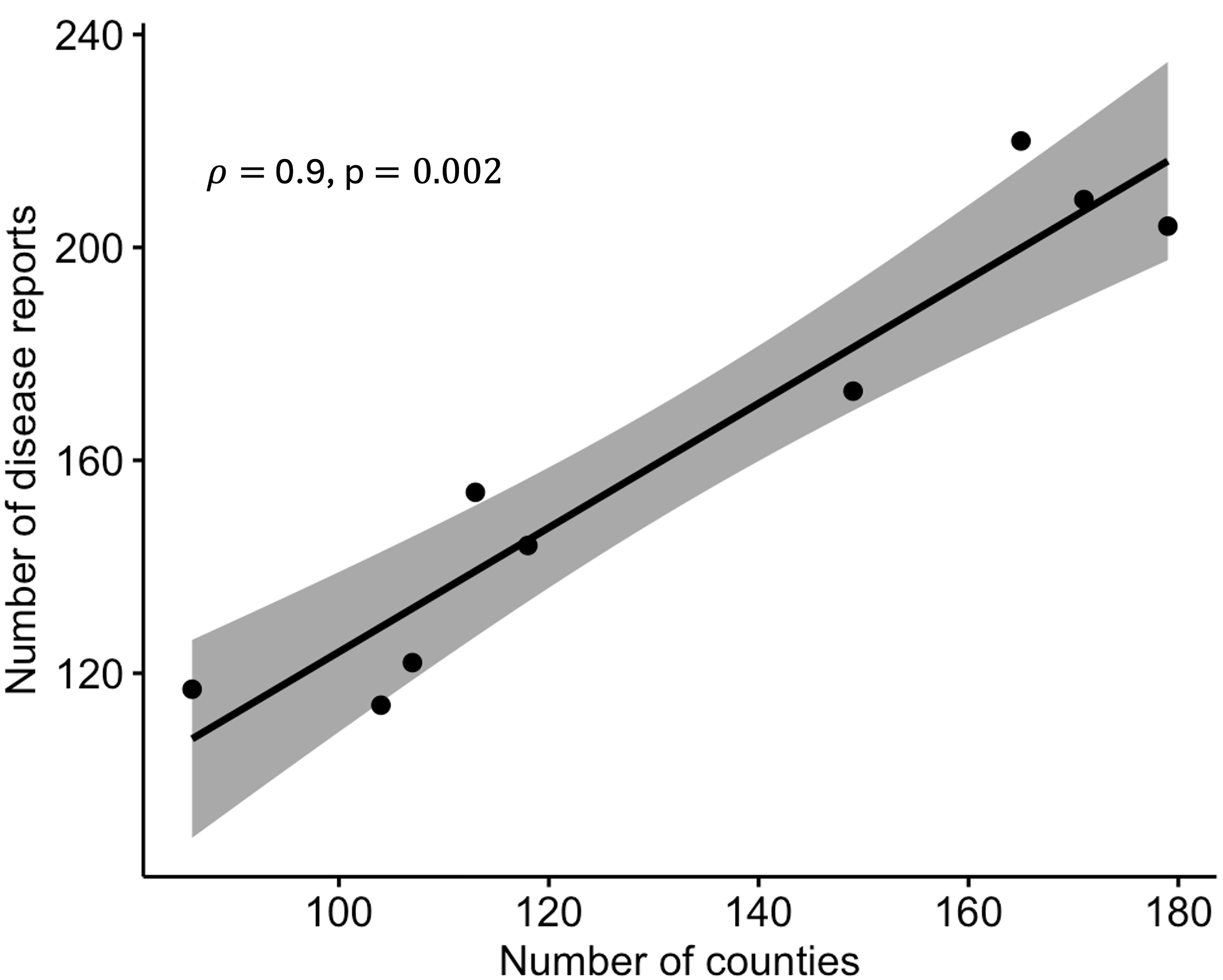
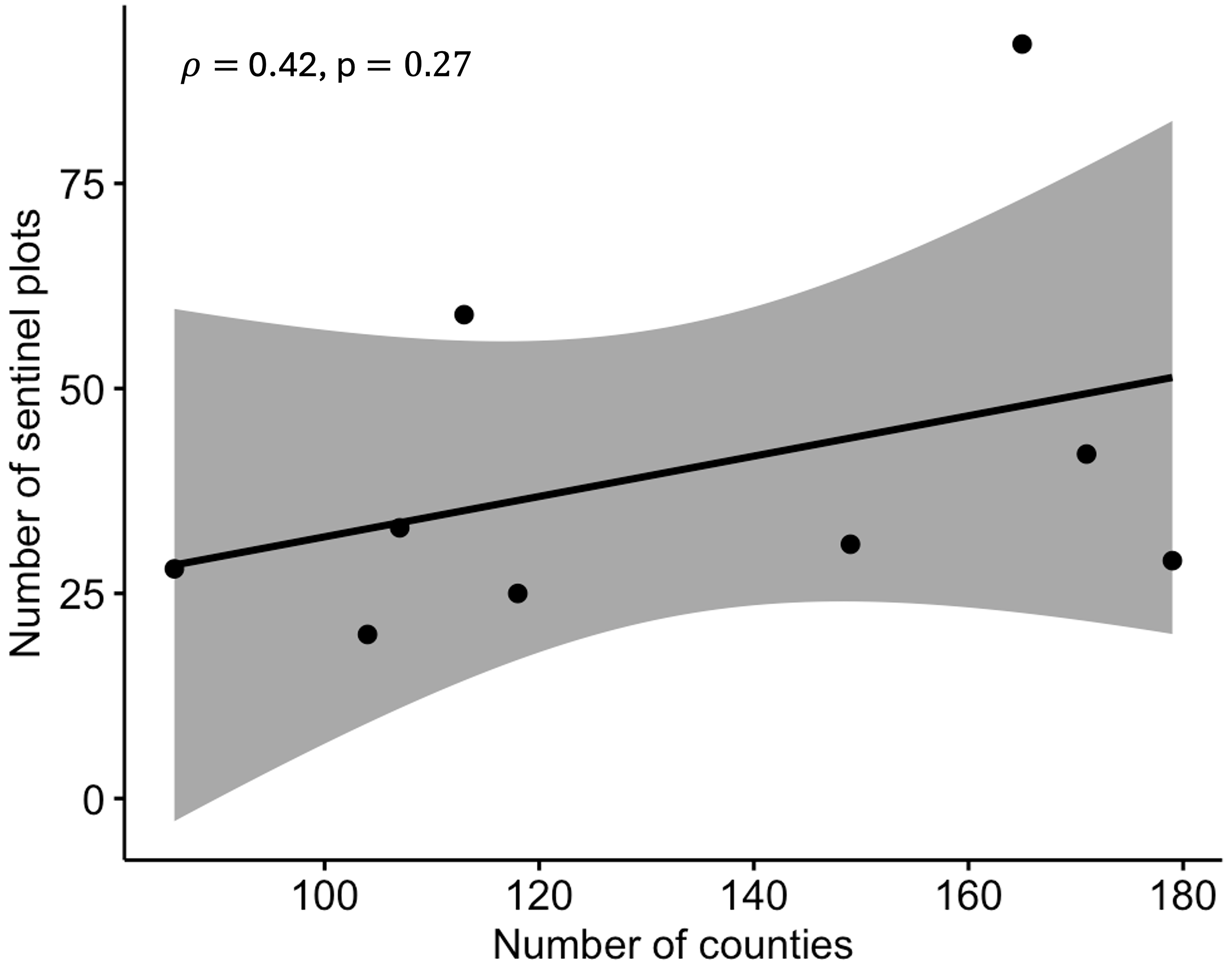
Latitudes and longitudes geo-coordinates for sentinel and non-sentinel sites were generated from the customized section of the CDM ipmPIPE website (http://cdm.ipmpipe.org). Where plot data was not available, latitudes and longitudes of county centroids were extracted from US Census Bureau 1990 Gazetteer Files and used as approximate georeferenced points. The compiled data from sentinel and non-sentinel sites included, among other things, the date of first disease symptoms, planting type (sentinel sites, commercial field, research plot, home garden, or unspecified), state, county, and geo-location. A disease case represented a unique combination of host and date of first disease symptoms at a particular location. The total number of disease cases across the study years ranged from 114 to 220, while the number of counties affected ranged from 86 to 179 across epidemic years (Table 1). Correlation analysis was performed to determine whether the number of counties influenced the number of disease reports (Fig. S1) and whether numbers of sites with active surveillance were correlated with the number of counties (Fig. S2) in the region during the study period.
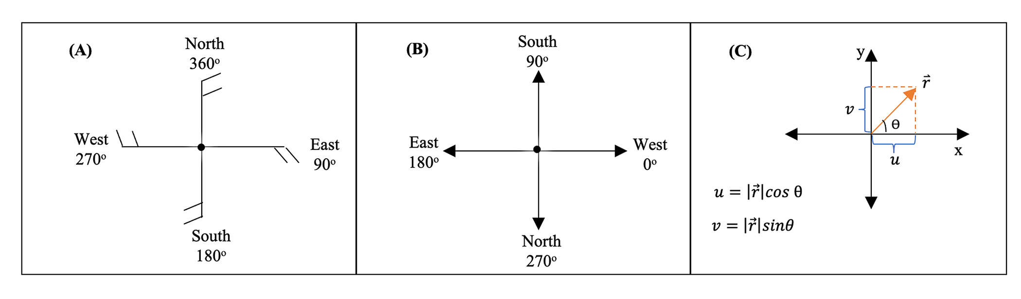
Hourly wind speed and direction at each sentinel site were derived from weather observations from the National Oceanic and Atmospheric Administration Integrated Surface Database (Smith, Lott & Vose, 2011) provided by BASF (Research Triangle Park, Raleigh, NC, USA). Wind measurements were recorded 10 m above the ground and the maximum wind speed was used in this study. Meteorological wind direction is the direction the wind is blowing from, e.g., the wind coming from the north is a northerly wind, and a southerly wind is a wind coming from the south. A raw observation for the meteorological wind direction for a northerly wind is defined as 360°, a southerly wind is 180°, a westerly wind is 270°, and an easterly wind is 90° (Fig. S3). Meteorological wind direction (wd) in degrees was converted to a mathematical direction (md, i.e., the angle as measured in the mathematically conventional way, counterclockwise from the eastward direction) in degrees using the formula:
(1)
The mathematical direction in degrees was subsequently converted to radians (i.e., radians = [degrees × π]/180). The x and y (u and v) components of the hourly wind vectors were then calculated as: and , where r is the wind speed in miles per hour and θ is the wind direction in radians (Fig. S3).
Static network analysis
In this study, nodes were a combination of sentinel and non-sentinel sites in the eastern United States. We point out that other locations in the eastern United States that were not monitored in this study may contribute to the risk and spread of CDM. However, the locations where CDM was monitored or reported were available for inclusion in this study. Static networks were constructed for each epidemic year to provide insight into the structure of the spread of CDM in the eastern United States.
The general methodology involved creating a link (l) between a ‘source’ node i at one location and a ‘sink’ node j at another location using a probability that was based on the distance between the two nodes. This probability is given by a connection kernel, which decays with distance such that connections are predominantly localized (Danon et al., 2010). Between-node Euclidean distances were calculated using the Haversine formula (Sinnot, 1984) in the geosphere package (Hijmans, 2017) implemented in the R programming language (R Core Team, 2018). The x and y displacement vectors for two nodes were calculated based on the equirectangular projection as follows:
(2) where φ = latitude (radians), λ = longitude (radians), R = radius of the earth (mean = 6,371 km), and = haversine distance between node i to node j.
Links were created using an inverse power-law dispersal kernel , where is the probability of transmission from node i to node j (Andersen et al., 2019), is the distance between node i and node j, and b is the spread parameter. The parameter b was not estimated in this study but was obtained from a previous study on the isotropic spread of CDM in the eastern United States (Ojiambo et al., 2017) using the same epidemic data from 2008 to 2016 that was used in the present study. Ojiambo et al. (2017) examined how b varied over multiple epidemic years and found that b ranged from 1.61 to 3.36. Thus, a value of b generated for each year from that study was used in the corresponding year examined in the present study to represent isotropic spread through links in the network. In essence, a link was created between node i and node j based on whether it was within a certain distance and if y > τ for 0 < τ < 1, where τ is the threshold probability of pathogen transmission.
Several static networks were created for a range of τ values for uncertainty analysis to determine the influence of τ on link formation as described by Andersen et al. (2019). The range of τ selected was bounded by values that produced a full network and a near-zero probability of link formation (Fig. S4) to facilitate the identification of a network with a giant component (GC), since a network without a GC does not provide much information on the behavior of disease spread. A GC is a connected component whose size is on the same order of magnitude as the size of the whole network. Thus, the value of τ selected to generate the final static network was identified in two stages. First, τ had to result in a network where each node was connected to at least another node (Ferrari, Preisser & Fitzpatrick, 2014). Second, the selected τ also had to have a high proportion of nodes within the GC in the resulting static network. For each epidemic year, the final static network generated using the selected τ value for each epidemic year was used in additional network analyses described below (dynamic networks and error quantification). The degree and the exponent of the degree distribution, γ, for final static networks were estimated in R using the powerLaw package (Gillespie, 2015) as described by Kolaczyk & Csárdi (2020).
Network centrality measures
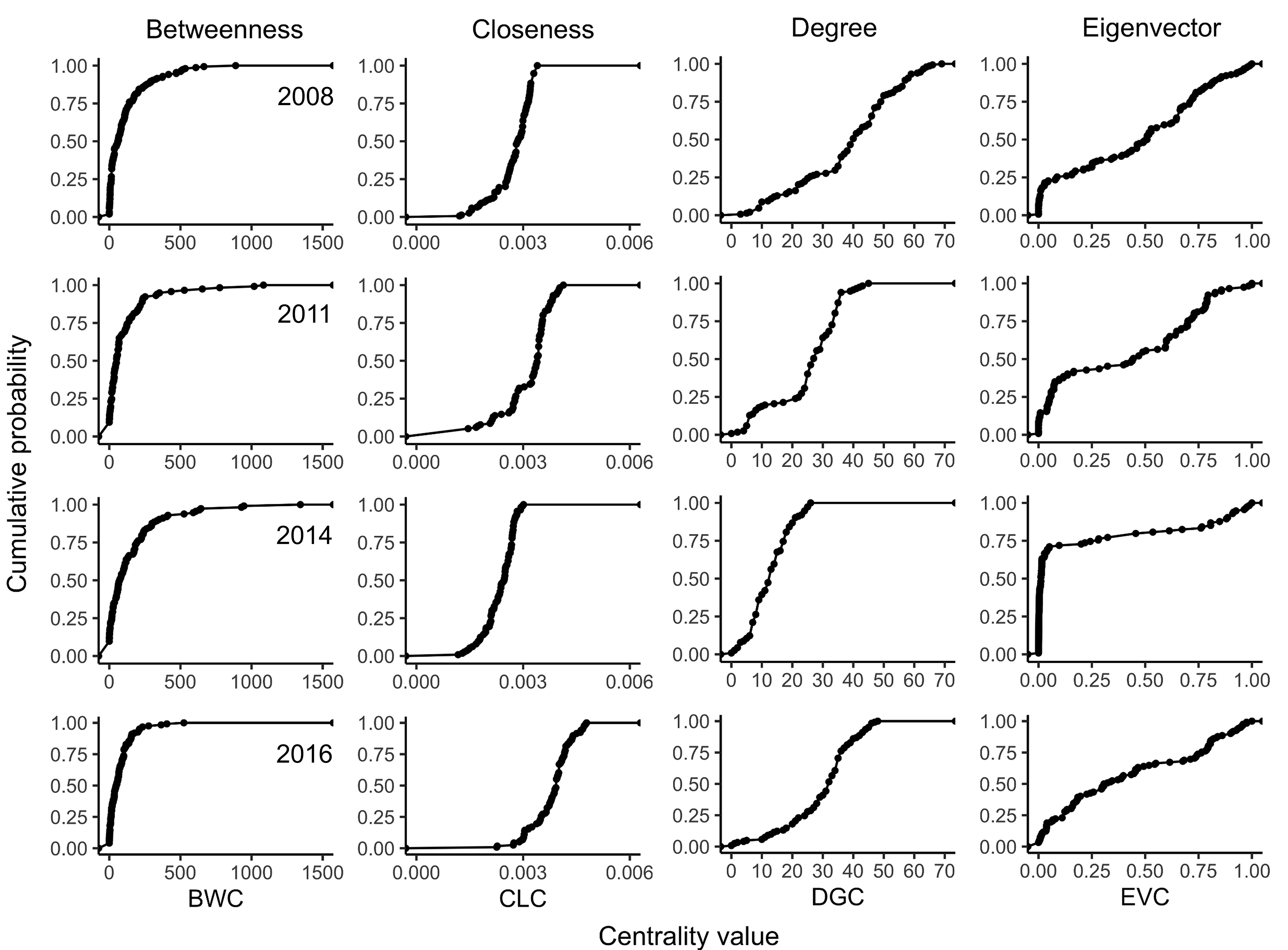
Centrality measures, betweenness centrality (BWC), closeness centrality (CLC), degree centrality (DGC) and eigenvector centrality (ECV) (Table 2), were calculated using the igraph package in R (Csárdi & Nepusz, 2006) for each static network that was created for different τ values as described below (identification of important nodes). The empirical cumulative distribution functions of BWC, CLC, DGC, and EVC were calculated for each epidemic year to describe the distribution of the generated centrality metrics across all nodes. The cumulative distribution functions of BWC, CLC, DGC, and EVC were obtained using stat_ecdf and visualized using the ggplot2 package in R (Wickham, 2016). The similarity in ranking of nodes among centrality metrics was then assessed using Spearman’s rank-based correlation.
| Centrality measure | Central node | Relevance in epidemic spread |
|---|---|---|
| Betweenness (BWC) | Acts as a bridge to other nodes | Removal of nodes with high betweenness may contain an epidemic |
| Closeness (CLC) | Lies on the shortest path | Nodes are able to spread disease through a network |
| Degree (DGC) | Connected to many other nodes | Nodes with high degree may be ‘superspreaders’ |
| Eigenvector (ECV) | Connected to other high-degree nodes | Nodes with neighbors having high degree may be ‘superspreaders’ |
Identification of important nodes for disease spread within the static network
Analysis of disease outbreaks from 2008 to 2016 was conducted to determine if recurring patterns of disease spread occurred that could help to identify important nodes in the networks. We tallied the number of times a node was observed as infected from 2008 to 2016, herein referred to as the infection frequency. In addition, a new dataset was created with only nodes where the disease occurred in at least one year i.e., infection frequency 1. Two approaches were used to identify nodes potentially important for disease spread that could be useful for risk-based surveillance or disease mitigation: i) selection of nodes based on infection frequency and ii) selection of nodes based on a combination of infection frequency and centrality metrics.
In the first approach, nodes were ranked from highest to lowest based on their infection frequency. In the second approach, a static network was created such that each node was connected to at least another node (Ferrari, Preisser & Fitzpatrick, 2014) using b = 2.11 as estimated previously by Ojiambo et al. (2017) and the centrality metrics were calculated for this network. Centrality metrics were scaled to a value between 0 and 1 and combined with infection frequency in a ratio of 4:1 (frequency:centrality) for each node, to give more weight to infection frequency as described by Sutrave et al. (2012). Nodes were then ranked in decreasing order based on this weighted value. This weighting in the second approach puts more emphasis on nodes where the disease is observed recurrently between years and nodes that either are highly connected and acting as bridges to other nodes (BWC), occur on the shortest path (CLC), or are connected to other potential super-spreaders (DGC and EVC). A sensitivity analysis was conducted with four additional frequency:centrality ratios with different weights. The results of this analysis showed that changing the weights changed the ranks but did not give more weight to the infection frequency (Fig. S5). Further, of all ratios tested, only the 4:1 ratio resulted in consistent results wherein the higher frequency nodes also had higher weights and were ranked higher (Table S1).
For each epidemic year, a range of threshold values (0 < τ < 1) was considered such that bounds for τ produced a range of dense networks and sparse networks. In each year, 20 to 30 individual values of τ were used to construct 20 to 30 networks. Centrality metrics were calculated for each network and the results were ranked in a decreasing order. The top 20 nodes with the highest scores were then selected and a second ranking was done for each node in this set. The number of times a node appeared in the top 20 ranking across all thresholds was recorded to eliminate the nodes that were ranked with higher scores in the dense and sparse networks. The nodes were then ranked in decreasing order. The results across centrality metrics and τ values were combined into a heatmap visualization using the ggplot2 package in R (Wickham, 2016).
Dynamic network model of cucurbit downy mildew
To describe the dynamic process of disease spread occurring on a static network, we modeled the probability of different nodes being infected over a discrete weekly time step, , in each epidemic year, based on a simplified SI model described by Sutrave et al. (2012) with the following assumptions: i) the pathogen is primarily dispersed by wind, ii) host response to the pathogen is homogeneous and iii) weather is favorable for infection and disease spread. This model combines the static (constant during each year) and the dynamic (time-varying during each year) components of the network and was formulated as:
(3) where is a constant function of the between-node distance and decays exponentially with distance, is the dynamic wind-based infection rate, and b are as defined above, is the displacement vector between two nodes, is the wind vector at time t, and is the link weight based on and between node i and node j at time t.
Given that the probability of a node being infected depends on the number of infected neighbors, the probability of node i not being infected by its neighbors was calculated as:
(4) where is the probability of node j being infected at time t, ∈ [0,1] is the link weight as defined above, and is a set of neighbors of node i. Given Eq. (4), the probability of node i being infected at time t was calculated thus:
(5)
Values of and were calculated and updated, respectively, at each weekly time step. All calculations were performed in MATLAB version R2019a (MathWorks Inc., Natick, MA, USA).
Error quantification in the dynamic network model
The observed infection status of a node and the corresponding predicted infection probability of the node were used to quantify the error in the dynamic network model. First, a value of 0 or 1 was assigned to a node that was either non-infected or infected, respectively, in the observed data at each time step t. Secondly, the observed (0 or 1) value for each node was compared to the corresponding infection probability calculated by the model at each time step t. The error was then defined as the absolute difference between the observed and predicted infection probability. The mean error for the infected nodes at time step t was then calculated as Sutrave et al. (2012):
(6) where is the total number of infected nodes at time step t, while is as defined above. Similarly, the mean error for non-infected nodes for at each time step t was calculated as:
(7) where is the total number of non-infected nodes at time step . The total error was obtained by using the expression:
(8) where υ is a weighting factor. The ratio υ: (1 − υ) in Eq. (8) was 4:1 such that observed-infected nodes were given four times more weight than the observed-non-infected nodes in evaluating the total error. Here, it was deemed more important to correctly predict infection (i.e., sensitivity) than to correctly predict an absence of infection (i.e., specificity) such that a few nodes incorrectly predicted will have an insignificant effect on the prediction error (Sutrave et al., 2012). All these calculations were performed in MATLAB.
Assessing node importance in disease spread using a dynamic network
The importance of nodes identified as highly connected based on the four centrality measures from the static network analysis, i.e., BWC, CLC, DGC, and EVC, were subsequently evaluated for their impact on disease spread based on link structures of the dynamic network model described above. Nodes identified as most important based on each centrality metric were removed from the networks and the probabilities of disease spreading among the remaining nodes were recalculated in the new dynamic network for each epidemic year as described above. Prediction of disease outbreaks based on all nodes present in the network was subsequently compared to predictions of disease outbreaks when nodes identified as important based on the above centrality measures were removed from the network. This approach of node evaluation is equivalent to intensive disease management, where important nodes are completely removed and the resultant impact of their removal on disease propagation within the network is assessed (Sutrave et al., 2012). A sensitivity analysis was also conducted for a range of υ: (1 − υ) ratios to examine the effect of the choice of the value of the weighting factor υ on the model prediction errors. This analysis showed that increasing the value of υ resulted in negligible changes in prediction errors across all centrality measures and epidemic years (Table S2).
Results
Spatiotemporal dynamics of disease spread in the eastern United States
Observations of disease outbreaks suggested a spatial association between the locations of first and last disease reports. The disease was first observed in a sentinel site in southern Florida in Miami-Dade County in 5 out of 8 epidemic years (Fig. 1). Most of the first disease reports from 2008 to 2016 occurred in February and March in southern Florida or southwestern Texas along the Gulf of Mexico, with reports of initial disease outbreaks being from both sentinel and non-sentinel sites.
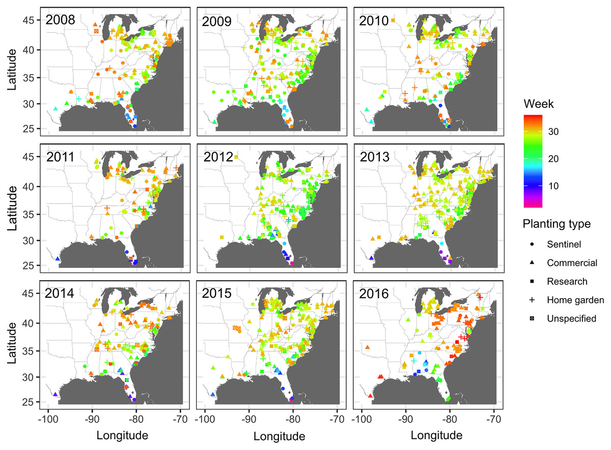
Figure 1: Map of locations of disease monitoring.
Locations of cucurbit downy mildew outbreaks in the eastern United States from 2008 to 2016. Locations are color-coded based on the week of the year. Shapes represent the surveillance plot type associated with disease reports during the study period. Map Source: ggmap and ggplot.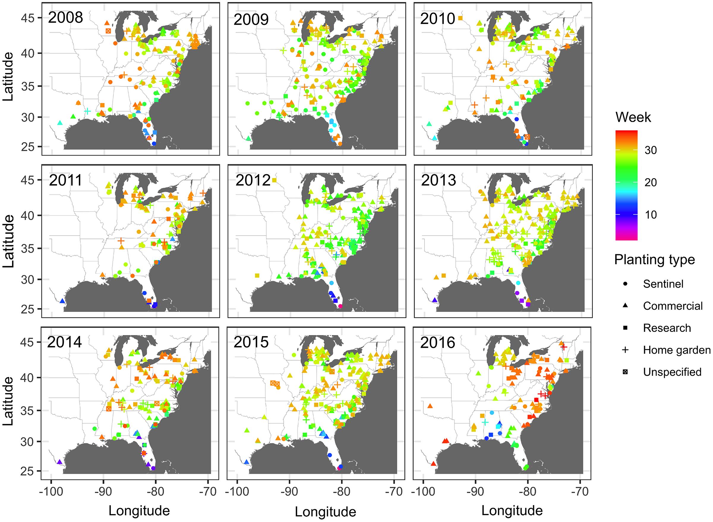
Subsequent reports of new disease outbreaks progressed northward with time, with new outbreaks occurring later in more northern states (Fig. 1). The first outbreaks of CDM in more northern states (e.g., Michigan, New York, or Wisconsin) occurred considerably later than corresponding reports of first CDM outbreaks in southern states (e.g., Alabama, Georgia or South Carolina). Across all years, the last set of new disease reports occurred in July, August and September across several states within the region (Fig. 1).
The total number of states with CDM ranged from 22 to 27, and the corresponding number of counties ranged from 86 to 179 across the region (Table 1). There was a positive correlation (r = 0.90; P = 0.0002) between the number of disease reports and counties (Fig. S1), with the number of sites increasing with an increasing number of infected counties. However, the correlation between the number of counties where the disease was reported and the number of counties where surveillance was occurring was not significant (r = 0.42; P = 0.2700) (Fig. S2). The linear maximum distance between two disease reports, a measure of the spatial extent of the epidemic, ranged from 2,491 km in 2012 to 3,071 km in 2015.
The number of times that nodes were infected at least once based on combined epidemic data across all years varied from 1 to 6 (Fig. 2). Nodes where the infection frequency was consistently higher than the median frequency (frequency >3) were in Alabama, Maryland, Michigan, North Carolina, Ohio, and South Carolina. Nodes with the highest levels of infection frequency were in Wicomico County in Maryland, Johnson, Lenoir, New Hanover, and Sampson counties in North Carolina, and Sandusky, Huron, and Wayne counties in Ohio, with an infection frequency of 5 and 6 (Fig. 2). The remaining nodes had an infection frequency less than the median and they constituted most of the nodes present in counties scattered throughout the region.
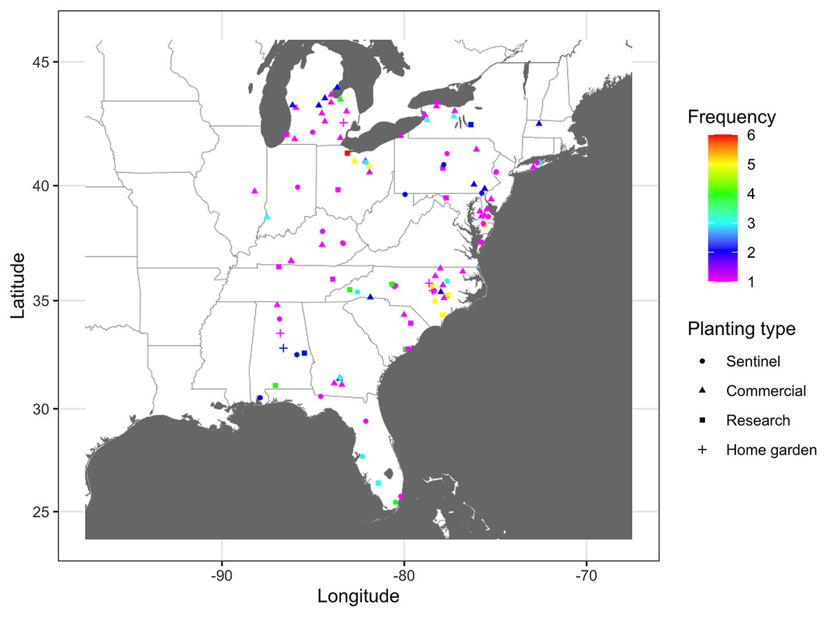
Figure 2: Frequency map of cucurbit downy mildew outbreak.
Frequency of cucurbit downy mildew outbreaks across all epidemic years from 2008 to 2016 in the eastern United States. Colors represent the frequency (n) of disease cases: red (n = 6), yellow (n = 5), green (n = 4), light blue (n = 3), blue (n = 2) and pink (n = 1). Frequency represents the number of years a node was observed as an infected node (i.e., a location where the disease was reported at least once). Map Source: ggmap and ggplot.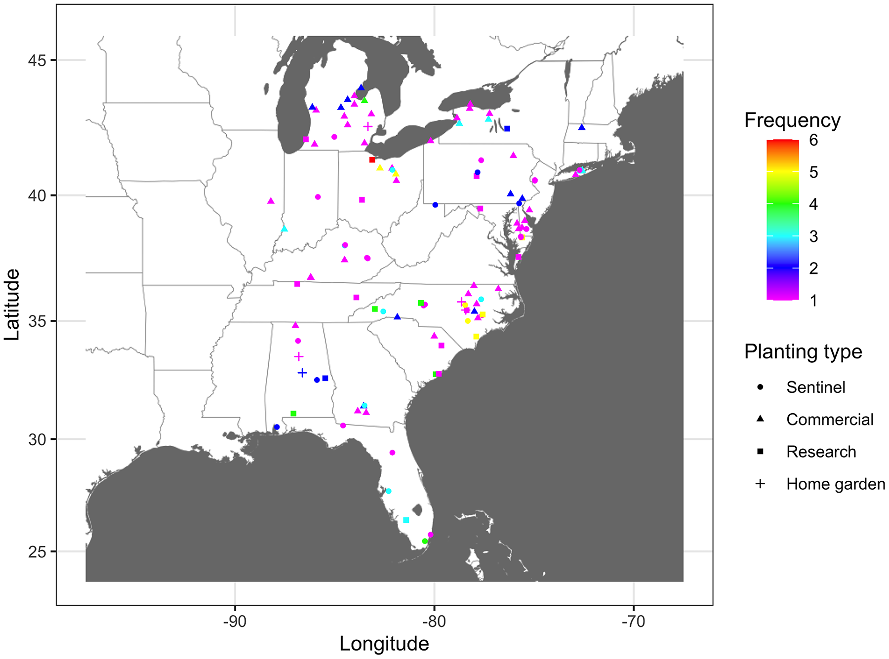
Connectivity threshold and static networks of cucurbit downy mildew
The proportion of nodes in the giant component (GC) and the extent of connectedness in a network were used to select the threshold probability of transmission, τ, to generate the final static networks. For example, for the 2008 epidemic data, networks were more connected at τ = 6.21 × 10⁻⁹ (GC = 1.0) than at τ = 1.14 × 10⁻⁹ (GC = 0.92), with other threshold values resulting in either highly or sparsely connected networks. Thus, to achieve a balance in connectivity, τ = 6.21 × 10⁻⁹ was used to generate the final static network for the epidemic data in 2008 (Fig. 3). Similarly, for the 2009 data, networks were more connected at τ = 7.83 × 10⁻⁹ (GC = 0.98) than at τ = 1.12 × 10⁻⁸ (GC = 0.95) with the remaining threshold values resulting in either highly or sparsely connected networks. Thus, τ = 7.83 × 10⁻⁹ was used to generate the final network for disease records in 2009. This logical approach was used to generate the final networks for disease records for the remaining epidemic years from 2010 to 2016. The corresponding values of τ were 1.0 × 10⁻¹⁹, 4.72 × 10⁻¹³, 2.55 × 10⁻¹³, 1.0 × 10⁻¹⁴, 2.55 × 10⁻¹⁷, 1.0 × 10⁻¹² and 1.0 × 10⁻¹², respectively (Fig. 3). In summary, the threshold for probability of transmission for the final static networks was very low ranging from (1.0 × 10⁻¹⁹ to 7.8 × 10⁻⁹) and the average degree ranged from 12.9 (in 2014) to 52.1 (in 2015). The exponent of the degree distribution (γ) was 2.34 (2008), 1.63 (2009), 2.03 (2010), 1.75 (2011), 1.93 (2013), 1.82 (2014), 2.05 (2015) and 2.14 (2016). Values of γ ≥ 2 indicate that a network is scale-free, i.e., the degrees follow a power-law distribution and the network is characterized by large hubs or nodes with a very high number of links.
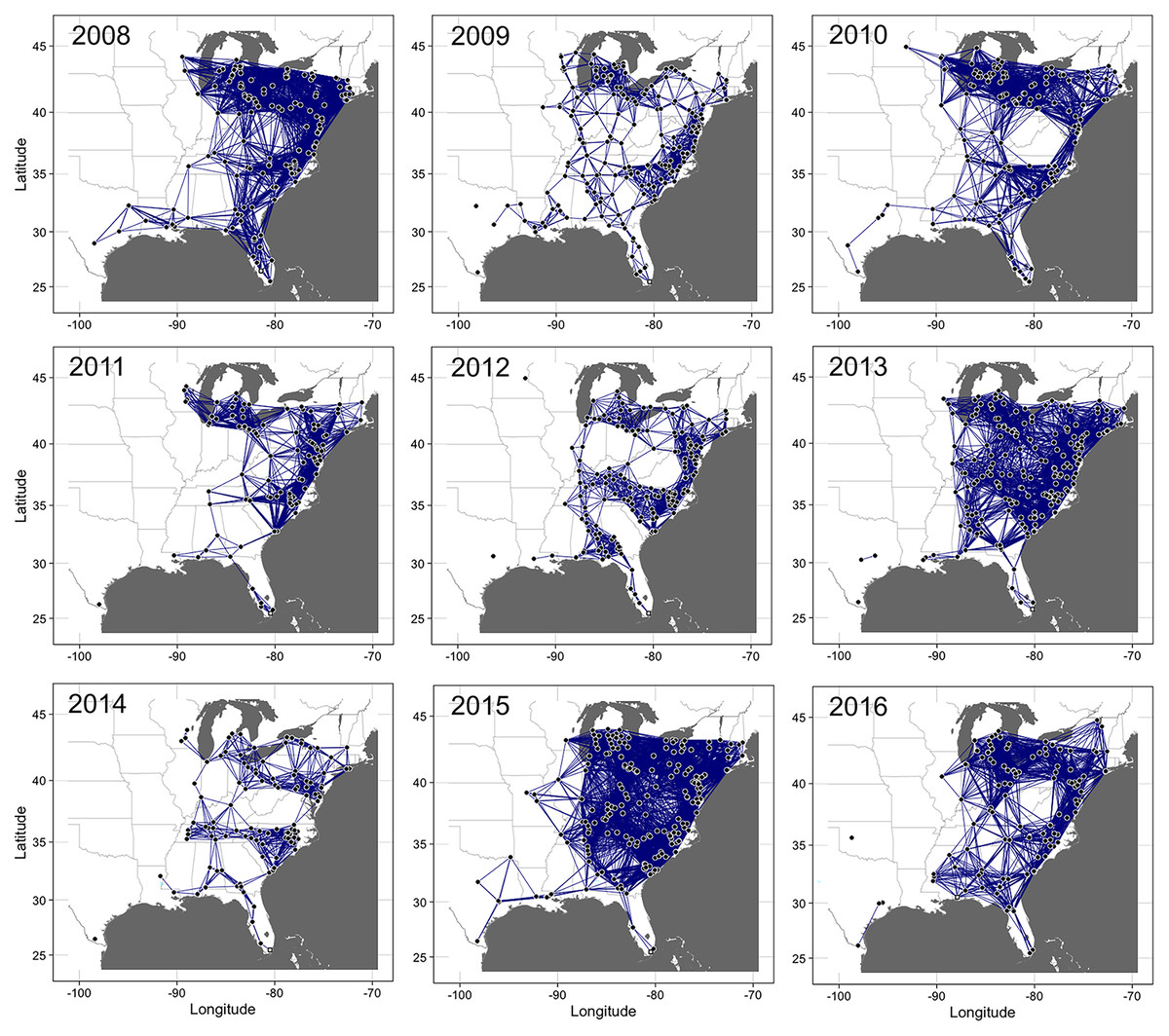
Figure 3: Static networks of cucurbit downy mildew epidemics.
Static networks of cucurbit downy mildew epidemics in eastern United States from 2008 to 2016. Closed circles are nodes where disease was reported (either in a sentinel and non-sentinel site) and the lines between two nodes are links for the probability of transmission between two nodes calculated based on the power-law dispersal kernel. Thresholds for probability of pathogen transmission ranged from ranged from 1.0 × 10⁻¹⁹ to 7.8 × 10⁻⁹. The initial source of disease outbreak (open square) in 2009, 2011, 2012-2015 was a sentinel site in Miami-Dade County in southern Florida, while the initial source in 2008, 2010 and 2016 was a sentinel site in Collier County in Florida, Alachua County in Florida and Baldwin County in Alabama, respectively. Map Source: ggmap and ggplot.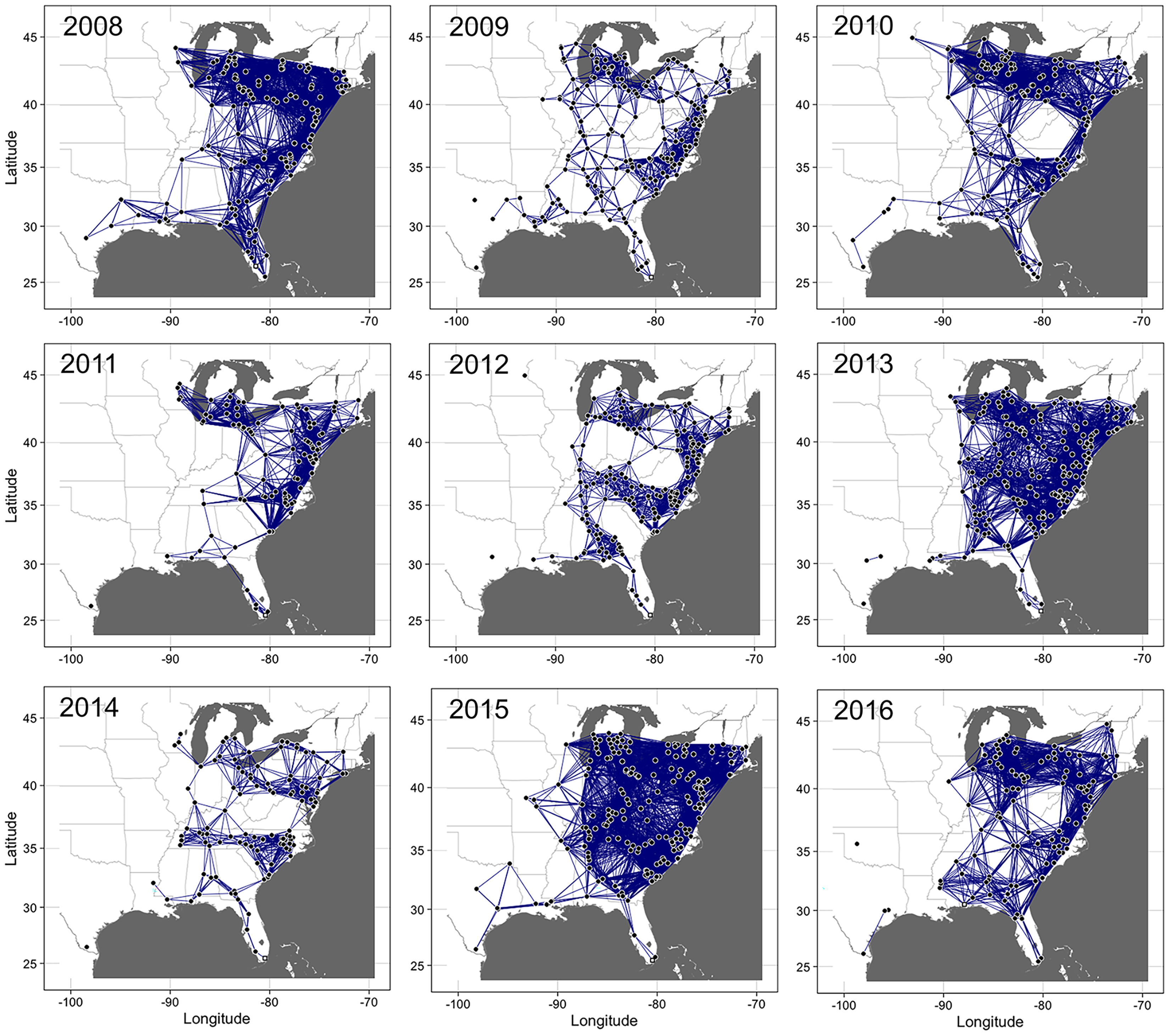
Centrality measures and selection of important nodes
Betweenness, closeness, degree, and eigenvector centrality metrics varied between epidemic years. Variability among the 20 most important nodes for each of these metrics was also observed for the final static network constructed within a given epidemic year. Overall, variability among the 20 most important nodes within any epidemic year across the entire study was high for BWC. For example, BWC values ranged from 264.5 to 888.3 in 2008 (Table 3), from 1,147.6 to 2,415.7 in 2009 (Table 4), and from 237.6 to 1,718.2 in 2010 (Table 5). The mean values for the 20 most important nodes identified by BWC in these respective years were 441.8, 1,656.9, and 474, with corresponding standard deviations of 441.1, 896.7 and 1,046.9. Variability among the 20 most important nodes as identified by the other centrality metrics was relatively limited (Tables 3–5), with variability among the nodes identified as important based on CLC being the lowest across the entire study period.
| Betweennessa | Closenessa | Degreea | Eigenvectora | |||||||||
|---|---|---|---|---|---|---|---|---|---|---|---|---|
| Rank | ID | State | BWC | ID | State | CLC | ID | State | DGC | ID | State | EVC |
| 1 | 74 | MS | 888.3 | 89 | NC | 0.0034 | 131 | PA | 73 | 128 | PA | 1.000 |
| 2 | 118 | OH | 665.3 | 118 | OH | 0.0034 | 52 | MD | 72 | 131 | PA | 0.994 |
| 3 | 135 | SC | 608.6 | 125 | PA | 0.0034 | 125 | PA | 72 | 134 | PA | 0.989 |
| 4 | 124 | OH | 534.1 | 128 | PA | 0.0034 | 128 | PA | 72 | 125 | PA | 0.981 |
| 5 | 39 | KY | 517.2 | 130 | PA | 0.0034 | 130 | PA | 72 | 130 | PA | 0.974 |
| 6 | 141 | TN | 507.2 | 124 | OH | 0.0034 | 127 | PA | 71 | 99 | NY | 0.963 |
| 7 | 31 | GA | 500.4 | 52 | MD | 0.0034 | 134 | PA | 69 | 127 | PA | 0.962 |
| 8 | 89 | NC | 471.1 | 134 | PA | 0.0034 | 99 | NY | 66 | 102 | NY | 0.953 |
| 9 | 137 | SC | 470.8 | 86 | NC | 0.0033 | 102 | NY | 65 | 96 | NY | 0.943 |
| 10 | 82 | NC | 416.6 | 148 | VA | 0.0033 | 96 | NY | 64 | 97 | NY | 0.930 |
| 11 | 91 | NC | 416.6 | 150 | VA | 0.0033 | 129 | PA | 64 | 98 | NY | 0.926 |
| 12 | 139 | TN | 375.8 | 131 | PA | 0.0033 | 11 | DE | 63 | 100 | NY | 0.902 |
| 13 | 52 | MD | 372.1 | 87 | NC | 0.0033 | 97 | NY | 63 | 52 | MD | 0.879 |
| 14 | 75 | MS | 336.7 | 88 | NC | 0.0033 | 98 | NY | 63 | 126 | PA | 0.858 |
| 15 | 125 | PA | 324.7 | 127 | PA | 0.0033 | 13 | DE | 62 | 129 | PA | 0.856 |
| 16 | 128 | PA | 305.4 | 80 | NC | 0.0033 | 100 | NY | 61 | 111 | OH | 0.847 |
| 17 | 136 | SC | 290.5 | 78 | NC | 0.0033 | 10 | DE | 59 | 113 | OH | 0.847 |
| 18 | 33 | GA | 290.1 | 79 | NC | 0.0033 | 93 | NJ | 59 | 117 | OH | 0.828 |
| 19 | 29 | GA | 279.0 | 151 | VA | 0.0032 | 94 | NJ | 59 | 120 | OH | 0.820 |
| 20 | 34 | GA | 264.5 | 39 | KY | 0.0032 | 133 | PA | 59 | 101 | NY | 0.814 |
| Mean | 441.8 | 0.0033 | 65.4 | 0.913 | ||||||||
| SD | 441.1 | 0.0000 | 9.9 | 0.132 | ||||||||
Notes:
BWC, Betweenness centrality; CLC, Closeness centrality; DGC, Degree centrality; and EVC, Eigenvector centrality; SD, Standard deviation.
| Betweennessa | Closenessa | Degreea | Eigenvectora | |||||||||
|---|---|---|---|---|---|---|---|---|---|---|---|---|
| Rank | ID | State | BWC | ID | State | CLC | ID | State | DGC | ID | State | EVC |
| 1 | 34 | GA | 2,415.7 | 122 | NC | 0.0012 | 74 | MI | 35 | 109 | NC | 1.000 |
| 2 | 212 | VA | 2,390.2 | 132 | NC | 0.0012 | 79 | MI | 35 | 136 | NC | 0.979 |
| 3 | 48 | KY | 2,376.2 | 134 | NC | 0.0012 | 82 | MI | 33 | 114 | NC | 0.979 |
| 4 | 154 | OH | 2,152.4 | 129 | NC | 0.0012 | 93 | MI | 33 | 118 | NC | 0.966 |
| 5 | 32 | GA | 2,011.5 | 124 | NC | 0.0012 | 109 | NC | 33 | 130 | NC | 0.960 |
| 6 | 192 | TN | 1,907.7 | 135 | NC | 0.0012 | 158 | OH | 33 | 127 | NC | 0.960 |
| 7 | 186 | SC | 1,803.5 | 205 | VA | 0.0012 | 200 | VA | 33 | 211 | VA | 0.937 |
| 8 | 169 | PA | 1,796.5 | 212 | VA | 0.0012 | 76 | MI | 32 | 119 | NC | 0.913 |
| 9 | 2 | AL | 1,672.3 | 48 | KY | 0.0011 | 90 | MI | 32 | 128 | NC | 0.906 |
| 10 | 180 | SC | 1,605.4 | 163 | OH | 0.0011 | 114 | NC | 32 | 207 | VA | 0.898 |
| 11 | 104 | MS | 1,515.0 | 164 | OH | 0.0011 | 118 | NC | 32 | 115 | NC | 0.891 |
| 12 | 171 | PA | 1,413.6 | 165 | OH | 0.0011 | 136 | NC | 32 | 125 | NC | 0.887 |
| 13 | 103 | MS | 1,351.4 | 133 | NC | 0.0011 | 211 | VA | 32 | 126 | NC | 0.884 |
| 14 | 25 | FL | 1,343.5 | 192 | TN | 0.0011 | 75 | MI | 31 | 113 | NC | 0.882 |
| 15 | 200 | VA | 1,311.5 | 123 | NC | 0.0011 | 83 | MI | 31 | 121 | NC | 0.872 |
| 16 | 153 | OH | 1,259.8 | 169 | PA | 0.0011 | 88 | MI | 31 | 120 | NC | 0.869 |
| 17 | 147 | NY | 1,258.1 | 171 | PA | 0.0011 | 89 | MI | 31 | 112 | NC | 0.869 |
| 18 | 54 | KY | 1,248.4 | 183 | SC | 0.0011 | 91 | MI | 31 | 203 | VA | 0.867 |
| 19 | 101 | MS | 1,158.2 | 207 | VA | 0.0011 | 92 | MI | 31 | 200 | VA | 0.864 |
| 20 | 158 | OH | 1,147.6 | 203 | VA | 0.0011 | 111 | NC | 31 | 110 | NC | 0.850 |
| Mean | 1,656.9 | 0.0011 | 32.2 | 0.912 | ||||||||
| SD | 896.7 | 0.0000 | 2.8 | 0.106 | ||||||||
Notes:
BWC, Betweenness centrality; CLC, Closeness centrality; DGC, Degree centrality; and EVC, Eigenvector centrality; SD, Standard deviation.
| Betweennessa | Closenessa | Degreea | Eigenvectora | |||||||||
|---|---|---|---|---|---|---|---|---|---|---|---|---|
| Rank | ID | State | BWC | ID | State | CLC | ID | State | DGC | ID | State | EVC |
| 1 | 30 | KY | 1,718.2 | 30 | KY | 0.0033 | 116 | OH | 56 | 116 | OH | 1.000 |
| 2 | 31 | KY | 1,009.3 | 31 | KY | 0.0032 | 103 | OH | 54 | 109 | OH | 0.998 |
| 3 | 65 | MS | 691.0 | 116 | OH | 0.0032 | 104 | OH | 54 | 106 | OH | 0.997 |
| 4 | 4 | AL | 577.1 | 121 | PA | 0.0032 | 105 | OH | 54 | 110 | OH | 0.995 |
| 5 | 139 | TX | 556.0 | 105 | OH | 0.0032 | 106 | OH | 54 | 103 | OH | 0.995 |
| 6 | 77 | NC | 486.1 | 103 | OH | 0.0032 | 108 | OH | 54 | 113 | OH | 0.995 |
| 7 | 25 | GA | 469.3 | 104 | OH | 0.0032 | 109 | OH | 54 | 114 | OH | 0.995 |
| 8 | 74 | NC | 410.1 | 108 | OH | 0.0032 | 110 | OH | 54 | 104 | OH | 0.995 |
| 9 | 13 | FL | 404.1 | 110 | OH | 0.0032 | 113 | OH | 54 | 108 | OH | 0.995 |
| 10 | 23 | GA | 342.0 | 113 | OH | 0.0032 | 114 | OH | 54 | 61 | MI | 0.992 |
| 11 | 26 | GA | 342.0 | 114 | OH | 0.0032 | 61 | MI | 53 | 41 | MI | 0.983 |
| 12 | 5 | AL | 331.3 | 107 | OH | 0.0032 | 40 | MI | 52 | 53 | MI | 0.983 |
| 13 | 120 | PA | 305.2 | 106 | OH | 0.0031 | 41 | MI | 52 | 60 | MI | 0.983 |
| 14 | 130 | SC | 296.8 | 109 | OH | 0.0031 | 48 | MI | 52 | 48 | MI | 0.983 |
| 15 | 138 | TX | 282.0 | 120 | PA | 0.0031 | 53 | MI | 52 | 105 | OH | 0.977 |
| 16 | 80 | NC | 264.0 | 119 | PA | 0.0031 | 60 | MI | 52 | 42 | MI | 0.964 |
| 17 | 67 | NC | 257.1 | 115 | OH | 0.0031 | 107 | OH | 52 | 40 | MI | 0.960 |
| 18 | 117 | PA | 253.7 | 61 | MI | 0.0031 | 112 | OH | 52 | 111 | OH | 0.960 |
| 19 | 122 | PA | 246.7 | 112 | OH | 0.0031 | 122 | PA | 52 | 112 | OH | 0.959 |
| 20 | 140 | VA | 237.6 | 111 | OH | 0.0031 | 42 | MI | 51 | 43 | MI | 0.959 |
| Mean | 474.0 | 0.0032 | 53.1 | 0.983 | ||||||||
| SD | 1,046.9 | 0.0000 | 3.5 | 0.029 | ||||||||
Notes:
BWC, Betweenness centrality; CLC, Closeness centrality; DGC, Degree centrality; and EVC, Eigenvector centrality; SD, Standard deviation.
The distribution of BWC values across the nodes in the examined networks exhibited a power-law distribution. About 85% of the nodes had BWC values <250, with BWC >1,500 being the largest BWC value observed, as shown in the CDF (Fig. S6). In contrast, the distributions of CLC and DGC values were more characteristic of a normal distribution, with the variance of CLC being relatively smaller than that of DGC. The distribution of EVC values followed a Poisson distribution since each other node had an EVC value that was closer to that of one or two other nodes, except for the most important node in each epidemic year (EVC = 1).
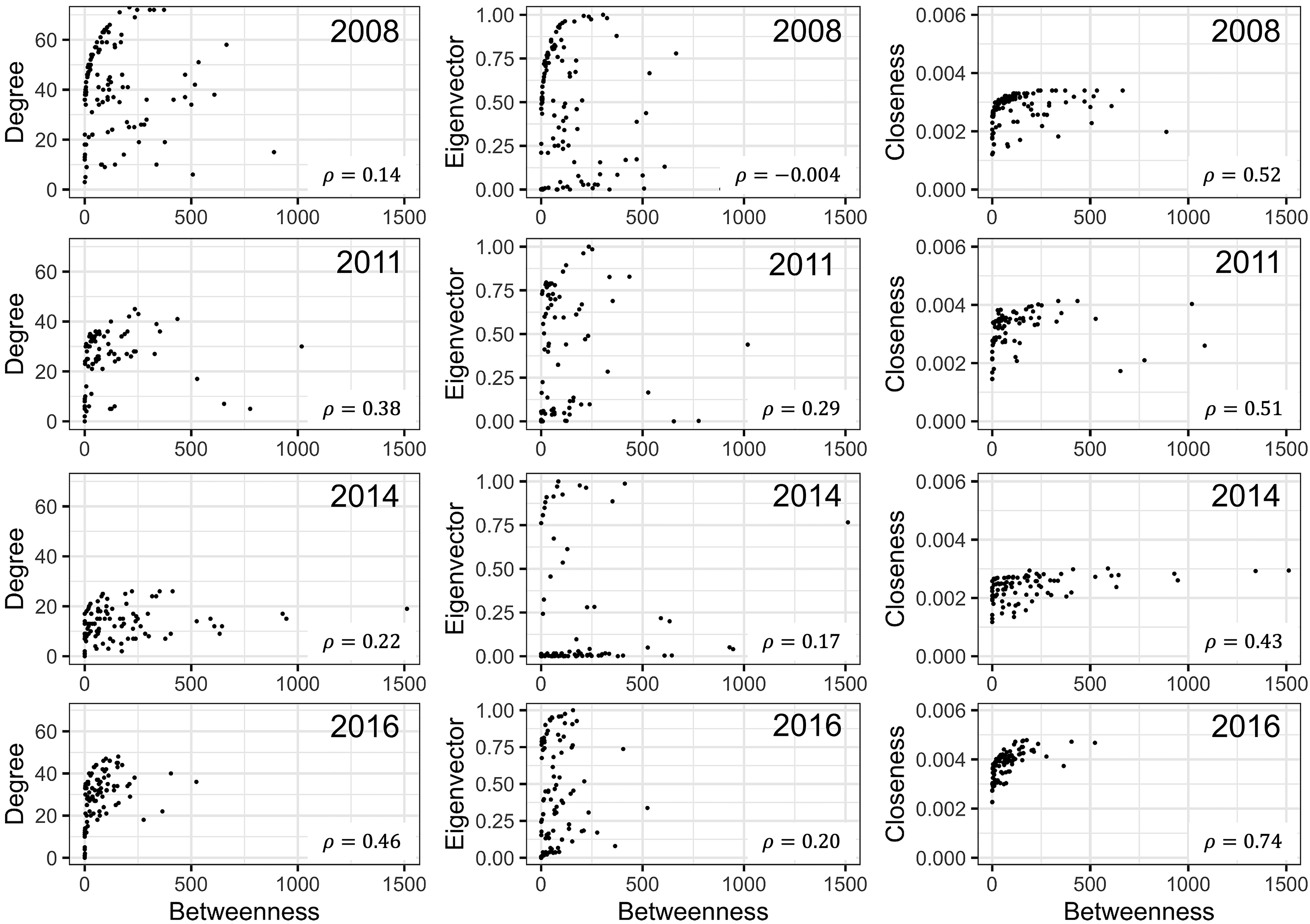
Ranking of nodes considered to be important varied among centrality metrics for epidemic years examined (Tables 3 to 5). Spearman’s rank-based correlation coefficients were highest between BWC and CLC, with correlations ranging from 0.43 to 0.74 (Fig. S7). Correlations between BWC and DGC or EVC were relatively lower across the epidemic years except between BWC and DGC in 2016, where r = 0.46 (Fig. S7). The consistency in the rankings of nodes based on centrality measures was summarized as a heatmap to visualize unique nodes within the networks (Fig. 4). Many nodes overlapped in their rankings among the top 20 important nodes (across all thresholds and centralities) in 2010 (Fig. 4A) and 2014 (Fig. 4C) based on BWC and CLC. However, most nodes overlapped across the four centrality measures in 2011 (Fig. 4B). For example, node 117 in Lewis County, West Virginia, appeared more than 20 times in the top 20 rankings based on BWC and CLC. This same node also appeared more than 10 times in the top 20 ranking of nodes based on DGC and EVC.
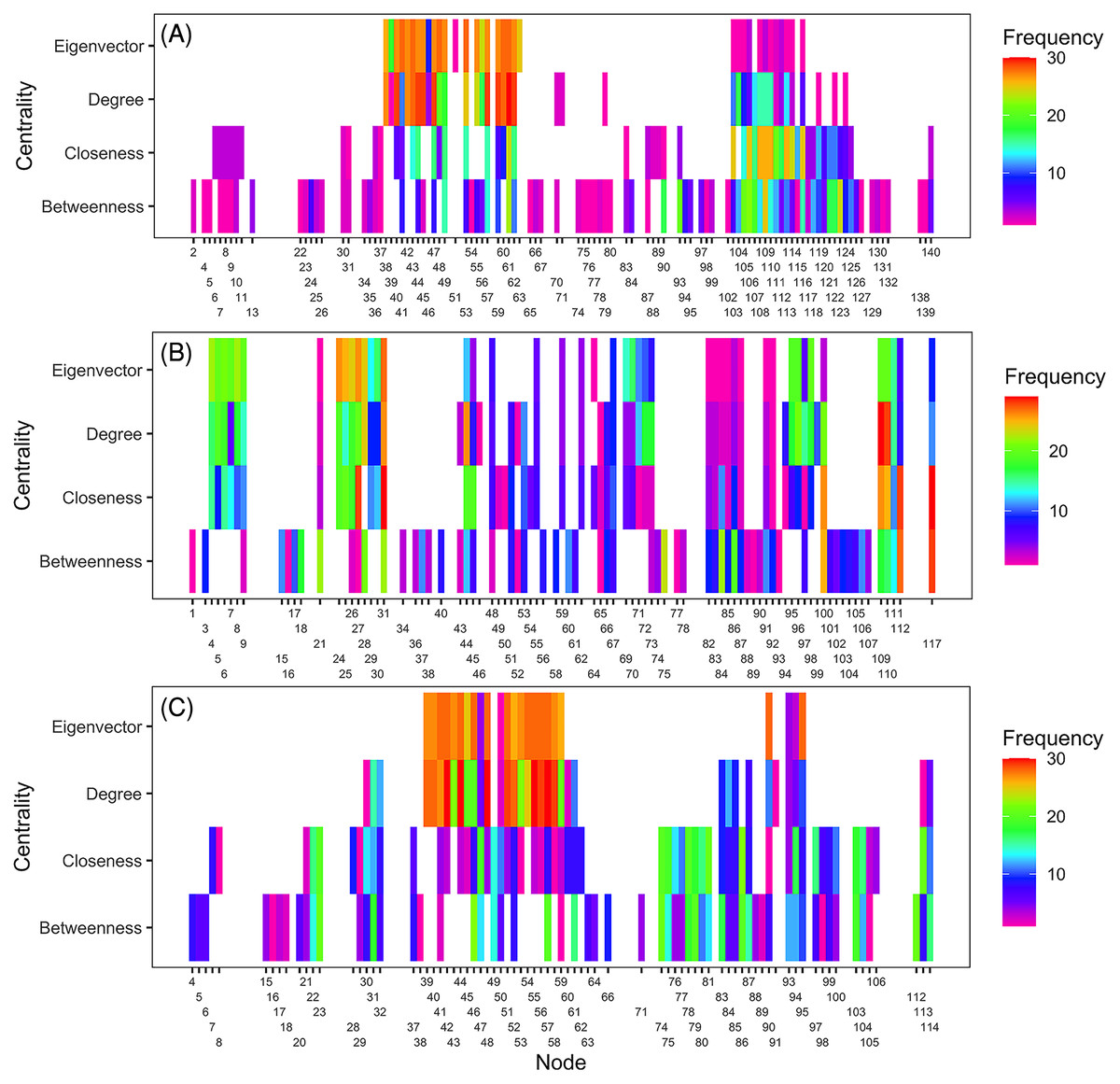
Figure 4: Illustration of important nodes for disease spread.
A heatmap representation of the most important nodes (node IDs x-axis) across 20 thresholds and the four centrality measures (y-axis) for 2010 (A), 2011 (B), and 2014 (C) networks. Frequency represents the number of times a node appeared in the top 20 ranked list across all evaluated thresholds. Most nodes overlapped across the four centrality measures in 2011. For example, node 117 in Lewis County in West Virginia appeared more than 20 times in the top 20 ranks based on BWC and CLC. This node also appeared more than ten times in the top 20 ranks based on DGC and EVC.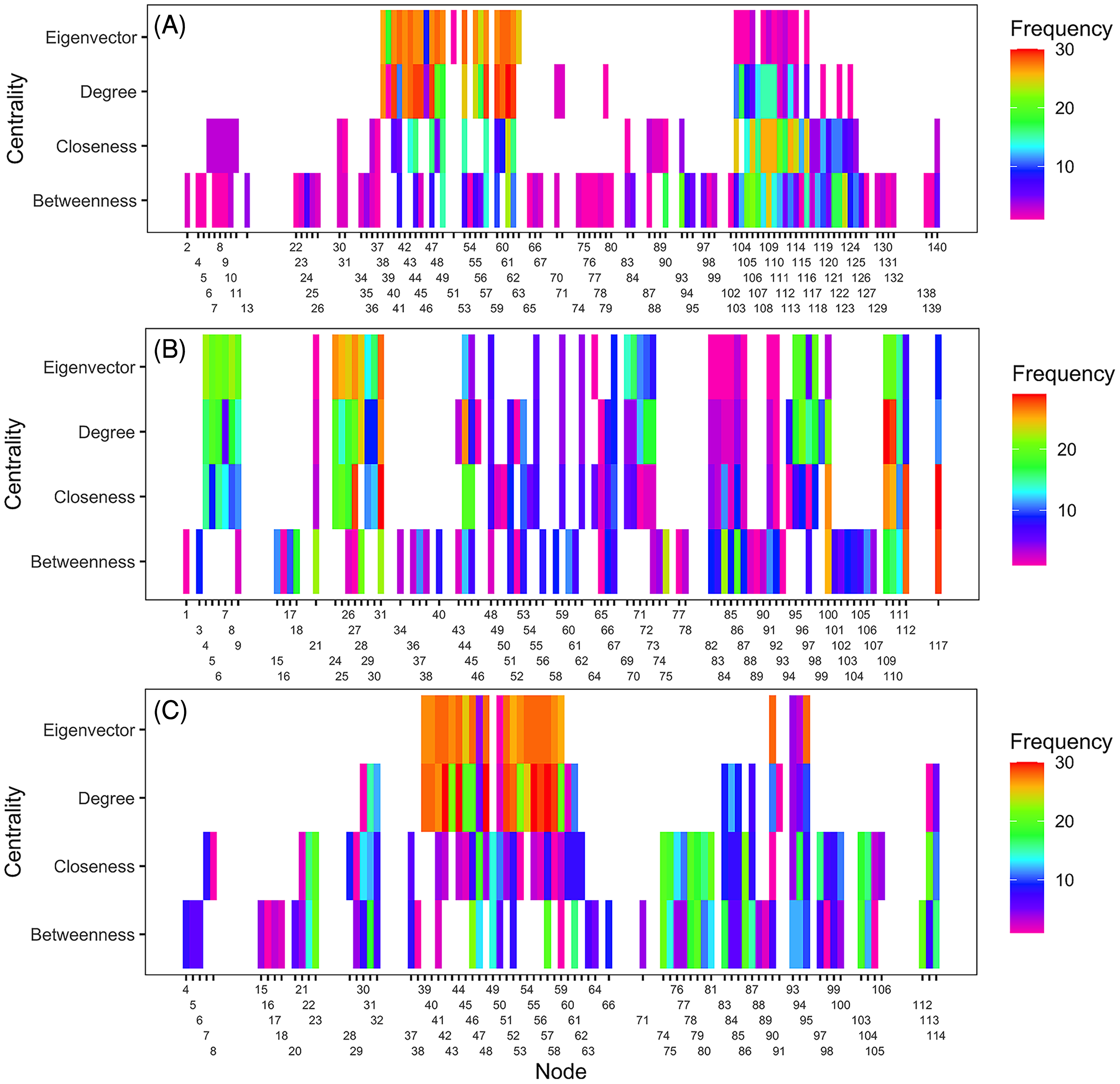
Infection frequency and centrality selection of important nodes
Identifying important nodes based on infection frequency and centrality measures of static networks showed some similarities and differences based on the examined centrality metric. The ranking of nodes based on BWC and CLC was generally similar across years, while rankings based on EVC differed from all other centrality measures. Based on BWC, nodes that had a frequency >4 had the highest calculated values (combined frequency × centrality), with the largest value being 0.82 for the node in Sandusky County in Ohio that had an infection frequency of 6 (Fig. 5), while the lowest weight was 0.13 for a node in Charleston County in South Carolina. Based on CLC, the largest weight was 0.98 for a node in Sandusky County in Ohio that had a frequency >6, while the lowest weight was 0.198 for a node in Miami-Dade County in Florida. Similarly, the node in Sandusky County in Ohio had the highest weight of 0.93 based on DGC, followed by nodes in Johnston, Lenoir and New Hanover counties in North Carolina, Wicomico County in Maryland, and Huron and Wayne counties in Ohio that had an infection frequency of 5 (Fig. 5). Node ranking based on EVC was comparably different from the ranking based on all other centrality measures. A node in Johnston County in North Carolina had the highest weight of 0.84, followed by nodes in Wicomico County in Maryland, Sampson and Johnston counties in North Carolina and Wayne County in Ohio (Fig. 5).
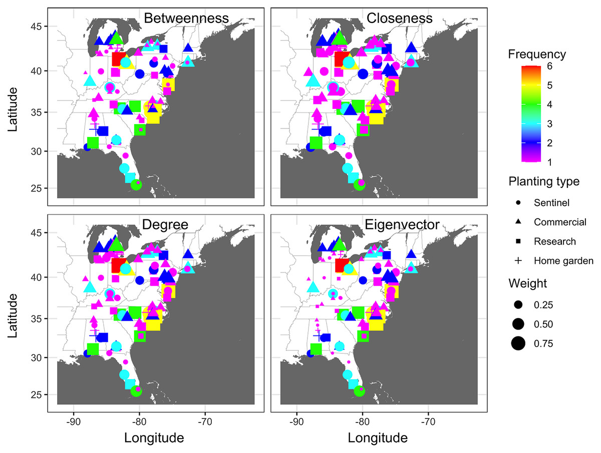
Figure 5: Node importance based on frequency of disease occurrence and centrality measures.
A depiction of node importance based on a combination of the frequency of cucurbit downy mildew occurrence in the eastern United States and betweenness, closeness, degree or eigenvector network centrality measures. Frequency represents the number of years a node was observed as an infected node based on epidemic years from 2008 to 2016. Frequency of occurrence and centrality measures are weighted based on a ratio of 4:1. Map Source: ggmap and ggplot.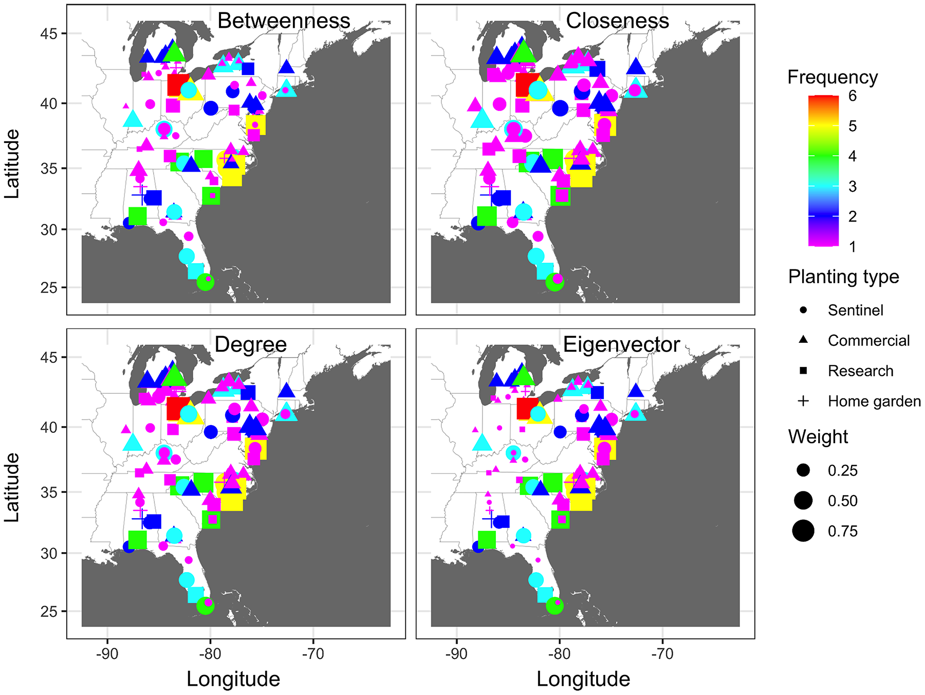
Dynamic network model of disease spread and predicted probability of node infection
The dynamic network model revealed an emerging and evolving network that differed from the static network representation of disease spread (Fig. 6). Generally, similar temporal and spatial patterns were observed in all other years, although the probabilities between nodes in different states and levels of these probabilities differed between years. In all epidemic years, links between nodes closest to the initial disease outbreak (open square) in southern Florida had the highest probabilities of transmission early in the season (i.e., week 10), while the probability of transmission for links between nodes elsewhere in the network was relatively low (Fig. 6). As epidemics progressed in time and space, link probabilities increased for nodes that were more distant from the initial outbreak in more northern latitudes, although probabilities remained relatively low for isolated nodes (Fig. 6).
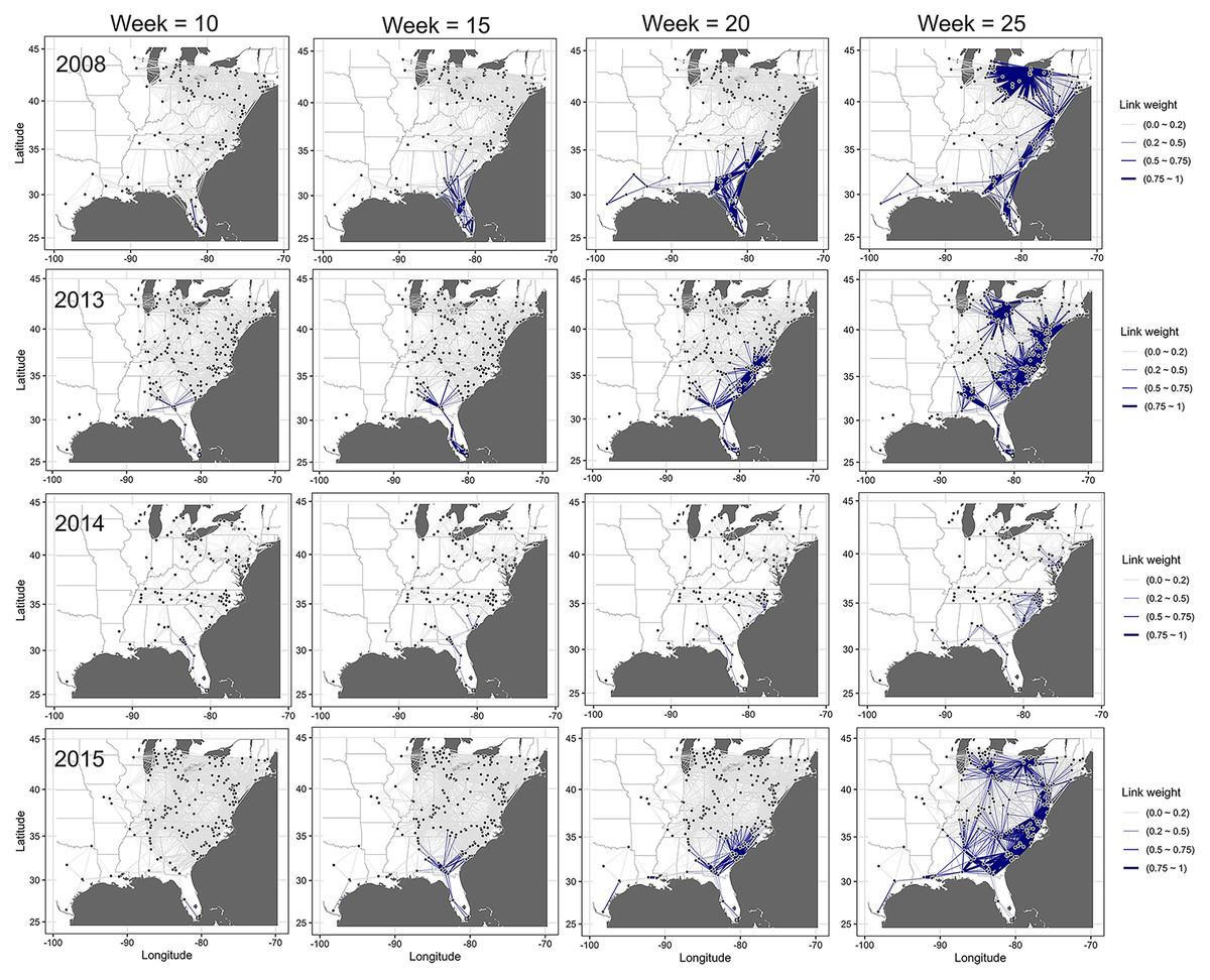
Figure 6: Dynamic network of the spread of cucurbit downy mildew.
Evolving networks resulting from a dynamic network model for the spread of cucurbit downy mildew in the eastern United States in 2008, 2013, 2014 and 2015. Black circles indicate node centroids of disease outbreak, while the open square is initial source of disease outbreak. Lines are links that have been scaled relative to the probability of transmission by time, with darker and thicker lines indicating higher probabilities of transmission. Map Source: ggmap and ggplot.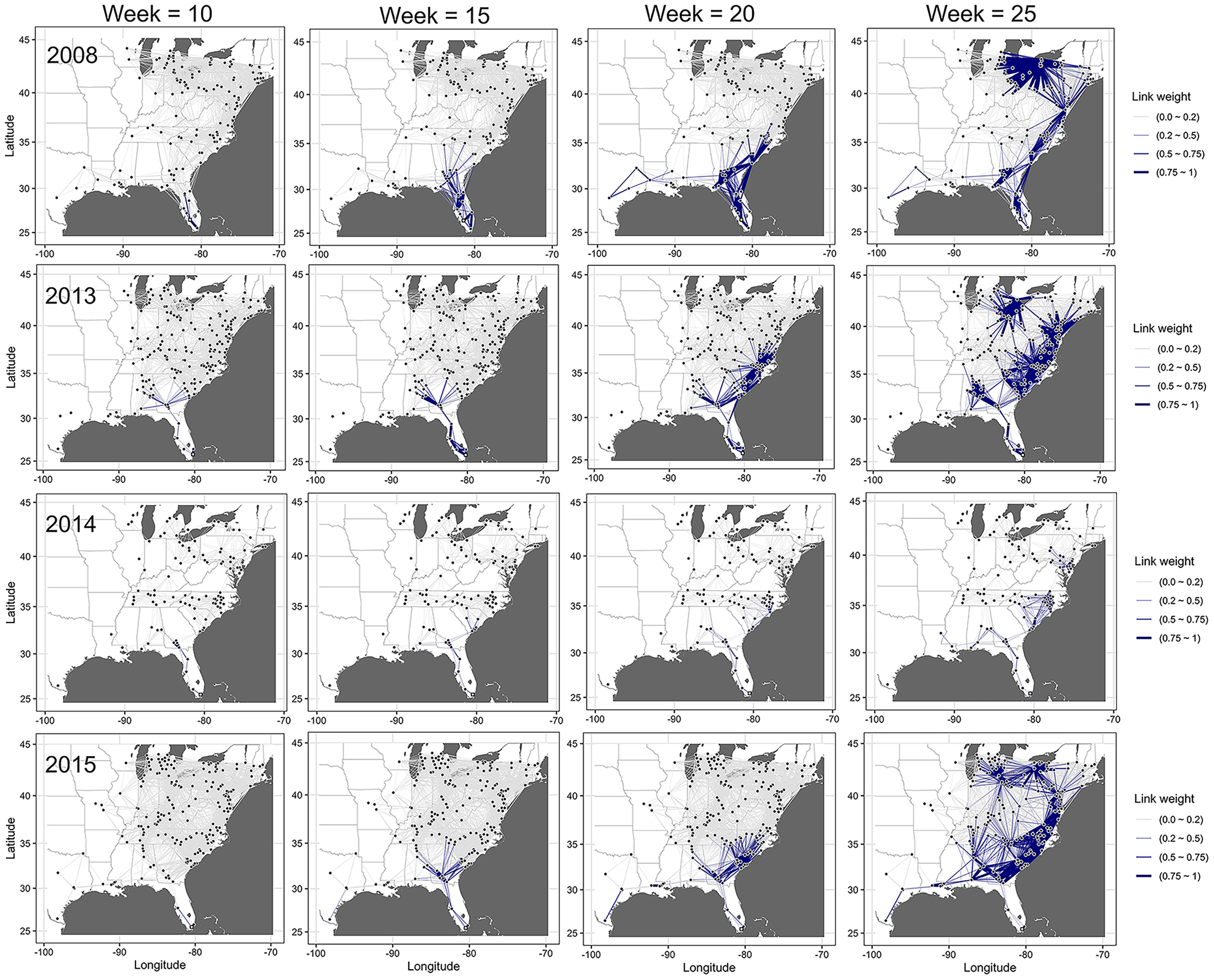
The probability of infection increased in time and space, with a generally northward expansion of the epidemic front in all years (Fig. 7). Predicted probability of infection increased most during weeks 20 or later. By week 35, the predicted probability increased for most nodes in the eastern United States, with only a relatively few nodes in Illinois and Michigan having a low infection probability.
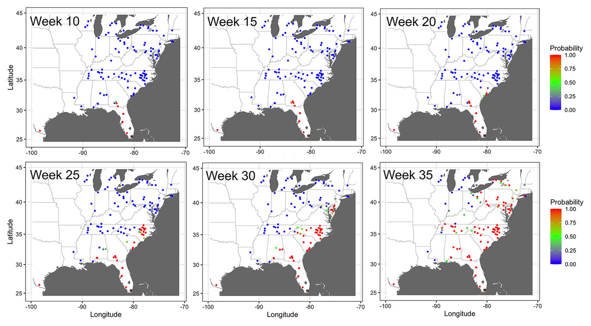
Figure 7: Prediction of the temporal spread of cucurbit downy mildew.
Prediction of cucurbit downy mildew outbreaks in the eastern United States in 2014 based on cumulative disease outbreaks observed in previous times steps in the same epidemic year. Dark red nodes represent sites predicted to have an outbreak with a high probability. Blue nodes represent sites predicted to have no outbreak with negligible probability of infection, and all other shades from green to dark red represent increasing probability of disease outbreak. A single node in Texas was reported as infected by week 10 in the observed data; thus the county was considered infected with probability of 1 by week 10. Map Source: ggmap and ggplot.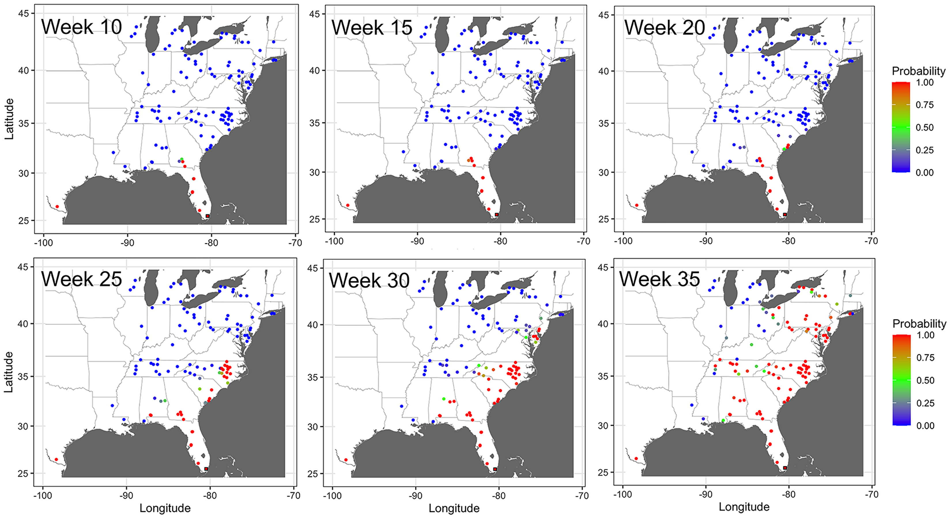
Errors in dynamic model and impact of removal of important nodes on model errors
Based on all nodes in the network, the mean absolute error for the dynamic model generated across weekly time steps and averaged monthly from January to August was lowest in 2015 with a value of 0.09 and highest in 2011 with a value of 0.33. The mean absolute error for the dynamic model across the entire study for all the nodes was 0.21 (Table 6).
| Error after removal of important nodes based on centrality measureb | |||||
|---|---|---|---|---|---|
| Yeara | All nodes | Betweenness | Closeness | Degree | Eigenvector |
| 2008 | 0.18 | 0.31 | 0.22 | 0.21 | 0.22 |
| 2009 | 0.27 | 0.39 | 0.29 | 0.28 | 0.33 |
| 2010 | 0.15 | 0.23 | 0.20 | 0.19 | 0.20 |
| 2011 | 0.33 | 0.40 | 0.35 | 0.34 | 0.34 |
| 2012 | 0.27 | 0.33 | 0.27 | 0.27 | 0.27 |
| 2013 | 0.28 | 0.45 | 0.30 | 0.31 | 0.31 |
| 2014 | 0.26 | 0.44 | 0.36 | 0.37 | 0.37 |
| 2015 | 0.09 | 0.12 | 0.10 | 0.10 | 0.10 |
| 2016 | 0.10 | 0.17 | 0.09 | 0.10 | 0.10 |
| Mean | 0.21 | 0.32 | 0.24 | 0.24 | 0.25 |
Removal of nodes identified as important based on BWC, CLC, DGC, and EVC increased the mean absolute errors, indicating that these nodes were indeed important in the network structure and prediction accuracy. However, the changes in mean absolute errors after node removal varied depending on the specific centrality measure considered. Removal of nodes identified as important by BWC resulted in the largest mean absolute error, 0.32, a 52.4% error rate relative to the base prediction that included all nodes. In contrast, removing nodes identified as important based on CLC, EVC and DGC led to comparatively small increases in mean absolute error (0.24, 0.24 and 0.25, respectively). Thus, model errors due to the removal of nodes identified as important based on BWC were 3 to 4 times higher than errors resulting from the removal of nodes identified as important based on CLC, DGG, or EVC, indicating BWC was superior in identifying important nodes in this data set (Table 6).
The probability of node infection and epidemic progress in the disease network was also affected by removing nodes identified as central in the network. Relative to a network with all nodes present, removing nodes identified as important based on BWC reduced the probability of infection of non-infected nodes in the subsequent time step in all epidemic years (Fig. 8). For example, removing of nodes in counties in north Florida, Georgia, and South Carolina that were identified as important based on BWC arrested the progression of CDM and infection of nodes in north Florida, South Georgia, and South Carolina in 2009 by week 25 (Fig. 8). We observed a similar pattern of infection probability being meaningfully changed in other years as well when node removal was based on BWC, with the precise change in infection probability varying in specific years. In contrast, removing nodes identified as central based on CLC, DGC or EVC had a comparably minor impact on the probability of node infection and epidemic progress in all years (Fig. 8).
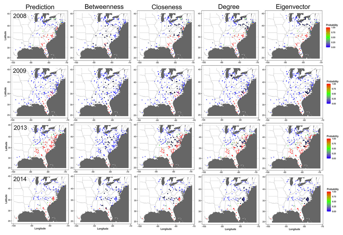
Figure 8: Impact of removing important nodes on disease spread in the network.
Prediction of cucurbit downy mildew outbreaks in the eastern United States by week 25 for all nodes present in the network (i.e., prediction) compared to prediction when the 20 most important nodes (based on betweenness, closeness, degree, and eigenvector centrality measures) are removed from the network based on data from epidemics in 2008, 2009, 2013 and 2014. Diamond symbols are nodes identified as important based on each centrality metric. The initial source of disease outbreak is represented by a square symbol. Map Source: ggmap and ggplot.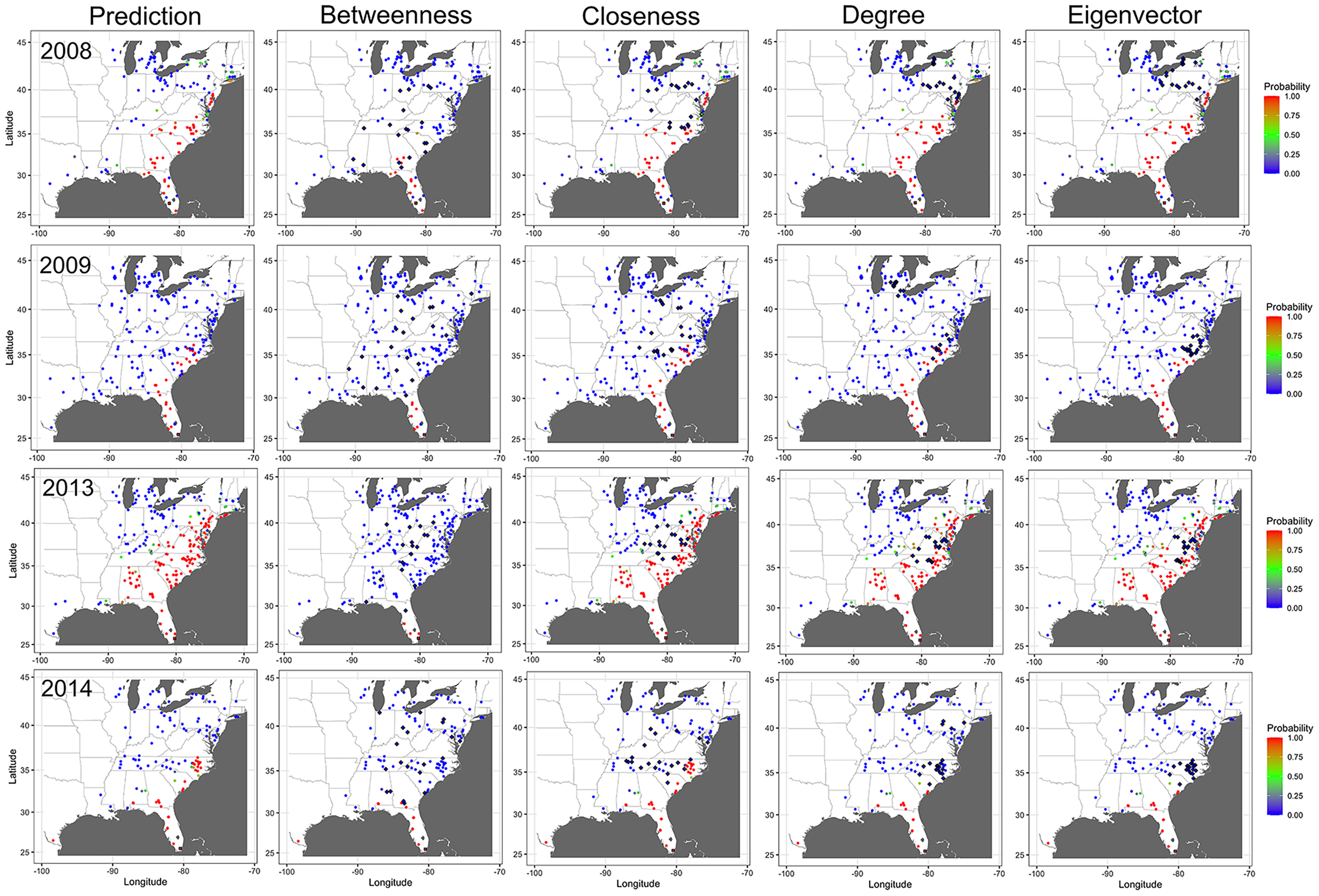
Discussion
Estimating the probability and timing of outbreaks in specific sites and determining where and when the introduction of inoculum can impact the extent of an epidemic, is one of the challenges in predicting the spread of plant diseases and pests (Meentemeyer et al., 2011; Fitzpatrick et al., 2012). The CDM pathogen can be dispersed over long distances and the disease can spread rapidly under favorable environmental conditions (Ojiambo & Holmes, 2011). In this study, networks were formulated based on historical epidemic records of CDM to establish how connectivity of cucurbit fields influences pathogen dispersal and disease spread in the eastern United States. Multiple low- to high-density static networks were initially generated and analyzed, and networks with biologically-plausible structures and topologies were selected for further analysis. The exponent of the degree distributions for most of the examined networks followed a power-law distribution, indicating that static networks of CDM displayed scale-free properties (Pastor-Satorra & Vespignani, 2001), where most nodes had a small number of links, while a smaller number of nodes had a relatively large number of connections. Scale-free connectivity implies the existence of highly connected nodes (hubs) that are responsible for the rapid spread of disease within the network (Jeger et al., 2007). The transmission probability threshold is low or even absent in scale-free networks (Shirley & Rushton, 2005; Pastor-Satorra & Vespignani, 2001) and this may partly explain the low levels of τ observed in the present study. Disease spread in scale-free networks is rapid and models suggest that control of pathogens spreading in such networks should focus on the highly connected sites (Jeger et al., 2007). Thus, targeted sampling of frequently-infected and highly connected sites that are critical in spreading the disease may benefit disease surveillance.
Sites in Florida, Alabama, North, and South Carolina that were infected more frequently in the past may be candidates for disease surveillance. Acquiring the frequency of infection data is a prerequisite, but constant scouting for the disease is expensive. However, once the historical frequency of infection data is available, additional information about network traits is inexpensive to obtain using mathematical models (Sutrave et al., 2012). Network centrality metrics such as BWC, CLC, DGC and EVC can facilitate the identification of such highly connected nodes (Andersen et al., 2019; Gent, Bhattacharyya & Ruiz, 2019) and aid in evaluating strategies for selecting nodes for surveillance (Sanatkar et al., 2015). Based on a complete static network model, these centrality measures were used to identify highly connected sites for the spread of CDM in the eastern United States. Combining past infection frequency with centrality measures improved the identification of important nodes. For example, DGC, BWC, and CLC produced similar rankings with the infection-based frequency for nodes with an infection frequency greater than four. Although EVC produced a different ranking, nodes with a frequency greater than four still had high weights, thus agreeing with the rankings from the other centrality measures. The combination of frequency-based and DGC was useful in selecting sampling nodes for sentinel sites for soybean rust in the United States (Sutrave et al., 2012). DGC is considered the standard measure in network science and is useful for identifying important nodes in static networks of several pathosystems to inform strategic management (Christley et al., 2005; Gent, Bhattacharyya & Ruiz, 2019; Kiss, Green & Kao, 2006; Xing et al., 2020). Unlike other centrality measures, DGC is easier to calculate and does not require assessing the entire network (Christley et al., 2005). In this study, DGC was ineffective in identifying important nodes compared to BWC. Further, BWC rankings were poorly correlated with those of DGC except for the epidemic data collected in 2016.
Betweenness centrality was more useful in identifying the influential nodes in the network as compared to other commonly used metrics. BWC measures the importance of a node by computing how many times a node of interest is on the shortest paths between any two other nodes. This centrality measure has been used to characterize large networks by way of selected nodes since the seminal work by Granovetter (1973). Nodes with high BWC have been used to determine keystone species in food webs, find clusters and communities, and analyze the robustness of networks by identifying sensitive points of failure (Barabási & Bonabeau, 2003; Girvan & Newman, 2002; Vasas & Jordán, 2006). In epidemiology, nodes with high BWC indicate that they are important in disease spread as they act as bridges or ‘hubs’ to other nodes. Thus, greater disease surveillance efforts and treatment should be directed towards these nodes to decrease the risk of pathogen transmission and disease spread within the network (Marquetoux et al., 2016). The observation that BWC was more informative of node importance than other centrality measures emphasizes the need to generate centrality measures that are specific to the disease of interest (Holme, 2018). Invariably, different centrality measures can result in a dissimilar ranking profiles of important nodes for diverse pathosystems, possibly due to the inherent differences in the underlying mechanisms of pathogen dispersal and disease spread, landscape connectivity, or other factors (Dudkina et al., 2023; Holme, 2018; Singer, Thompson & Bonsall, 2022).
The importance of the highly connected sites in disease spread was further evaluated using a dynamic network model. Mean absolute errors and the probability of infection in nodes across the networks were relatively insensitive to removing of nodes identified as central by CLC, DGC, and EVC. In contrast, mean absolute errors and the probability of infection in simulated epidemics were quite sensitive to removing of nodes identified as central based on BWC. This may be related to the physical location of the nodes identified as highly central by the various centrality measures. Removing nodes identified as important based on CLC, DGC and EVC that were located in Pennsylvania, Ohio, and New York did not affect disease progression northward from southern states, whereas removing important nodes in North Carolina largely prevented disease spread. Nodes with high BWC scores were scattered across the region, including in the southern United States. Removing these nodes, reduced disease spread, and in some epidemic years, it entirely halted disease spread from most southern states. Most of the spread of CDM is over relatively short distances of less than 30 km (Ojiambo & Holmes, 2011) as the host is planted from south to north. Since BWC is based on the number of shortest paths that pass through a target node, a target node will have a high BWC score if it appears in many shortest paths. Given the relative short dispersal distances of P. cubensis, it is plausible that BWC may be better at capturing the dynamics of disease transmission for most of the dispersal events that drive the spread of CDM.
Where resources available for control are limited, targeting nodes with high BWC for treatment has also been found to be an effective strategy in impeding epidemics caused by a disease that spreads rapidly (Singer, Thompson & Bonsall, 2022). The most central nodes identified as important based on BWC were sites in Michigan in the Great Lakes region, Ohio in the Midwest, and Maryland, North Carolina, South Carolina, and Virginia along the mid-Atlantic coast. These states are located along the seasonal transport pathway of P. cubensis spores from overwintering locations from the south (Aylor, 2003). Further, most of these states have the largest acreage of cucurbit production in the United States. Thus, a combination of spore transport and host density may be a reason for the location of the most central nodes in the above states. These sites could thus be reasonable targets for more intensive sampling for surveillance of new disease outbreaks within the region. Potentially, more effective disease management in these highly connected sites, such as the strategic deployment of host resistance, could reduce inoculum production that drives infection in neighboring cucurbit fields in the eastern United States.
Static networks capture connectivity patterns at a single point in time, while dynamic models account for changes in network structure over time, allowing for more accurate predictions of disease spread trajectories. Thus, the simpler static network representations are often deficient when compared with a fully dynamic representation, and should thus be used only with caution in epidemiological modelling (Vernon & Keeling, 2009). Unlike the dynamic model used for the spread of soybean rust in the United States (Sutrave et al., 2012), the dynamic model used in this present study incorporated a power-law dispersal gradient characteristic for the long-distance dispersal of plant pathogens. Based on the 2008 and 2009 epidemic data and point-pattern analysis, the dispersal distances for the CDM pathogen were estimated to be up to 390, 737 and 879 km, with 1,000 km being the maximum possible distance of spatial association (Ojiambo & Holmes, 2011). Further, Ojiambo et al. (2017) showed that the spread parameter b varied in different epidemics, with the final epidemic extent ranging from 4.16 × 10⁸ to 6.44 × 10⁸ km2. Thus, different values of b were used in the construction of static networks and in the dynamic network model to account for the difference in spatial spread in each epidemic year. The dynamic network model used in the present study improves on modeling long-distance dispersal by using a flexible threshold for distance to allow for the connectivity of nodes that are further apart (Ferrari, Preisser & Fitzpatrick, 2014). However, the model does not account for differences in environmental factors that are likely to influence pathogen dispersal. In addition, accounting for differences in host susceptibility at the different locations could further improve our ability to generalize the findings reported here to different cucurbit host types. Subsequent studies are also needed to establish how unknown disease sources can be imputed in this network modeling framework and determine how accounting for these unknown sources could influence the network structure and inference made on the location of highly connected sites for disease surveillance reported in this study. Due to the non-random placement of sentinel sites within the monitoring network, these results may not be generalizable and additional studies may be needed to assess how the random placement of sentinel sites could influence the findings reported in this study.
Supplemental Information
Sensitivity analysis of the effect of weighting in the infection frequency:centrality ratio on the frequency and ranking of nodes for different centrality measures.
Absolute errors for a network model based on removal of nodes identified as important across all centrality measures for different values of the weight factor, υ, in calculation of total error.
Correlation between total number of reports and number of counties with disease.
Spearman’s correlation between the total number of disease reports and the number of counties where disease was reported based on combined epidemic data from 2008 to 2016.
Correlation between number of monitoring plots and counties with disease.
Spearman’s correlation between the number of plots with active surveillance and number of counties where disease was reported based on combined epidemic data from 2008 to 2016.
Conversion of meteorological wind direction to mathematic wind direction.
Graphical illustration of the conversion of meteorological wind direction to mathematical wind direction: (A) A wind bar graph representing raw observations for the meteorological wind direction, i.e., a northerly wind is 360°, a southerly wind is 180°, a westerly wind is 270°, and an easterly wind is 90°. (B) The mathematical convention for the meteorological wind direction, i.e., a northerly wind is 270°, a south wind is 90°, a westerly wind is 0°, and an easterly wind is 180°. (C) The u and v are components of the wind where |r| is the magnitude (or wind speed). Here, we treat |r| as the observed wind speed in miles per hour. A positive u and a negative u represent a westerly wind and an easterly wind, respectively. A positive v and a negative v represent a southerly wind and a northerly wind, respectively. The figures and notes are courtesy of Virginia Weather & Climate Data lecture.
Static networks constructed using a range of threshold values.
Static networks of cucurbit downy mildew constructed using a range of thresholds values to generate networks bounded by values that produce a full network and a near-zero probability of link formation for epidemics years for the 2009 epidemic. Map Source: ggmap and ggplot.
Sensitivity analysis to assess the effect of ratios on ranking of nodes.
A sensitivity analysis of the weighting ratio of combining the frequency of occurrence and betweenness, closeness, degree, or eigenvector centrality measures. The frequency represents the years a node was observed as infected based on epidemic years from 2008 to 2016. A) A 4:1 ensures that the high-frequency nodes have high weights and rank higher. B) A 1:1 ratio does not ensure that all the high-frequency nodes have high weights or rank higher (except for closeness for the top 20). C) A 0.5:0.5 ratio does not ensure that all the high-frequency nodes have high weights or rank higher (except for closeness for the top 20). D) A 1:4 ratio produces new ranks and mixed results. E) A 0.65:0.35 ensures that some high-frequency nodes have high weights and rank higher. However, some high-frequency nodes rank lower. Map Source: ggmap and ggplot.
Cumulative probability distribution of centrality measures for selected epidemic years.
Cumulative probability distribution of centrality metrics of cucurbit downy mildew networks based on disease reports in 2008 (first row), 2011 (second row), 2014 (third row), and 2016 (fourth row) in the eastern United States. Centrality metrics on the horizontal axis are as follows: BWC = betweenness centrality, CLC = closeness centrality, DGC = degree centrality and EVC = eigenvector centrality.
Correlation between different measures of network centrality.
Correlation between betweenness centrality (BWC), closeness (CLC), degree (DGC), and eigenvector (EVC) centrality metrics for cucurbit downy mildew networks constructed using disease data recorded in specific epidemic years in the eastern United States.