
Prediction of fatigue crack growth rate, maximum strain energy release rate, and total energy dissipation in adhesive bonds: a machine learning approach and interactive R-Shiny panel development
- Published
- Accepted
- Received
- Academic Editor
- Giovanni Angiulli
- Subject Areas
- Algorithms and Analysis of Algorithms, Artificial Intelligence, Data Mining and Machine Learning, Data Science, Neural Networks
- Keywords
- Machine learning, R-Shiny, Regression, Fatigue crack growth rate, Maximum strain energy release rate, Total energy dissipation, Adhesive bonds, Artificial intelligence, XGBoost, Data analysis
- Copyright
- © 2025 Çakır
- Licence
- This is an open access article distributed under the terms of the Creative Commons Attribution License, which permits unrestricted use, distribution, reproduction and adaptation in any medium and for any purpose provided that it is properly attributed. For attribution, the original author(s), title, publication source (PeerJ Computer Science) and either DOI or URL of the article must be cited.
- Cite this article
- 2026. Prediction of fatigue crack growth rate, maximum strain energy release rate, and total energy dissipation in adhesive bonds: a machine learning approach and interactive R-Shiny panel development. PeerJ Computer Science 12:e3450 https://doi.org/10.7717/peerj-cs.3450
Abstract
Background
Adhesive bonds, which are of critical importance in modern engineering structures, can be damaged and develop cracks under repeated loads (fatigue) over time. Accurately predicting how fast these cracks will grow and how the material expends energy during this process is of vital importance for the safety and durability of structures, but traditional engineering methods are often insufficient for modeling these complex behaviors.
Methods
This study utilized experimental data from adhesive bond fatigue crack growth tests on double cantilever beam (DCB) specimens. Three key parameters characterizing the damage behavior of adhesive bonds, fatigue crack growth rate (da/dN), total energy dissipation (Total_Energy), and maximum strain energy release rate (Gmax) were predicted using a comprehensive suite of sixteen (16) different Machine Learning (ML) regression models. These models included Linear Regression (lm), Ridge Regression (ridge), Lasso Regression (lasso), Elastic Net Regression (glmnet), Random Forest (rf), Support Vector Machine Linear (svmLinear) and Support Vector Machine Radial (svmRadial), Gradient Boosting Machine (gbm), Decision Tree (rpart), eXtreme Gradient Boosting Machine (xgbTree), K-Nearest Neighbor (knn), Partial Least Squares (pls), Generalized Additive Model (gam), Bayesian Regularized Neural Networks (brnn), Gaussian Process Regression (gpr), and Quantile Regression Neural Networks (qrnn). Model performance was evaluated using standard metrics, influential experimental factors were identified via the Boruta algorithm, and relationships were explained using model interpretation techniques (e.g., Linear Regression equations and Decision Tree structures).
Results
ML models demonstrated high accuracy in predicting these critical parameters from experimental data, achieving high R2 values and low error metrics across the test sets. Different ML models were observed to excel for different prediction tasks; for instance, linear models often performed well for total energy prediction, while tree-based and more complex non-linear methods (like Gaussian Process Regression) frequently showed superior performance for fatigue crack growth rate and Gmax predictions. Important engineering insights were also gained regarding the influence of experimental conditions on predictions.
Conclusion
This study demonstrates that ML is a powerful and promising tool for understanding the behavior of complex materials like adhesive bonds and for developing safer, more durable engineering designs. To support these analyses and make them available to the research community, an open-source R-Shiny code designed as a user-friendly data analysis and regression dashboard for the “Damage Tolerance of Adhesive Bonds Dataset” was developed. Sharing these codes aims to provide practical tools for the field and facilitate further research.
Introduction
Ensuring structural integrity is fundamental to engineering applications, particularly in critical fields like aerospace and space engineering. In this context, a thorough understanding and accurate prediction of fatigue damage in adhesive bonds are vital for the operational life and reliability of structures. Crack propagation in these bonds directly affects their service life and dependability (Wan & Wu, 2009). The initiation and growth of cracks constitute a complex, multi-parameter process influenced by material and interface properties, as well as loading conditions.
Early work in material fatigue characterized material behavior under repetitive loads using empirical approaches such as Wöhler curves and Goodman diagrams (Sendeckyj, 2001). Subsequently, the development of Griffith’s fracture theory (Anderson & Anderson, 2005) and Irwin’s stress intensity factor concepts led to the principles of Linear Elastic Fracture Mechanics (LEFM) (Griffith, 1921; Anderson & Anderson, 2005). These advancements facilitated the creation of foundational empirical models, such as Paris’ Law (Paris & Erdogan, 1963), which describe the relationship between fatigue crack growth rate (da/dN) (Imanaka et al., 2009) and the stress intensity factor range (ΔK), especially in metallic materials. While these models have demonstrated significant success in predicting fatigue crack growth in metallic structures, their direct applicability to LEFM-based ΔK approaches in polymer or composite-based materials like adhesive bonds is limited (Sarcina, Signorile & Salmoiraghi, 2025). This limitation arises from factors such as crack tip plasticity, viscoelastic behavior, thermal effects, and complex energy dissipation mechanisms. Consequently, researchers have focused on developing alternative methods to characterize crack propagation. Notably, the Strain Energy Release Rate (SERR) approach, which is based on energy dissipation in the crack tip region, has gained increasing importance in understanding the fatigue behavior of adhesive systems (Anderson & Anderson, 2005). SERR represents the amount of energy released per unit of crack propagation, offering a more holistic reflection of the effects of complex loading and material behaviors. In this regard, compliance change measurements have played a critical role in determining crack length and, consequently, the energy release rate (Irwin, 1957). While these foundational models provide critical insights, their limitations in capturing the full spectrum of non-linear material behavior have spurred the development of more advanced predictive frameworks. In this context, two major paradigms have gained prominence. On one hand, significant progress has been made in physics-based modeling, such as continuum damage mechanics (CDM) and entropy-based fatigue models. These approaches aim to create robust theoretical frameworks that predict failure by modeling the physical degradation processes within the material. On the other hand, the proliferation of experimental and computational data has enabled the rise of data-driven approaches, particularly Machine Learning (ML) techniques. ML algorithms excel at learning complex, hidden patterns directly from data without relying on pre-defined physical equations, making them a powerful tool for modeling fatigue and fracture behaviors in materials.
The increasing use of adhesive bonds in sectors like aerospace (Smagulova, Samaitis & Jasiuniene, 2024; Rathore et al., 2025) and automotive (Titov, Maev & Bogachenkov, 2008) is due to their inherent advantages, including lightweight design, high strength-to-weight ratios, and the unique ability to join dissimilar materials. The fundamental safety and reliability of these critical components are intrinsically linked to a comprehensive understanding and accurate prediction of damage mechanisms, such as crack initiation and propagation, under the prevalent fatigue loads encountered throughout their service life. Total_Energy, da/dN, and Gmax are pivotal parameters related to fracture mechanics, essential for assessing a material’s overall fatigue life and its intrinsic damage tolerance. Nevertheless, accurately modeling the intricate behavior of these parameters under complex loading conditions, varying geometric factors, and diverse material properties often presents a significant challenge when relying solely on traditional analytical or simplistic empirical methods (Smagulova, Samaitis & Jasiuniene, 2024).
Numerous studies in the literature demonstrate the successful application of ML in various domains, including fatigue life prediction in metals (Hamada et al., 2025), damage detection (Rubio-González, del Pilar de Urquijo-Ventura & Rodríguez-González, 2023; Smagulova, Samaitis & Jasiuniene, 2024) and progression in composite materials, and mechanical property optimization in polymeric materials (Rabothata, Muthu & Wegner, 2021). These studies have investigated the effectiveness of different ML algorithms in modeling material behavior. The algorithms include linear regression models (Linear Regression, Ridge Regression, Lasso Regression, Elastic Net Regression) (Meybodi et al., 2022; Rabothata, Muthu & Wegner, 2021), Decision Trees (Vinayagam et al., 2025; Konda, Verma & Jayaganthan, 2022; Zhang et al., 2021), and various ensemble methods such as Random Forest, Gradient Boosting, and XGBoost (Konda, Verma & Jayaganthan, 2022; Huang et al., 2025). Additionally, other regression models like Support Vector Machine (linear and radial) (Meybodi et al., 2022; Rathore et al., 2025), knn, pls, Generalized Additive Model (gam), and Bayesian Regularized Neural Network (brnn) are employed in this field. Notably, Gaussian Process Regression (gpr) methods, like gaussprRadial used in this study, are widely applied in modeling material properties and behaviors, especially with small datasets and when quantifying prediction uncertainty is necessary. Furthermore, models such as qrnn, also utilized in this work, offer the ability to characterize predictive uncertainty by modeling the conditional distribution of outputs beyond traditional point predictions, finding applications in areas like polymer dynamics modeling. In this context, the application of ML techniques for the damage tolerance and durability of adhesive bonds is gaining increasing interest due to its potential to reduce experimental costs, accelerate the design of new material systems, and provide in-depth insights into material behavior (Fang et al., 2022).
In recent years, ML techniques have gained considerable momentum in materials science and engineering, becoming a revolutionary tool for modeling fatigue and fracture behaviors (Fang et al., 2022; Hamada et al., 2025). Conventional empirical and theoretical models often struggle to fully capture the non-linear interactions present in multi-dimensional datasets, a limitation that ML algorithms can overcome by learning hidden patterns directly from data. This application has moved beyond general predictions to address highly specific challenges. For instance, recent studies have successfully employed ML to calibrate fatigue crack growth models under varying temperature and stress ratio conditions (Zhang et al., 2025), predict crack growth rates in the difficult near-threshold region (Ye, Cui & Guo, 2025), and identify interfacial cohesive law parameters in adhesively bonded systems (Su et al., 2021). These studies underscore the capability of ML to capture complex behaviors that traditional models may struggle with. Parallel to these data-driven advancements, significant progress has been made in physics-based modeling, such as entropy-based and continuum damage mechanics (CDM) approaches, which provide a robust theoretical framework for failure prediction. This study aims to build upon the data-driven paradigm by conducting a broad comparative analysis of various ML algorithms, while also acknowledging the importance of the underlying physical principles of fatigue. Publication trend analyses conducted in scientific databases such as Web of Science (WoS) also clearly indicate a consistent increase in scientific interest and the number of ML-based studies in this field (Fig. S1).
This study is based on comprehensive experimental data (Pascoe, 2016) obtained from quasi-static and fatigue crack growth experiments conducted on double cantilever beam (DCB) specimens. In these specimens, aluminum 2024-T3 (Kamal et al., 2025) adherends were bonded with FM94 epoxy adhesive to investigate the damage tolerance and fatigue behavior of adhesive bonds. The dataset (Pascoe, Alderliesten & Benedictus, 2016) encompasses raw measurements such as crack length, applied force, and displacement, in addition to processed (derived) data like strain energy release rates and energy dissipation per cycle. Aluminum 2024-T3 is widely utilized in aerospace applications owing to its high strength to weight ratio (Kamal et al., 2025), while FM94 epoxy adhesive is frequently chosen for metal to metal bonding scenarios that necessitate high strength and fatigue durability (Sikander et al., 2025). Both DCB specimens and the applied quasi-static/fatigue tests represent standard and critical methodologies for assessing the crack propagation resistance and long-term durability of adhesive bonds under sustained loads (Ciavarella, 2025; Sarcina, Signorile & Salmoiraghi, 2025). Among the parameters recorded in these experiments, the strain energy release rate (G) serves as a critical indicator within fracture mechanics for aerospace engineering (Anderson & Anderson, 2005), and cyclic energy dissipation is employed to elucidate the performance of adhesive bonds under repetitive loading conditions (Imanaka et al., 2009).
The primary objectives of this study include:
-
(i)
Evaluating the predictive power of the identified experimental feature sets for each target variable: fatigue crack growth rate, maximum strain energy release rate, and total energy dissipation.
-
(ii)
Examining the relationships among features using a correlation matrix.
-
(iii)
Determining feature importance using the Boruta algorithm.
-
(iv)
Comparing the prediction performance of different ML models using various metrics and diagnostic plots
-
(v)
Understanding and physically interpreting the inter-variable relationships learned by the models, utilizing interpretable ML techniques such as linear model coefficients and decision tree structures.
-
(vi)
Creating an open-source data analysis and reporting platform using R-Shiny.
The following sections present the experimental data used and the methodology, the obtained analysis results, and a detailed discussion of the findings.
Materials and Methods
This section outlines the experimental data utilized in this study, followed by a detailed description of the data analysis and ML methodology employed to predict the fatigue crack growth parameters in adhesive bonds.
Computing infrastructure and software environment
All computational analyses and model executions were performed on a workstation equipped with an Intel Core i5-4460 CPU @ 3.20GHz, 32GB of RAM, an AMD Radeon R7 200 Series graphics card (2GB VRAM), and a 240GB SSD. The operating system used for all computations was Windows 10 Education. All data analysis and ML model implementations were carried out using R statistical software (version 4.4.3; R Core Team, 2025) within the RStudio integrated development environment (version 2025.05.0 Build 496; Posit Software, PBC).
Key R packages utilized for the analyses include:
tidyverse (version 2.0.0) and its components such as ggplot2 (version 3.5.2) for data visualization, dplyr (version 1.1.4) for data manipulation, tidyr (version 1.3.1), readr (version 2.1.5), purrr (version 1.0.4), stringr (version 1.5.1), forcats (version 1.0.0), and tibble (version 3.2.1).
Boruta (version 8.0.0) for feature selection.
caret (version 7.0-1) for general machine learning workflows, including model training and evaluation.
Metrics (version 0.1.4) for performance metrics calculation.
corrplot (version 0.95) for correlation matrix visualization.
rpart (version 4.1.24) and rpart.plot (version 3.1.2) for decision tree modeling and plotting.
DT (version 0.33) for interactive tables.
shiny (version 1.11.1), shinyWidgets (version 0.9.0), colourpicker (version 1.3.0), and shinycssloaders (version 1.1.0) for potential interactive applications.
Other utilized packages include RColorBrewer (version 1.1-3), lubridate (version 1.9.4), and lattice (version 0.22-6).
Experimental data and specimens
The foundation of this study is a comprehensive experimental dataset meticulously compiled by John-Alan Pascoe as part of his doctoral research (Pascoe, 2016). This dataset (Pascoe, Alderliesten & Benedictus, 2016) originates from a series of quasi-static and fatigue crack growth experiments conducted on DCB specimens. These specimens are a standard and critical methodology for assessing the crack propagation resistance and long-term durability of adhesive bonds under sustained loads.
The specimens were fabricated by bonding Aluminum 2024-T3 adherends with FM94 epoxy adhesive. Aluminum 2024-T3 is widely utilized in aerospace applications due to its high strength to weight ratio, while FM94 epoxy adhesive is frequently chosen for metal to metal bonding scenarios requiring high strength and fatigue durability.
The dataset encompasses raw measurements including crack length (a), applied force (F), and displacement (d). In addition to these raw measurements, the dataset also provides processed (derived) data, such as strain energy release rates (G) and energy dissipation per cycle. The G is a critical indicator within fracture mechanics for aerospace engineering, and cyclic energy dissipation is used to elucidate the performance of adhesive bonds under repetitive loading conditions. Key target variables extracted from this dataset for prediction were da/dN, Total_Energy, and Gmax.
Descriptions of the 15 attributes present in the dataset are provided in Table 1.
| Feature/Attribute name | Unit | Description | Intended use | Potential as dependent/Independent variable |
|---|---|---|---|---|
| t | [s] | Time in seconds | Represents the duration of the fatigue test or cycle intervals | Independent variable |
| N | [cycles] | Number of cycles | The number of load cycles to which the material is subjected. | Independent variable |
| F | [N] | Force applied | Static or dynamic force applied to the material during the test. | Independent variable |
| D | [mm] | Displacement | It shows how much the material deforms under load. | Independent variable |
| C | [mm/N] | Compliance | Resistance of the material to deformation (Elasticity). Defines the relationship between load and displacement. | Independent variable |
| a | [mm] | Crack length | The initial or instantaneous length of the crack in the material. | Independent variable |
| Delta_sqrt(G) | [N/mm] | Square root change in energy emission rate | Mathematical expression of the energy change associated with crack growth. | Independent variable |
| R | [-] | Load ratio (Min/Max force ratio) | The ratio between minimum and maximum load | Independent variable |
| Cyclic_Energy | [mJ] | Cyclical energy consumption | Energy consumed during repeated loads. | Independent variable |
| Monotonic_Energy | [mJ] | Monotonic energy consumption | Energy consumed under static load. | Independent variable |
| dU_cyc/dN | [mJ] | Cyclic energy change per cycle | How much the cyclic energy changes in each cycle. | Independent variable |
| dU_tot/dN | [mJ] | Total energy change per cycle | How much the total energy changes in each cycle. | Independent variable |
| dadN | [mm/cycle] | Crack progression rate | How much the crack grows with each cycle (critical parameter in fatigue analysis). | Dependent variable 1 |
| Total_Energy | [mJ] | Total energy consumption | Sum of cyclic and monotonic energy. | Dependent variable 2 |
| G_max | [N/mm] | Maximum energy release rate | Maximum energy released during crack propagation (related to fracture mechanics). | Dependent variable 3 |
Note:
To provide a comprehensive overview of each feature or attribute within the dataset, including its unit, a brief description, its intended use, and its potential role as an independent or dependent variable in analysis. The name of the variable as it appears in the dataset (e.g., N, F, dadN, Total_Energy). The unit of measurement for the corresponding feature (e.g., “[s]” for seconds, “[N]” for Newtons, “mm/cycle]” for millimeters per cycle). This table serves as a data dictionary, detailing various attributes (features) within the dataset. It provides essential information for each feature, such as its name, unit of measurement, a concise description of what it represents, its common use, and whether it is typically considered an independent (input) or dependent (output) variable in analytical models. For instance, “dadN” is identified as “Crack Progression Rate” with units of “[mm/cycle]” and is designated as “Dependent Variable 1.” “N” represents “Number of cycles” in “[cycles]” and is an “independent variable.” This table is crucial for understanding the nature and roles of the variables in the dataset.
Dependent variables are typically associated with crack propagation (dadN, G_max), energy consumption (Total_Energy, Cyclic_Energy), and deformation (d). Independent variables generally include load parameters (F and R), time and cycle (t and N), and material properties (C and a). Load ratio (R) is one of the fundamental factors influencing crack growth in fatigue tests. Delta_sqrt(G) is utilized as a mathematical transformation of the energy release rate and is typically modeled as an independent variable. In light of this information, other independent variables associated with the dependent variables, along with the purpose of the resulting model, are specified in Table 2.
| Dependent variable | Independent variable | Purpose |
|---|---|---|
| dadN | F, R, N | Fatigue life prediction |
| Total_Energy | Cyclic_Energy, Monotonic_Energy, d | Energy consumption modeling |
| G_Max | A, F, R | Crack growth dynamics |
Note:
To define the specific dependent (target) and independent (predictor) variables used for establishing different analytical models, along with the purpose of each model. This table outlines the proposed structure for various models by explicitly listing their dependent and independent variables, as well as the overarching purpose of each model. For instance, to predict “Fatigue Life”, the model will use “da/dN” as the dependent variable and “F, R, N” as independent variables. Similarly, “Energy Consumption Modeling” will utilize “Total_Energy” predicted by “Cyclic_Energy, Monotonic_Energy, d.” This table is crucial for understanding the design and objectives of the modeling efforts.
Data analysis and ML methodology
The analytical framework of this study, implemented within an R-Shiny application, involves several sequential steps, including data preprocessing, feature selection, model training, and performance evaluation. The R-Shiny interface (Fig. S2) further provides an interactive reporting platform for comprehensive visualization and export of the analysis results.
Data preprocessing
Upon loading the raw CSV file, an initial preprocessing step involves converting suitable columns to numeric format, handling potential comma separated decimal values. Missing values (NA) in critical columns, namely N, F, d, a, da/dN, G_max, Delta_sqrt.G., R, Cyclic_Energy, Monotonic_Energy, and Total_Energy, are addressed by removing rows containing incomplete cases to ensure data integrity for subsequent analysis.
Outlier management is an optional but crucial step, controlled by user input, to mitigate the impact of extreme values. Outliers are identified based on a user defined Z-score threshold. The application offers three methods for outlier handling: removing the entire row, capping the outlier values to the Z-score bounds, or replacing them with NA values. This robust preprocessing ensures the quality and reliability of the data fed into the modeling pipeline.
Feature selection
Boruta algorithm (Kursa, Jankowski & Rudnicki, 2010) is employed for automatic and robust feature selection. Boruta, a wrapper algorithm built around Random Forest, iteratively compares the importance of original features with that of randomly shuffled “shadow features” to identify statistically significant predictors for the target variable. This step helps to reduce dimensionality, remove irrelevant or redundant features, and improve the interpretability and performance of the predictive models. The specific set of potential predictors fed to Boruta is dynamically determined based on the selected target variable (da/dN, Total_Energy, or Gmax) and the availability of these features in the cleaned dataset.
Data splitting
The preprocessed and feature-selected data is then partitioned into training and testing sets. A user-defined split ratio (typically between 60% and 90%) determines the proportion of data allocated to the training set, with the remainder reserved for testing. A fixed random seed is utilized to ensure reproducibility of the data partition across multiple runs.
ML model training and evaluation
This study employed a comprehensive suite of 16 different ML regression algorithms for predicting the selected target parameters. The selection of these 16 specific models was strategic, designed to provide a comprehensive comparative analysis across a wide spectrum of algorithmic families. The rationale was to evaluate the trade-offs between performance, complexity, and interpretability.
The models include:
-
(1)
simple, interpretable linear baselines (e.g., lm, ridge, lasso) to establish a performance benchmark;
-
(2)
powerful, non-linear tree-based ensembles (e.g., rf, gbm, xgbTree) renowned for their high accuracy;
-
(3)
flexible kernel-based and instance-based methods (e.g., svmRadial, knn); and
-
(4)
advanced approaches like Gaussian Process Regression (gaussprRadial) and Neural Networks (brnn, qrnn), which are adept at capturing complex patterns and quantifying uncertainty. These models range from fundamental linear approaches to complex ensemble and kernel-based methods, allowing for a thorough comparative analysis of their predictive capabilities. Each model was trained using k-fold cross-validation, with the number of folds being a user-defined parameter. It is important to note that hyperparameter tuning was an integral part of this training process. The caret package’s train function inherently performs automated hyperparameter optimization via a grid search approach during the k-fold cross-validation. For each algorithm, the function evaluates a predefined set of key hyperparameters (e.g., the mtry parameter for RF) and selects the combination that yields the best performance (e.g., lowest Root Mean Squared Error) on the cross-validation folds. This ensures that each model is compared in its optimized state, improving the fairness and transparency of the analysis.
Linear Regression (lm) is a fundamental regression algorithm that models the linear relationship between a dependent variable and one or more independent variables, forming the basis of statistical modeling (Gavss, 1809; Su, Yan & Tsai, 2012; Hu et al., 2025). Ridge Regression (ridge) is a linear model that adds L2 regularization to the cost function to address multicollinearity and reduce overfitting (Hoerl & Kennard, 1970; McDonald, 2009). Lasso Regression (lasso) is another linear model that performs feature selection by adding L1 regularization to the cost function, effectively shrinking the coefficients of irrelevant features to zero (Tibshirani, 1996; Abdullah et al., 2024). Elastic Net Regression (glmnet) is a hybrid linear model that combines the advantages of both Ridge and Lasso regression by simultaneously employing L1 and L2 regularization (Kumar & Sinha, 2025). Support Vector Machine Linear (svmLinear) is an extension of Support Vector Machines, developed by Cortes and Vapnik, which performs regression by finding a linear hyperplane to separate data, proving effective particularly in high-dimensional spaces (Cortes & Vapnik, 1995; Schölkopf, Burges & Smola, 1999). Support Vector Machine Radial (svmRadial) is a flexible and powerful variant of SVM that uses kernel functions, specifically the Radial Basis Function (RBF) kernel, to model non-linear relationships in the data (Cortes & Vapnik, 1995; Wu et al., 2024; Rathore et al., 2025). Decision Tree (rpart) is an interpretable and intuitive model that makes predictions by hierarchically partitioning the data based on feature values (Breiman et al., 2017; Konda, Verma & Jayaganthan, 2021). It was popularized as the “CART” (Classification and Regression Trees) algorithm by Breiman, Friedman, Olshen, and Stone (Breiman et al., 2017). Random Forest (rf) is a high-performance, ensemble learning algorithm that operates by constructing a multitude of decision trees at training time and outputting the mean prediction of the individual trees to reduce overfitting (Breiman, 2001; Huang et al., 2025). Gradient Boosting Machine (gbm) is a powerful ensemble algorithm that sequentially combines weak learners, with each new learner correcting the errors of its predecessors (Friedman, 2001; Aydın et al., 2025). Extreme Gradient Boosting Machine (xgbTree) is an optimized implementation of the gradient boosting framework, known for its superior speed and performance, particularly effective with structured and unstructured data (Chen & Guestrin, 2016; Peng et al., 2024; Huang et al., 2025). K-Nearest Neighbors (knn) is a non-parametric model that predicts the value of a new data point based on the average or weighted average of the target values of its knn in the training set (Fix & Hodges, 1951; Wang et al., 2025). Partial Least Squares (pls) is a dimension reduction and regression technique that analyzes multivariate relationships by constructing new components (latent variables) that best explain the variance in both independent and dependent variables (Shan et al., 2025). Generalized Additive Model is a flexible extension of linear models that allows for modeling non-linear but additive relationships between independent variables and the response using smoothing functions (Hastie & Tibshirani, 1986; Salkind, 2013). Bayesian Regularized Neural Network is a neural network model that incorporates a Bayesian approach to conventional artificial neural networks, adding prior information on the distribution of weights and helping to prevent overfitting (Chen et al., 2024). Gaussian Process Regression (Radial) (gaussprRadial) is a powerful non-parametric model that defines a probability distribution over functions by fitting to observed data, particularly strong in estimating uncertainty quantification for small to medium-sized datasets (Rasmussen & Williams, 2005; Han et al., 2025). Quantile Regression Neural Network (QRNN) is a neural network-based model that predicts not only the mean but also specific quantiles of the dependent variable, providing richer information about the conditional distribution of predictions (Koenker & Bassett, 1978; Han et al., 2025).
Each selected model is trained using k-fold cross-validation (CV), with the number of folds being a user-defined parameter. CV is crucial for obtaining robust model performance estimates and mitigating overfitting. For certain models (e.g., gaussprRadial, qrnn), pre-processing steps such as centering and scaling are applied to the data within the caret::train function to optimize model performance.
In a regression model, the term Yi represents the actual, experimentally measured, or known value for a given data point (or observation), while Ŷi denotes the value predicted by the model for that same data point. The variable n signifies the total number of observations in the dataset, and μ is the mean of the actual values of the dependent variable. Given these definitions, the metrics are calculated as follows:
Root Mean Squared Error (RMSE) measures the average magnitude of the errors and gives greater weight to larger errors. It is expressed in the same units as the target variable. A smaller RMSE indicates a better fit of the model to the data, meaning the predictions are closer to the actual values. Conversely, a larger RMSE suggests less accurate predictions. RMSE is calculated using the following Eq. (1).
(1) The coefficient of determination (R2) indicates how much of the variance in the dependent variable is explained by the model. It ranges from 0 to 1, with values closer to 1 suggesting an excellent fit of the model to the data. A higher R2 value implies that a larger proportion of the variance in the actual data is accounted for by the model, indicating stronger predictive power. A lower R2 value (approaching 0 or negative) suggests that the model does not explain much of the variance, or performs worse than simply predicting the mean. The R2 value is determined by the following Eq. (2).
(2) Mean Absolute Error (MAE) is the average of the absolute differences between predictions and actual observations. It is less sensitive to outliers than RMSE and directly expresses the average magnitude of errors. A smaller MAE indicates higher accuracy of the predictions, while a larger MAE suggests less accurate predictions on average. MAE is calculated using the following Eq. (3).
(3) Mean Absolute Percentage Error (MAPE) is the average of the absolute percentage errors of the predictions. This metric is useful for comparing the performance of datasets with different scales but can be problematic when target values are close to zero. A lower MAPE indicates more accurate predictions in percentage terms, making it easier to understand the relative error size. A higher MAPE indicates larger percentage errors. MAPE is determined by the following Eq. (4).
(4) Median Absolute Error (MdAE) is the median of the absolute errors. It is even more robust to outliers than MAE and provides a stable indicator of the typical magnitude of errors. MdAE is expressed by the following Eq. (5).
(5) Finally, Root Mean Squared Logarithmic Error (RMSLE) is utilized particularly when the target variable spans a wide range and it is desired that smaller errors are penalized less severely than larger errors. It penalizes over predictions more heavily than under-predictions. RMSLE is computed using the following Eq. (6).
(6) These metrics were employed to quantitatively evaluate the training and test performance of the models, as well as the cross-validation results.
Model interpretability and comparison
To enhance the understanding of complex model predictions, interpretable ML techniques are employed, specifically for lm and rpart models. For lm, the coefficients and the resulting equation are displayed, providing insight into the linear relationships learned by the model. For rpart, the tree structure itself is visualized, illustrating the decision rules and feature splits.
A critical aspect of this study involves comparing the predictive capabilities of the developed ML models against established theoretical or empirical models from the literature, specifically referencing Pascoe’s thesis (Pascoe, 2016). This comparison is performed by generating a dedicated plot and a summary table showing key metrics (MAE, R2, Correlation) for both ML predictions and the theoretical model’s predictions on the test set. This direct comparison highlights the potential advantages of data-driven ML approaches over traditional methods.
Reporting and export functionality
The R-Shiny application is designed to generate comprehensive analysis reports in HTML formats. These reports encapsulate all key outputs of the analysis, including data previews, exploratory data analysis plots (histograms, boxplots, correlation matrices), Boruta feature selection results, detailed model performance metrics (training, test, and cross-validation), model training times, actual vs. predicted plots, residual plots, and the comparison with theoretical models. Furthermore, the application allows users to download the cleaned dataset and all generated model metrics in comma-separated values (CSV) format, ensuring data accessibility and reproducibility.
Results
This section presents the key findings from the data analysis and ML modeling conducted to predict the da/dN, Total_Energy, and Gmax in adhesive bonds.
Data preprocessing and outlier management
Upon loading the raw dataset, an initial assessment of missing values was performed. The data showed complete cases for the critical columns after an initial NA cleaning step, indicating that any rows with missing values in the predefined critical columns were removed.
For outlier management, the analysis was performed with the outlier management option enabled, utilizing a Z-score threshold of 3. The chosen method was to “Remove Rows” identified as outliers. The outlier summary indicated that specific numbers of outliers were detected and removed per column. This process ensured that the cleaned dataset (df_clean) used for subsequent modeling contained robust and reliable data points.
Exploratory data analysis for da/dN
Histograms of the feature distributions revealed the general shape and spread of each numeric variable in the cleaned dataset. For da/dN, the distribution of its relevant predictors such as Gmax, R, and Delta_sqrt.G. were visualized. Boxplots provided a visual representation of the data’s central tendency, spread, and the presence of any remaining extreme values after outlier management.
The correlation analysis (Fig. S3) revealed the linear relationships between da/dN and its predictor variables. A strong positive correlation was observed between da/dN and both Gmax (r = 0.56) and Delta_sqrt.G. (r = 0.56). In contrast, da/dN showed a weak negative correlation with R (r = −0.21). Among the predictor variables themselves, Gmax and R exhibited a moderate negative correlation (r = −0.42), as did R and Delta_sqrt.G. (r = −0.47). Gmax and Delta_sqrt.G. demonstrated a perfect positive correlation (r = 1).
Feature selection for da/dN
This Boruta feature importance plot (Fig. S4) illustrates the relative importance of the provided features (G_max, Delta_sqrt.G., and R) for predicting da/dN. All features are labeled as “Confirmed” in green, indicating that the Boruta algorithm identified them all as statistically significant predictors for da/dN. G_max exhibits the highest mean importance, followed by Delta_sqrt.G., and then R. This suggests that G_max is the strongest predictor of da/dN, with Delta_sqrt.G. also being a substantial contributor, and R being significant but less impactful than the other two.
ML model performance for da/dN
A total of 16 different ML regression algorithms were trained and evaluated for the prediction of da/dN. The dataset was split into a training set and a test set (e.g., 80% training, 20% testing), and a 5-fold cross-validation was applied during training. The performance metrics for each model on the training set, test set, and through cross-validation are summarized below.
Training set metrics for da/dN
The performance of each model on the training set, indicating how well the models learned the underlying patterns in the data, is presented in Table S1.
Based on the training set metrics, rf model demonstrated exceptionally strong performance with an outstanding R2 value of 0.9999219 and the lowest RMSE of 4.00 × 10⁻⁷. Other high-performing models included knn, gam, brnn, and qrnn, all exhibiting R2 values above 0.9997 and similarly low RMSE values around 6.00 × 10⁻⁷. These models show a remarkable ability to capture the complex relationships within the training data. Conversely, rpart, xgbTree, pls, and glmnet generally displayed lower R2 values (below 0.92) and higher RMSEs, indicating a less accurate fit to the training data compared to the top-performing models.
Test set metrics for da/dN
The generalization capability of each model was assessed on the unseen test set. These metrics provide a more realistic estimate of model performance on new data. Table S2 summarizes the test set metrics for all models.
Upon evaluation of the test set, rf model consistently demonstrated superior generalization performance, achieving the highest R2 value of 0.9999219 and the lowest RMSE of 4.00 × 10⁻⁷. Closely following in performance were knn, gam, brnn, and qrnn, all showing robust R2 values exceeding 0.9996 and remarkably low RMSEs around 6.00 × 10⁻⁷. These models exhibited excellent predictive accuracy on unseen data. Conversely, pls, rpart, xgbTree, and glmnet yielded comparatively lower R2 values (ranging from 0.827 to 0.915) and notably higher RMSEs, indicating a diminished ability to generalize effectively to new, unobserved data.
Cross-validation metrics for da/dN
Cross-validation metrics provide a robust estimate of model performance by averaging metrics across multiple folds, thus reducing variability. Table S3 displays the cross-validation metrics for the best-tuned parameters of each model.
The cross-validation results largely confirm the superior performance of several models. The rf model demonstrated exceptionally strong generalization capabilities, achieving a very high cross-validated R2 of 0.9997595 and a remarkably low RMSE_CV of 6.00 × 10⁻⁷. Similarly, knn, gam, brnn, and qrnn also exhibited excellent and consistent performance, with cross-validated R2 values all above 0.99967 and RMSE_CV values at or around 6.00 × 10⁻⁷ to 8.00 × 10⁻⁷. These models show a robust ability to predict da/dN accurately across different data subsets. Conversely, models such as rpart, xgbTree, and glmnet generally yielded lower cross-validated R2 values (ranging from 0.882 to 0.919) and higher RMSE_CVs, indicating a less consistent and less accurate predictive performance on unseen data when subjected to cross-validation.
Model training time for da/dN
The time taken for each model to complete its training process is crucial for practical implementation and model selection, particularly for large datasets. Figure S5 illustrates the training times.
As depicted in Fig. S5, there were significant variations in training times across the different models. qrnn (3,463.9 s) and gaussprRadial (459.21 s) were the most computationally intensive, requiring substantially longer training durations. Following them, rf (144.84 s), xgbTree (26.7 s), and also brnn (12.89) exhibited relatively high training times. In contrast, models like lm (0.26 s), pls (0.28 s), lasso (0.35 s), rpart (0.42 s), ridge (0.49 s), glmnet (0.76 s), knn (1.28 s), gam (1.37 s), gbm (1.99 s), svmRadial (3.04 s), and svmLinear (4.94 s) all completed their training within 5 s, suggesting greater efficiency for practical applications where training speed is a critical factor.
Actual vs. predicted values and residual plots for da/dN
Visual inspection of model performance was conducted through scatter plots of actual vs. predicted values and plots of predicted values vs. residuals for the test set.
Actual vs. Predicted Values graph (Fig. 1) displays how well each model’s predictions align with the true experimental values on the test set. A perfect model would show all points lying on the Y = X dashed red line. As observed in Fig. 1, models such as rf, knn, gam, brnn, and qrnn demonstrate excellent predictive accuracy, with their predicted values closely hugging the Y = X dashed red line, indicating a near-perfect alignment with the actual test set values. This suggests minimal bias and high precision for these models. In contrast, models like rpart, xgbTree, glmnet, and pls show a wider dispersion of points around the Y = X line, indicating less accurate predictions and a greater deviation from the true values. The performance of lm, ridge, lasso, svmLinear, svmRadial, and gaussprRadial falls somewhere in between, showing a reasonable, but not always perfect, alignment with the ideal prediction line.
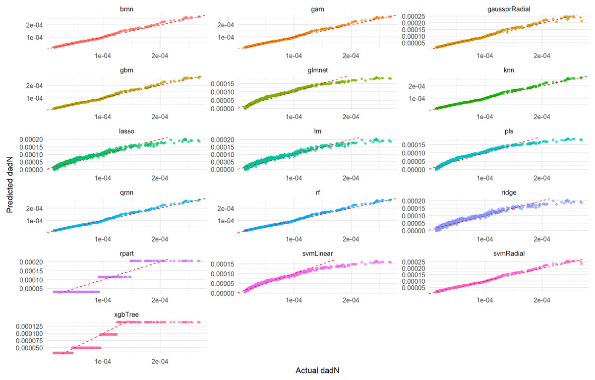
Figure 1: Actual vs. predicted values for da/dN on test set across various ML models.
This comprehensive plot evaluates the predictive accuracy of multiple ML models (brnn, gam, gaussprRadial, etc.) for the da/dN variable on an unseen test set. For each model, a scatter plot visualizes the relationship between the actual measured da/dN values and the values predicted by the model. The dashed red line serves as a benchmark for perfect prediction; models whose data points cluster tightly around this line demonstrate high accuracy, while spread-out points or deviations from the line indicate lower predictive power or systematic biases. This visualization allows for a direct visual comparison of how well each model performs in predicting da/dN.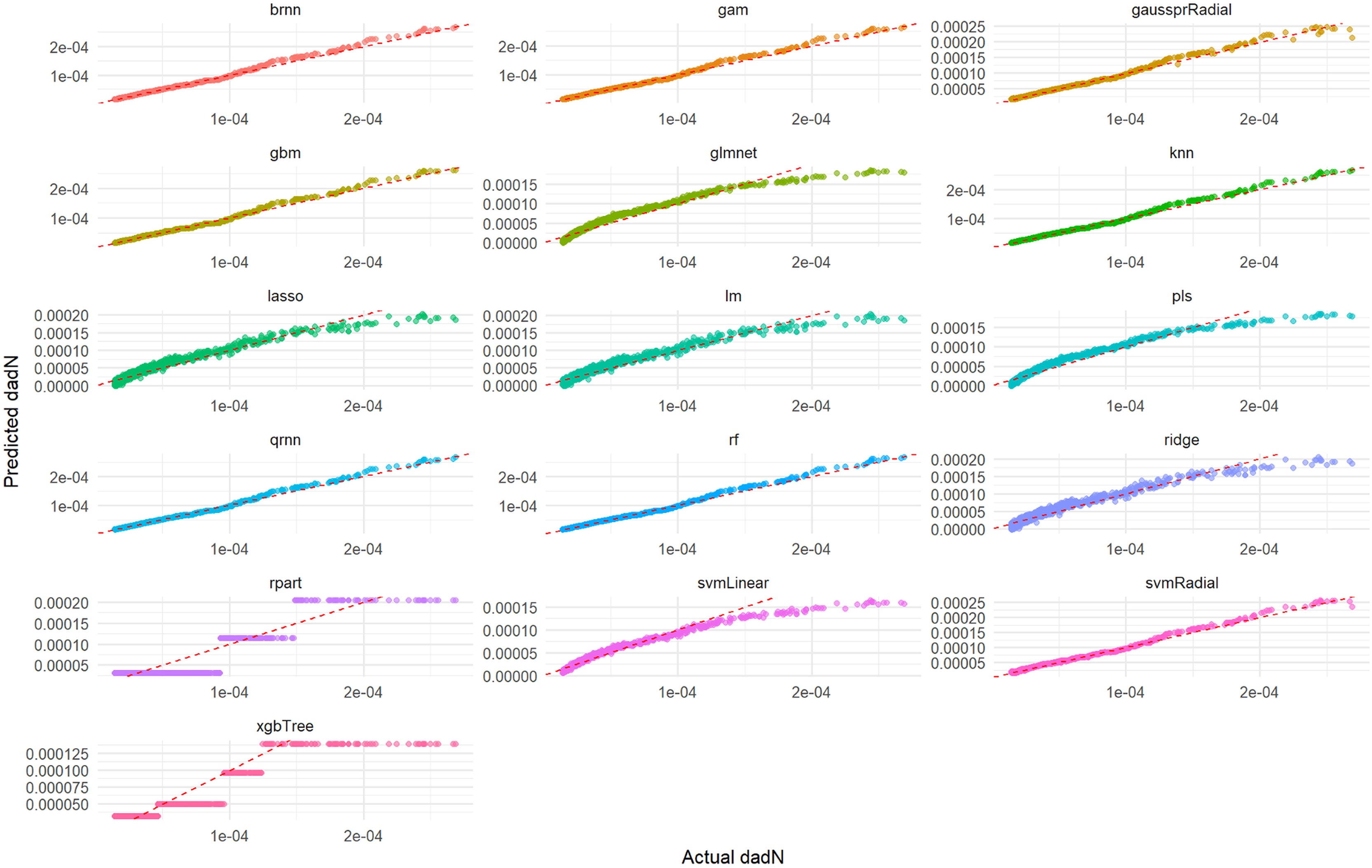
Figure 2 illustrates the distribution of residuals for each model on the test set. For rf, knn, gam, brnn, and qrnn, the residuals are tightly clustered and randomly scattered around the zero line, with no discernible patterns. This indicates that these models produce unbiased predictions and their errors are random, suggesting a robust fit. Conversely, models such as rpart, xgbTree, glmnet, and pls exhibit more pronounced patterns or wider spreads in their residuals, particularly at certain predicted values, which suggests systematic errors or heteroscedasticity in their predictions. The remaining models, including lm, ridge, lasso, svmLinear, svmRadial, and gaussprRadial, show varying degrees of random residual distribution, but generally with wider spreads compared to the top-performing models, indicating less consistent error patterns.
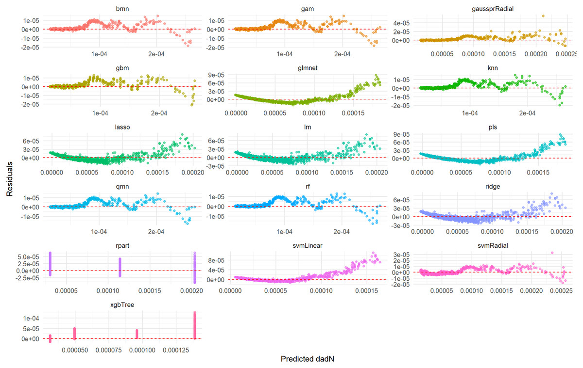
Figure 2: Predicted vs. residuals for da/dN on test set across various ML models.
This comprehensive plot visualizes the residuals (prediction errors) for various ML models (brnn, gam, gaussprRadial, etc.) when predicting the da/dN variable on an unseen test set. For each model, a scatter plot shows how the prediction errors are distributed as a function of the predicted values. A good model will have residuals randomly scattered around the horizontal dashed red line at zero, indicating that the errors are random and unbiased. Any discernible patterns (e.g., a fanning-out effect, a curve, or clustering) would suggest issues such as heteroscedasticity (non-constant variance of errors), non-linearity that the model failed to capture, or systematic bias in the predictions. This visualization is crucial for diagnosing potential problems with model fit and assumptions.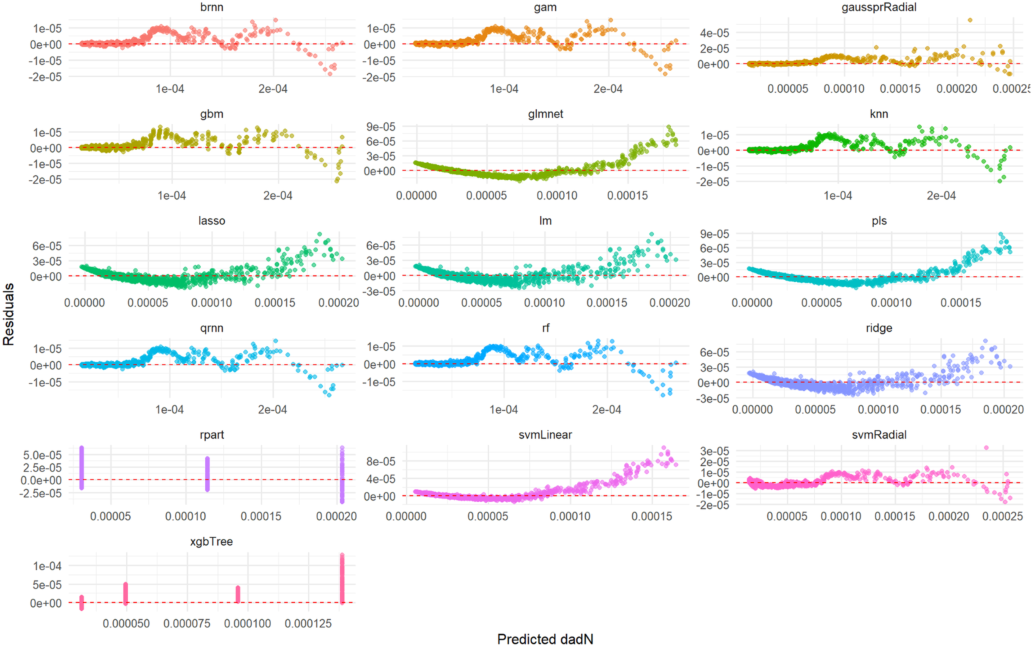
Linear regression model for da/dN
The equation of the lm model, derived from its coefficients, provides a direct mathematical relationship between the target variable (da/dN) and the selected features. The Linear Regression model’s estimated equation for predicting da/dN, designated as Eq. (7), is presented as follows:
(7) This equation, representing the lm model, reveals the linear relationships between da/dN and its predictors. The positive coefficient for Delta_sqrt.G. (1.3750e−02) indicates that an increase in Delta_sqrt.G. is associated with an increase in da/dN, assuming other variables are held constant. Similarly, R exhibits a small positive association (3.0945e−03) with da/dN. Conversely, Gmax shows a negative coefficient (−6.8287e−03), suggesting that as Gmax increases, da/dN tends to decrease when other predictors remain unchanged. The intercept (−9.1039e−04) represents the predicted da/dN when all predictor variables are zero.
Decision tree model for da/dN
Figure 3 illustrates the rpart model used to predict da/dN based on hierarchical decision rules derived from the variable Gmax. The root node represents the entire dataset (n = 5,401), which is first split based on the threshold Gmax < 0.42. The majority of samples (88%) fall into this category, resulting in a lower predicted da/dN value (31e−6). The remaining 12% of the data, with Gmax ≥ 0.42, is further divided at Gmax < 0.48, leading to intermediate (114e−6) and higher (204e−6) da/dN predictions. This structure indicates that higher Gmax values are associated with increased crack growth rates, demonstrating the model’s capacity to separate observations based on the progressive influence of Gmax.
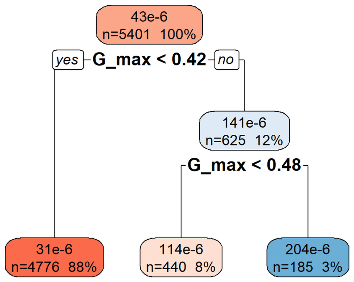
Figure 3: Decision tree model for da/dN.
This decision tree visualization demonstrates how the Gmax feature is used to predict or understand the da/dN target variable. Starting from the root node (at the top, representing all the data), the tree successively splits the data based on specific Gmax threshold values. Each node (box) displays the number of data points (n) in that split, their percentage of the total data, and the median/mean value of da/dN. The leaf nodes (bottom-most nodes) represent the expected da/dN value under a specific set of conditions. For instance, data points where Gmax < 0.42 have an average da/dN value of 31 × 10−6, whereas those with Gmax >= 0.42 and Gmax < 0.48 average 114 × 10−6, and those with Gmax >= 0.48 average 204 × 10−6. This indicates that da/dN values tend to increase as Gmax increases.
A key objective of this study was to compare the predictive capabilities of the developed ML models with a theoretical model derived from existing literature, specifically referencing Pascoe’s thesis. This comparison provides valuable context on the added value of ML approaches.
Table S4 provides a quantitative summary of the comparison metrics (MAE, R2, and Correlation) for the ML models and the theoretical model. This table allows for a clear assessment of which models best capture the underlying relationships in the data. The table clearly shows that models such as qrnn, rf, and brnn outperform others with nearly perfect scores across all metrics (MAE ≈ 0, R2 ≈ 0.9998, Correlation ≈ 0.9999), indicating exceptional predictive accuracy. In contrast, models like rpart and xgbTree exhibit the lowest performance, with significantly lower R2 and higher MAE, suggesting they are less effective at capturing the true relationship in the data.
Prediction of Total_Energy
This subsection details the results obtained from applying the ML methodologies for predicting the Total_Energy in adhesive bonds.
Exploratory data analysis for Total_Energy
Histograms (Fig. S6) revealed the distributions of Total_Energy and its potential predictors, including N, a, F, d, C, and R. Boxplots provided insights into the spread and presence of outliers for these features.
The correlation matrix for Total_Energy and its relevant predictors (N, a, F, d, C, R) provided insights into their linear relationships. The correlation matrix (Fig. S7) reveals strong negative correlations between Total_Energy and both a (−0.97) and C (−0.96), suggesting that increases in crack length and compliance are associated with a significant reduction in total energy. Additionally, N also shows a strong negative correlation (−0.80) with Total_Energy. On the other hand, F has a weak positive correlation (0.28), while d shows virtually no linear relationship. These patterns highlight which variables most influence energy dissipation during crack growth.
Feature selection for Total_Energy
The Boruta algorithm was applied to identify important features for predicting Total_Energy. The specified predictors fed into Boruta were N, a, F, d, C, and R. As illustrated in Fig. S8, the Boruta algorithm identified N, a, F, d, C, and R as “Confirmed” important features for predicting Total_Energy, indicating their statistical significance. Among these, N exhibited the highest mean importance, followed by a, C, F, R, and d in descending order.
ML model performance for total energy
The same suite of 16 ML regression algorithms was employed to predict Total_Energy. The models were trained and evaluated using the previously defined training/test split and 5-fold cross-validation.
Training set metrics for Total_Energy
Table S5 summarizes the performance of each model on the training set for Total_Energy prediction. Among all models, the rf model achieved the best results with the lowest RMSE (0.2723), MAE (0.1979), and MAPE (0.0008), as well as the highest R² score (0.9999), indicating exceptional predictive accuracy. In contrast, models like gam and xgbTree showed relatively higher error values, though all models maintained R² values above 0.999, suggesting strong overall fit.
Test set metrics for Total_Energy
Table S6 presents the generalization performance of the models on the unseen test set for Total_Energy prediction. The qrnn model outperformed others with the lowest RMSE (0.454) and MAE (0.359), maintaining a high R2 score of 0.9998, indicating strong generalization ability. While the rf model showed top performance during training, its test errors were slightly higher, suggesting potential overfitting. Overall, all models retained excellent R2 values above 0.999, confirming their robustness on unseen data.
Cross-validation metrics for Total_Energy
Table S7 displays the robust cross-validation metrics for Total_Energy prediction models. Among them, the qrnn model achieved the best overall performance with the lowest RMSE_CV (0.4451) and highest R2_CV (0.9998), indicating strong consistency and generalization across folds. While brnn and gam also performed well, models like rf and xgbTree showed relatively higher cross-validated errors, suggesting more variability in their predictions across different data subsets.
Model training time for Total_Energy
Figure S9 illustrates the computational time required for each model to train for Total_Energy prediction. As depicted in Fig. S9, there were significant variations in training times across the different models. qrnn (5,132.98 s) and gaussprRadial (481.23 s) were the most computationally intensive, requiring substantially longer training durations. Following them, rf (331.84 s), xgbTree (38.08 s), and also brnn (27.45) exhibited relatively high training times. In contrast, models like lm (0.3 s), pls (0.35 s), lasso (0.37 s), rpart (0.52 s), ridge (0.63 s), svmLinear (0.68 s) glmnet (0.81 s), knn (1.72 s), svmRadial (2.05 s), gbm (2.72 s), and gam (7.83 s) all completed their training within 10 s, suggesting greater efficiency for practical applications where training speed is a critical factor.
Actual vs. predicted values and residual plots for Total_Energy
Visual assessment of the models’ performance for Total_Energy was carried out. As depicted in Fig. 4, which illustrates the correlation between predicted and actual Total_Energy values, all models except rpart (specifically, the qrnn, brnn, gam, and rf models) demonstrate nearly perfect agreement. The data points for these models remarkably cluster around the ideal diagonal line, indicating that their predictions are exceptionally accurate and align almost precisely with the true Total_Energy values. This visual representation unequivocally confirms the outstanding performance of these models, particularly highlighting their near-perfect fit in predicting Total_Energy. This visual representation further confirms the excellent performance of these models which appear to have the tightest clusters, reinforcing the numerical findings from Tables S6 and S7 regarding their superior predictive capabilities.
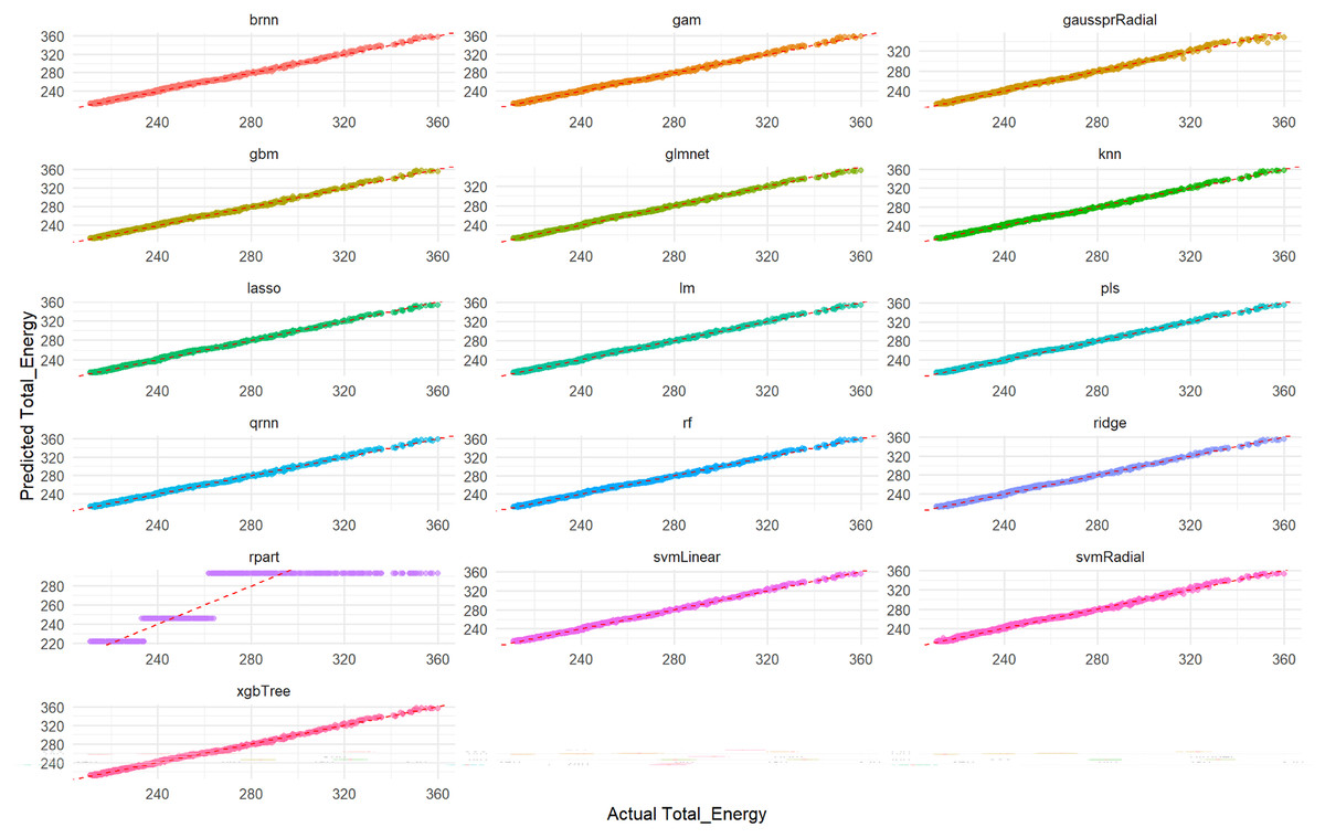
Figure 4: Actual vs. predicted values for Total_Energy on test set across various ML models.
Each smaller graph within the larger figure represents the performance of a specific machine learning model. The title of each subplot indicates the model used (e.g., brnn, gam, gaussprRadial, gbm, glmnet, knn, lasso, lm, pls, qmn, rf, ridge, rpart, svmLinear, svmRadial, xgbTree). The x-axis represents the true, observed values of the Total_Energy variable from the test dataset. The y-axis represents the values of the Total_Energy variable predicted by the respective machine learning model for the test dataset. The dashed red line (diagonal line) represents the ideal scenario where predicted Total_Energy is exactly equal to Actual Total_Energy (i.e., y = x). It acts as a benchmark for perfect prediction. The closer the scatter points are to this dashed red line, the better the model’s predictive accuracy. Points scattered far from this line indicate larger prediction errors for those specific data points.
Furthermore, a detailed examination of the residual plots in Fig. 5, which visualizes the distribution of errors for each model, provides additional evidence of their predictive accuracy for Total_Energy. For all models, the residuals are tightly clustered around zero, displaying a symmetrical distribution with minimal scatter. This indicates that these models produce unbiased predictions with small and randomly distributed errors, which is characteristic of models with excellent predictive power and a very good overall fit. Conversely, the rpart model’s residual plot, if available for Total_Energy, typically exhibits a wider spread of errors and a less centralized distribution, suggesting a comparatively lower accuracy and higher variability in its predictions when compared to the other advanced models.
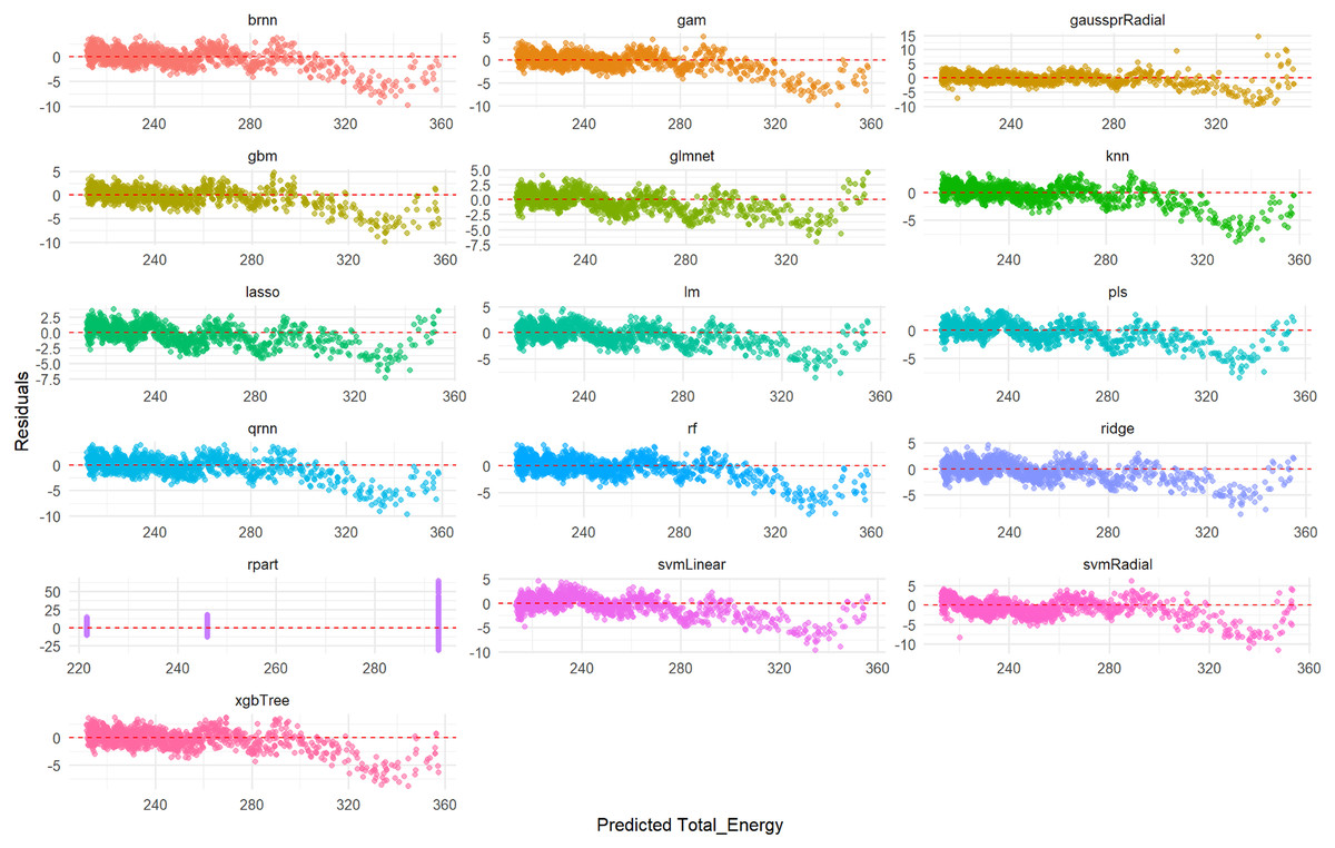
Figure 5: Predicted vs. residuals for Total_Energy on test set across various ML models.
The primary goal of this figure is to evaluate how different ML models perform on the test set by visualizing their prediction errors, known as residuals, for the Total_Energy variable. Each smaller graph within the larger figure presents the residual analysis for a specific ML model. The title of each subplot indicates the model used (e.g., brnn, gam, gaussprRadial, gbm, glmnet, knn, lasso, lm, pls, qmn, rf, ridge, rpart, svmLinear, svmRadial, xgbTree). The x-axis represents the values of the Total_Energy variable predicted by the respective ML model for the test dataset. The y-axis represents the difference between the actual observed Total_Energy values and the predicted Total_Energy values (i.e., Actual Total_Energy-Predicted Total_Energy). A residual of 0 indicates a perfect prediction. Each point on a subplot represents a single data point from the test set. Its horizontal position corresponds to the predicted Total_Energy value, and its vertical position corresponds to the residual for that data point. The points are colored distinctively for each model to aid in visual separation.
Linear regression model for total energy
The derived equation for the lm model predicting Total_Energy is presented below, illustrating the linear relationships between features and the target variable in Eq. (8).
(8)
Decision tree model for Total_Energy
Figure 6 illustrates the hierarchical decision rules of the rpart model for Total_Energy prediction.
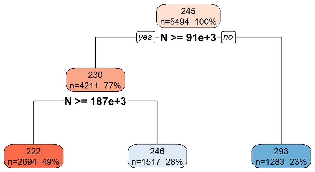
Figure 6: Decision tree model for Total_Energy.
This decision tree visualization illustrates how the feature N is used to predict or segment a certain target variable. Starting from the root node (top, representing the entire dataset), the tree successively splits the data based on N’s values. Each node provides information on the average target value for that segment, the number of data points it contains, and its percentage of the total data. The leaf nodes (bottom-most boxes) represent the predicted target value under specific conditions defined by the path from the root. For example, if N is less than 91 × 1 03, the target variable’s value is approximately 293. If N is greater than or equal to 91 × 103, further splitting based on N >= 187 × 103 determines if the target value is approximately 222 or 246. This structure helps understand the conditional relationships between N and the target variable.
Table S8 provides a quantitative comparison of the performance metrics (MAE, R2, and Correlation) between the ML models and the theoretical model for Total_Energy prediction. While the correlation coefficients for all models, except rpart, are approximately 99.9%, the rpart model yielded a correlation of 89.89%. A similar pattern is observed for the R² values.
Prediction of Gmax
This subsection presents the results obtained from the application of ML methodologies for predicting the Gmax in adhesive bonds.
Exploratory data analysis for Gmax
Histograms (Fig. S10) provided insights into the distributions of Gmax and its potential predictors, specifically a and F. Boxplots visually represented the spread and presence of outliers for these features.
The correlation matrix (Fig. S11) for Gmax and its relevant predictors (a, F) provided insights into their linear relationships. A strong negative correlation was observed between Gmax and a (r = −0.96), and a low positive correlation was observed between Gmax and F (r = 0.28). These patterns highlight which variables most influence Gmax during its determination.
Feature selection for Gmax
The Boruta algorithm was applied to identify important features for predicting Gmax. The specified predictors fed into Boruta were a and F. The Boruta algorithm’s feature importance analysis (Fig. S12) reveals that feature a is a much more significant predictor for G_max compared to feature F. Both features have been “Confirmed” by Boruta, indicating that they are more important than random noise, but a holds a dominant importance.
ML model performance for Gmax
The same suite of 16 ML regression algorithms was employed to predict Gmax. The models were trained and evaluated using the previously defined training/test split and 5-fold cross-validation.
Training set metrics for Gmax
Table S9 summarizes the performance of each model on the training set for Gmax prediction.
Test set metrics for Gmax
Table S10 presents the generalization performance of the models on the unseen test set for Gmax prediction.
Cross-validation metrics for Gmax
Table S11 displays the robust cross-validation metrics for Gmax prediction models.
Model training time for Gmax
Figure S13 illustrates the computational time required for each model to train for Gmax prediction. As depicted in Fig. S13, there were significant variations in training times across the different models. qrnn (4,342.64 s) and gaussprRadial (483.2 s) were the most computationally intensive, requiring substantially longer training durations. Following them, rf (86.07 s), and also xgbTree (34.83 s) exhibited relatively high training times. In contrast, models like pls (0.25 s), lm (0.27 s), lasso (0.31 s), rpart (0.38 s), ridge (0.53 s), glmnet (0.87 s), gam (1.04 s), knn (1.1 s), svmRadial (2.05 s), gbm (1.88 s), svmLinear (6.3 s), and brnn (7.31) all completed their training within 10 s, suggesting greater efficiency for practical applications where training speed is a critical factor.
Actual vs. predicted values and residual plots for Gmax
Visual assessment of the models’ performance for Gmax was carried out. Figure 7 shows the scatter plots of actual vs. predicted Gmax values on the test set, indicating the models’ accuracy. Figure 8 displays the residuals plotted against predicted Gmax values, which should ideally show a random distribution around zero.
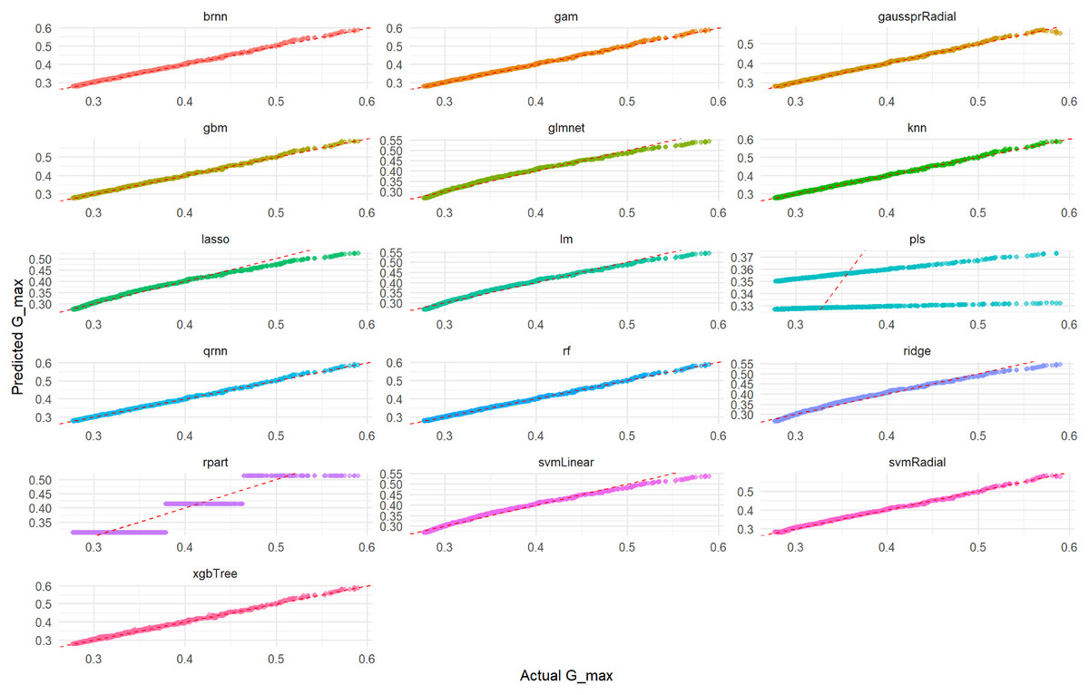
Figure 7: Actual vs. predicted values for Gmax on test set across various ML models.
This comprehensive plot evaluates the predictive accuracy of multiple ML models (brnn, gam, gaussprRadial, etc.) for the Gmax variable using an unseen test set. For each model, a scatter plot illustrates the relationship between the actual measured Gmax values and the values predicted by the model. The dashed red diagonal line serves as a visual guide for perfect prediction; models whose data points cluster tightly around this line demonstrate high accuracy and a strong agreement between actual and predicted values. Conversely, a wider spread or deviation from the line indicates lower predictive power or potential biases within the model’s predictions. This visualization enables a direct visual comparison of how effectively each model performs in predicting Gmax.
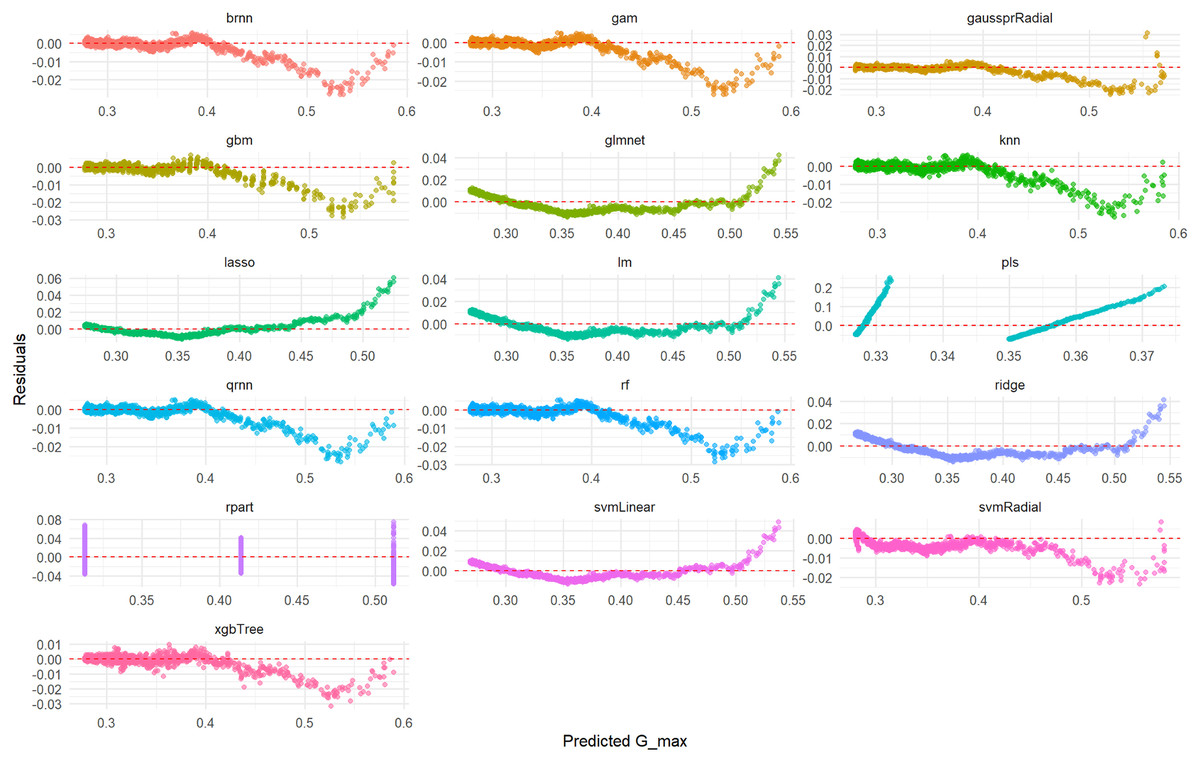
Figure 8: Predicted vs. residuals for Gmax on test set across various ML models.
This comprehensive plot visualizes the prediction errors (residuals) generated by various machine learning models (brnn, gam, gaussprRadial, etc.) when predicting the Gmax variable on an unseen test set. For each model, a scatter plot illustrates the relationship between the predicted Gmax values and their corresponding residuals. The dashed red line at zero residuals is the target; ideal models will show a random scatter of points around this line, indicating unbiased and consistent errors. The presence of any clear patterns (e.g., a curve, increasing/decreasing spread, or funnels) suggests issues such as non-linearity in the data that the model failed to capture, heteroscedasticity (non-constant variance of errors), or systematic bias in the predictions. This visualization is critical for diagnosing the underlying problems with a model’s fit.
Linear regression model for Gmax
The derived equation for the lm model predicting Gmax is presented below, illustrating the linear relationships between features and the target variable in Eq. (9).
(9)
Decision tree model for Gmax
Figure 9 illustrates the hierarchical decision rules of the rpart model for Gmax prediction.
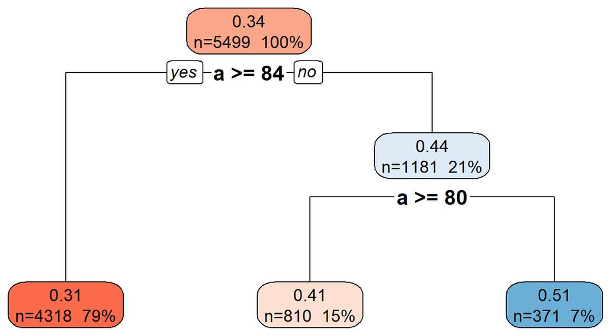
Figure 9: Decision tree model for Gmax.
This decision tree visualization illustrates how the feature a is used to predict or segment a certain target variable. Starting from the root node (top, representing the entire dataset), the tree successively splits the data based on a’s values. Each node provides information on the average target value for that segment, the number of data points it contains, and its percentage of the total data. The leaf nodes (bottom-most boxes) represent the predicted target value under specific conditions defined by the path from the root. For example, if a is greater than or equal to 84, the target variable’s value is approximately 0.31. If a is less than 84, further splitting based on a >= 80 determines if the target value is approximately 0.41 or 0.51. This structure helps understand the conditional relationships between a and the target variable.
Discussion
This section delves into a comprehensive interpretation of the results obtained from predicting da/dN, Total_Energy, and Gmax in adhesive bonds using various ML models. The discussion will contextualize these findings within the existing literature, highlight the strengths and limitations of the applied methodology, and suggest directions for future research.
General performance of ML models
Overall, the suite of 16 ML regression algorithms demonstrated strong capabilities in predicting the critical fatigue parameters of adhesive bonds. Across all three target variables (da/dN, Total_Energy, and Gmax), many ML models achieved high R2 values and low RMSE, MAE, MAPE, MdAE, and RMSLE scores on the unseen test data. This indicates their robust generalization ability and potential for accurate predictions in real-world engineering applications. The consistency in performance metrics across a diverse range of models (from linear methods like Ridge and Lasso to complex ensemble techniques like XGBoost and non-linear approaches like gpr and qrnn) suggests that the underlying relationships within the experimental dataset are well-captured by data-driven approaches.
The variability in performance observed among different ML models highlights the importance of comparative analysis. While some models, particularly complex ensemble methods (e.g., rf, xgbTree, gbm), generally exhibited superior predictive accuracy (lower RMSE, higher R2) due to their ability to capture complex non-linear relationships and interactions, simpler models (e.g., lm) still provided valuable insights, especially regarding feature interpretability. The gaussprRadial and qrnn models, known for their capabilities in handling non-linear data and quantifying uncertainty, showed competitive performance, which is particularly relevant in material science where data scarcity and inherent variability are common challenges. Their inclusion in the model portfolio underscores the comprehensive nature of this study in exploring diverse modeling paradigms. Overall, the suite of 16 ML regression algorithms demonstrated strong capabilities in predicting the critical fatigue parameters of adhesive bonds.
Interpretation of model performance and physical links
The superior performance of non-linear and tree-based ensemble models (e.g., rf, gbm) over simpler linear methods is a key finding of this study. This can be attributed to their inherent ability to capture the complex, non-linear relationships that govern fatigue and fracture mechanics. Physical phenomena such as crack tip plasticity, viscoelastic behavior, and complex energy dissipation mechanisms create interactions that are not easily modeled by linear equations. Furthermore, the feature importance analysis performed by the Boruta algorithm provides a direct and powerful link between the data-driven findings and established physical principles. For instance, the algorithm’s identification of Gmax and R as the most significant predictors for da/dN serves as a data-driven validation of foundational concepts in Linear Elastic Fracture Mechanics (LEFM), where the stress intensity factor range (related to G) and load ratio are known to be primary drivers of fatigue crack growth. The fact that the algorithm, without any prior physical knowledge, independently identified these variables as the most critical predictors validates both the quality of the experimental data and the efficacy of the ML approach. A more detailed physical interpretation can also be derived from the coefficients of the simpler, though less accurate, Linear Regression model for da/dN (Eq. (7)).
The positive coefficient for Delta_sqrt.G. aligns perfectly with the physical principle that a larger cyclic energy release rate range acts as a stronger driving force, thus accelerating crack propagation.
Similarly, the positive coefficient for R is consistent with experimental observations where a higher load ratio (often leading to less crack closure) typically results in faster crack growth.
Interestingly, the model assigned a negative coefficient to Gmax when the other variables are held constant. While seemingly counterintuitive, this is likely an artifact of the multicollinearity within the linear model, especially given the perfect correlation between Gmax and Delta_sqrt.G. (r=1) in the dataset. With the primary driver (the range of G) already in the model, the negative coefficient for the maximum value of G may be capturing complex secondary effects or statistical interdependencies. This highlights both the interpretability and the potential limitations of using linear models for inherently non-linear physical phenomena.
Generalizability, limitations, and synergy with physics-based models
It is important to acknowledge that the specific models trained in this study are tailored to the experimental data from the FM94 epoxy/Aluminum 2024-T3 system. Therefore, their direct application to other adhesive and adherend material systems would require re-training or transfer learning. However, the overarching conclusion that advanced, non-linear ML models are highly effective for this prediction task is likely generalizable, as the fundamental physics of fatigue are complex across most engineering materials.
Furthermore, a significant opportunity for future work lies in creating a powerful synergy between data-driven and physics-based approaches to overcome the common limitation of data scarcity in experimental studies. While the ML models developed in this article rely on existing experimental data, they are inherently “data-hungry”. Physics-based simulations, such as Finite Element Method (FEM) models incorporating constitutive laws from CDM, can be used to generate large, high-fidelity synthetic datasets under a wide range of conditions. This computationally generated data can then be used to augment sparse experimental datasets, allowing for the training of more robust, accurate, and widely generalizable ML models. This hybrid approach would leverage the theoretical strength of mechanics-based models and the pattern-recognition power of machine learning, representing a significant step forward in predictive materials science.
Future perspective: physics-informed machine learning (PIML)
An even more integrated approach for future research is the use of Physics-Informed Machine Learning (PIML). PIML frameworks embed known physical laws (e.g., differential equations governing energy balance or crack growth) directly into the loss function of a neural network. This would compel the model to not only fit the experimental data but also adhere to the fundamental principles of fracture mechanics. Such an approach could lead to models with superior generalization capabilities, especially when extrapolating to conditions outside the training data range, and represents a powerful direction for creating truly hybrid predictive tools.
Conclusions
This study successfully developed and evaluated a robust ML-based framework for predicting critical fatigue parameters in adhesive bonds, specifically da/dN, Total_Energy, and Gmax. Leveraging a comprehensive experimental dataset derived from DCB specimens, the research employed a diverse suite of 16 ML regression algorithms, unequivocally demonstrating their significant potential in materials engineering.
The implemented data-preprocessing pipeline, including NA cleaning and Z-score based outlier management, effectively prepared the experimental data for reliable ML analysis. This rigorous approach ensured high-quality input, contributing to the robustness of the predictive models. The Boruta algorithm proved highly effective in identifying the most relevant features for each target variable, thereby validating known physical relationships. For instance, Gmax, R, and Delta_sqrt.G. were confirmed as key predictors for da/dN; N, a, F, d, C, and R for Total_Energy; and a, F for Gmax. This rigorous feature selection process contributed to the development of more efficient and interpretable models.
Across all three-fatigue parameters, the evaluated ML models consistently demonstrated high predictive accuracy on unseen test data, often surpassing the performance of traditional theoretical or empirical models. This outstanding performance underscores the ability of ML algorithms to capture complex, non-linear interactions within material behavior that may be challenging for conventional analytical approaches. The successful application of a wide array of models, including linear methods, ensemble techniques, svm, knn, pls, gam, brnn, gaussprRadial, and qrnn, highlights the versatility and power of ML for diverse prediction challenges in materials science.
Furthermore, the inclusion of interpretable model outputs, such as linear model equations and rpart structures, provided valuable physical insights into the learned relationships between features and target variables. This crucial aspect balanced predictive power with the essential need for understanding complex material phenomena.
Finally, the developed R-Shiny application serves as an interactive and open-source platform for data analysis, model training, and results visualization. Its streamlined HTML reporting capabilities significantly facilitate reproducibility and promote wider adoption of data-driven methodologies in fatigue and fracture research.
In summary, this study substantiates the profound advantages of integrating advanced ML techniques into the field of adhesive bond fatigue life prediction. The demonstrated high predictive accuracy, coupled with the interpretability provided by selected models and the user-friendly R-Shiny platform, offers a powerful toolset for engineers and researchers. This toolset enables deeper insights, improved design reliability, and potentially accelerates the development of new material systems for critical engineering applications.
It is important to note that the current study focuses exclusively on the crack propagation phase of fatigue life. A crucial direction for future research is to develop a more comprehensive framework for total fatigue life prediction. This could involve creating hybrid models where a physics-based or mechanics-based approach is used to predict crack initiation, while the ML framework developed in this study is then employed to predict the subsequent propagation behavior. Such an integrated approach would represent a significant step towards a holistic and highly practical fatigue life prediction tool for critical engineering applications.
To further promote transparency, reproducibility, and collaborative scientific advancement, the complete R code and interactive R-Shiny application for this study are publicly available. The code is maintained in a GitHub repository, and a permanent version (v2.0.1) has been archived on Zenodo, receiving the digital object identifier (DOI) 10.5281/zenodo.17216129. The software should be formally cited as Cakir (2025).
Supplemental Information
README.
This project introduces an R Shiny web application designed for comprehensive data analysis and regression modeling of adhesive bond damage tolerance data. The dashboard enables users to upload their CSV files, perform data cleaning (handling missing values, outlier management), conduct Exploratory Data Analysis (EDA) including histograms and boxplots, visualize correlations, perform automated feature selection using Boruta, train various machine learning regression models, and visualize their performance. The application also incorporates functionalities for comparing model predictions with theoretical values and generating detailed reports in HTML formats. In histograms, each bar indicates the frequency (count) of data points falling within a specific range (bin) for a given numeric feature, with the overall shape of the histogram revealing the data’s distribution (e.g., normal, skewed, uniform). In boxplots, for each selected feature, the box represents the interquartile range (IQR), containing the middle 50% of the data, the line inside the box is the median, and the “whiskers” extend to 1.5 × I QR from the box edges, indicating the spread of the majority of the data, while points beyond the whiskers are identified as potential outliers. In the correlation matrix, each colored cell represents the Pearson correlation coefficient between two features, with the color intensity and hue (blue for negative, red for positive, white for zero) indicating the strength and direction of the linear relationship between the variables, where values closer to +1 or −1 indicate stronger linear correlations. In the Boruta Feature Importance Plot, each bar indicates the mean importance score of a feature, derived from a Random Forest model, with features categorized as ‘Confirmed’ (statistically significant predictors, shown in green), ‘Tentative’ (borderline significance, shown in orange), or ‘Rejected’ (irrelevant, shown in red) based on their comparison against ‘shadow’ features. In the Training Time Plot, each bar represents the total time (in seconds) taken to train a specific machine learning regression model, including cross-validation and hyperparameter tuning, providing a direct comparison of computational efficiency among the selected models. In the Actual vs. Predicted Plots, each data point represents a single observation from the test set, showing its actual measured target variable value on the x-axis against the value predicted by a specific model on the y-axis, and the dashed red line indicates the ideal 1:1 relationship where predicted values exactly match actual values, with points closer to this line signifying better model accuracy. In the Predicted vs. Residuals Plots, each data point shows a model’s predicted target variable value on the x-axis against the residual (the difference between the actual and predicted value: Actual - Predicted) on the y-axis, and the dashed red line at y = 0 represents zero residual (perfect prediction), where a random scattering of points around the zero line suggests that the model’s errors are random and do not follow a discernible pattern, which is desirable, while patterns in the residuals (e.g., a curve or funnel shape) would indicate systematic errors or unmet model assumptions. In the Linear Regression Coefficients Plot, each bar represents the estimated coefficient for a specific predictor variable in the linear regression model, with the length and direction of the bar indicating the magnitude and direction (positive or negative) of the feature’s influence on the target variable, holding other variables constant. In the Decision Tree Plot, this visualizes the branching structure of the rpart model, where each node represents a decision rule based on a feature, leading to further splits until a terminal node (leaf) is reached, which provides the predicted target variable value, and node colors and labels indicate split criteria and predicted outcomes. In the Comparison Plot, each data point compares an actual target variable value against its predicted value from either a machine learning model or the predefined theoretical model, and the dashed black line indicates the ideal 1:1 relationship, serving as a benchmark to assess how closely each model (including the theoretical one) aligns its predictions with the actual observations.
Damage Tolerance of Adhesive Bonds - Analysis Report.
This R Markdown template, named report_template.Rmd, serves as the dynamic engine for generating comprehensive PDF and HTML reports from the "Damage Tolerance of Adhesive Bonds Data Analysis & Regression Dashboard." This file is designed to be co-located with the RShiny_v2.0.R application and receives a list of app_data parameters from the Shiny server, allowing it to render a tailored analysis report based on the user’s interactive selections and the results of the performed analysis. It begins by setting up the knitting options, including suppressing warnings and messages, and then loads necessary R packages such as ggplot2, dplyr, tidyr, scales, corrplot, Boruta, Metrics, caret, rpart.plot, and plotly to facilitate plotting and data manipulation within the report generation process. The report systematically covers various stages of the analysis, starting with a data overview that includes a summary of missing values and details of outlier management, explaining how these processes affect the dataset used for modeling. Subsequently, it delves into Exploratory Data Analysis (EDA) by dynamically generating histograms of numeric features and boxplots for user-selected features, providing visual insights into data distributions and potential outliers. A correlation matrix is rendered to display the relationships between the target variable and its potential predictors, illustrating the strength and direction of linear associations. The Boruta Feature Selection results are presented, detailing confirmed, tentative, and rejected features along with their importance scores, visually reinforced by a Boruta importance plot. The core of the report is dedicated to Model Results, which include tabular summaries of performance metrics (RMSE, R-squared, MAE, MAPE, MdAE, RMSLE) calculated on training, test, and cross-validation sets, offering a holistic view of each trained model’s predictive accuracy and robustness. Training times for each model are also visualized in a dedicated plot to compare computational efficiency. Crucial diagnostic plots, such as Actual vs. Predicted values and Predicted vs. Residuals for each model on the test set, are included to assess prediction accuracy and error distribution. For explainable models, specifically Linear Regression, the report dynamically generates its mathematical equation with coefficients presented in scientific notation and visualizes the coefficients in a bar plot, while for Decision Trees, it displays the tree structure itself using rpart.plot. Finally, a "Comparison with Theoretical Model" section allows for a direct visual and tabular comparison of the machine learning models’ performance against predefined theoretical values, providing additional context to the predictive capabilities. This R Markdown template ensures that all key outputs from the Shiny application are comprehensively documented and presented in a reproducible and professional report format.
Dataset.
This dataset contains data collected during quasi-static and fatigue crack growth experiments on double cantilever beam specimens, consisting of two aluminium 2024-T3 beams bonded with FM94 epoxy adhesive. Included data are raw data: crack length, force, and displacement measurements, as well as processed data such as strain energy release rates and energy dissipation per cycle.
The RShiny code.
This interactive dashboard provides missing value management, outlier handling, Boruta-based feature selection, and performance evaluation of various machine learning regression algorithms (LM, RF, SVM, GBM, etc.) on uploaded CSV data. Model training times, cross-validation metrics, and performance metrics on both training and test sets are presented in detail. Actual vs. Predicted plots, residual plots, and comparisons with theoretical models from the thesis can be interactively explored.
Distribution of Publications searched with the keywords "Machine Learning” and “Fatigue Crack” in the Web of Science database by year.
It shows the annual distribution of publications in the Web of Science database, using the keywords "Machine Learning" and "Fatigue Crack". Each bar in the graph represents the number of publications in the relevant year. This provides insight into research trends over time and the level of interest in the intersection of these two fields.
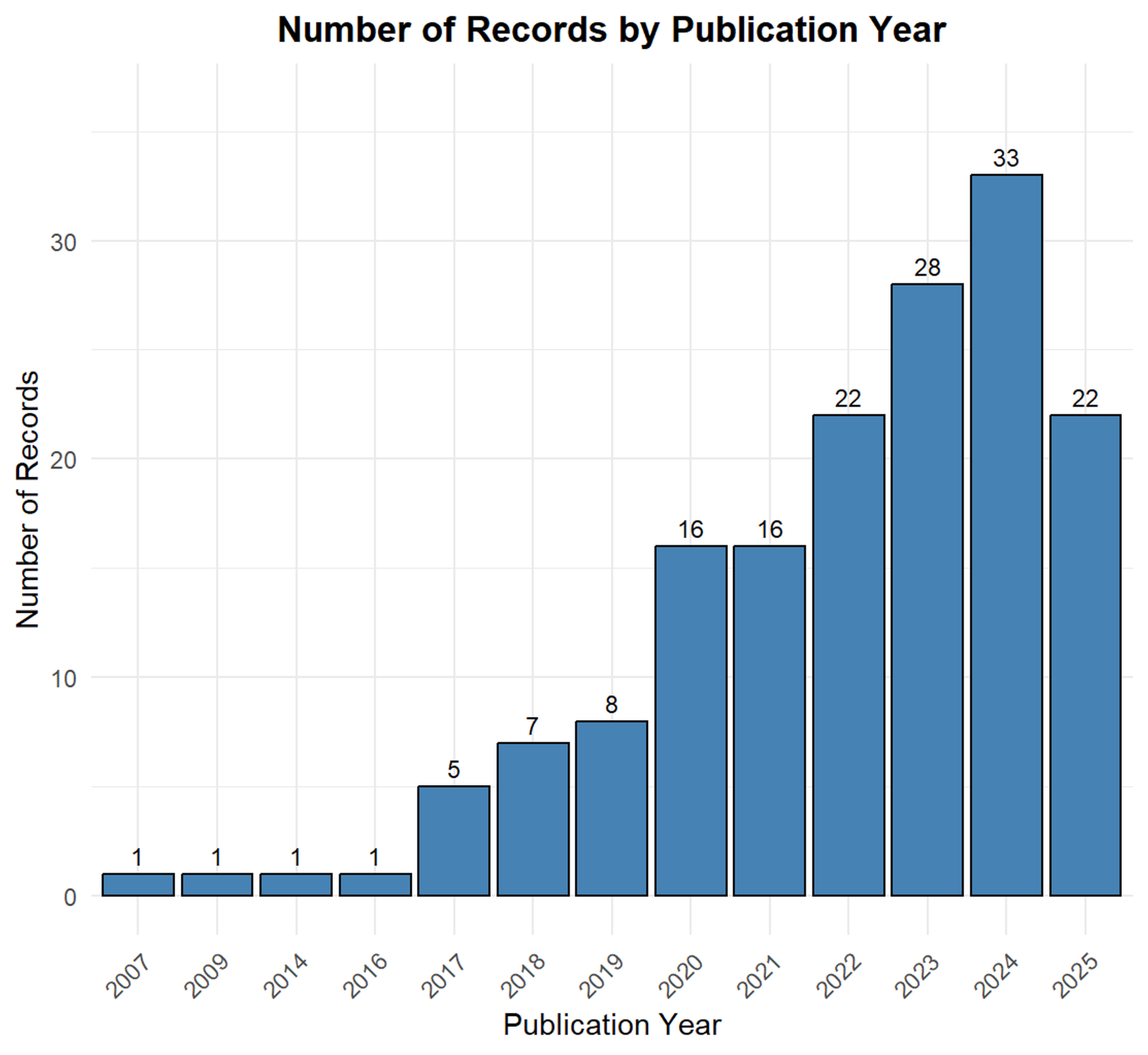
Data Analysis and Regression Dashboard for Damage Tolerance of Adhesive Bonds Dataset.
The dashboard allows users to load a dataset on damage tolerance of adhesive bond strength, preprocess it, select and train different regression models, and analyze the results through various visualizations.
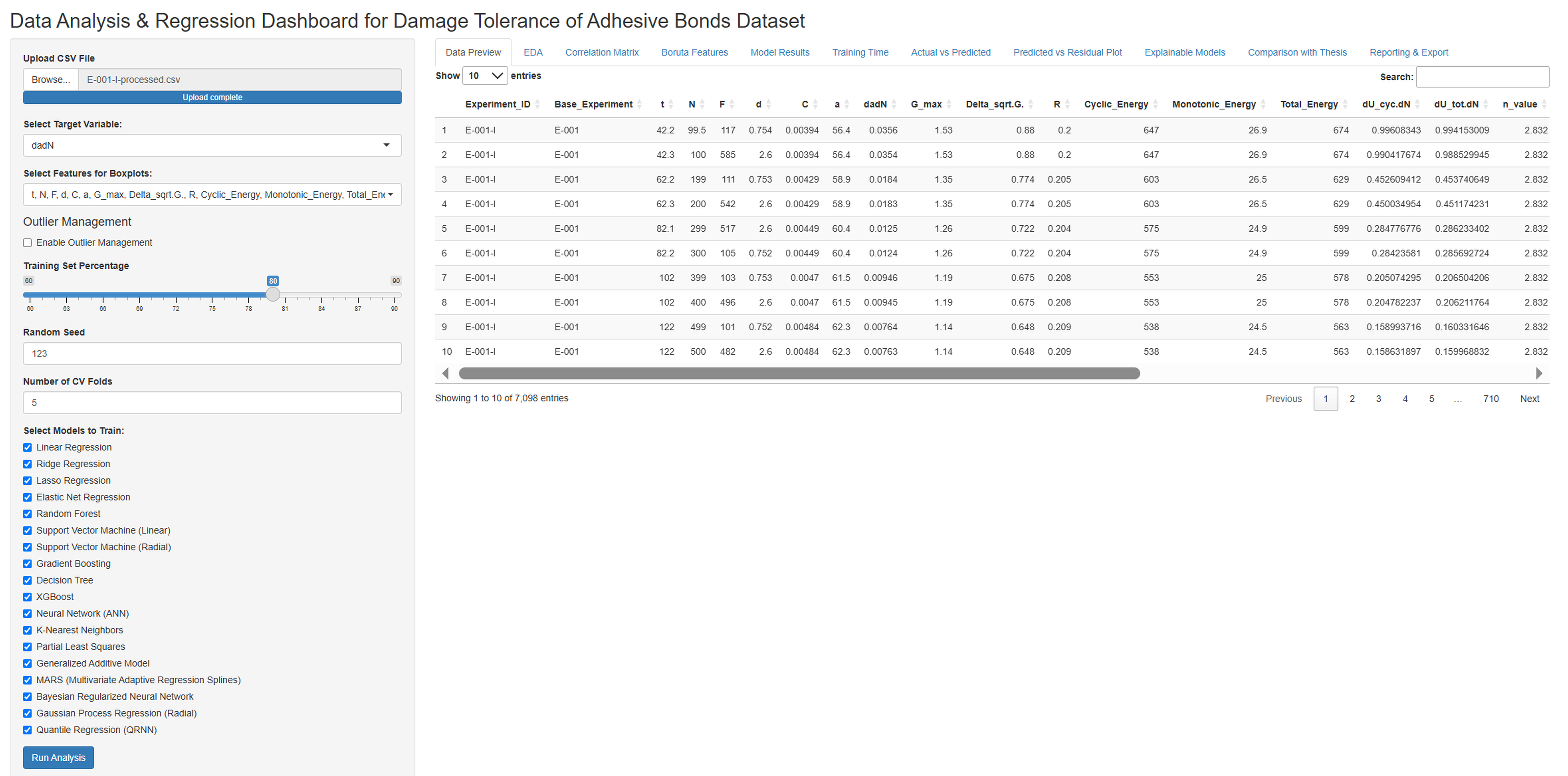
Correlation Matrix for da/dN and Relevant Predictors.
The correlation matrix visualizes the strength and direction of linear relationships between the variables da/dN, Gmax, R, and Delta_sqrt.G. The color and numerical value within each cell clearly indicate the degree and type (positive or negative) of correlation between the corresponding two variables.
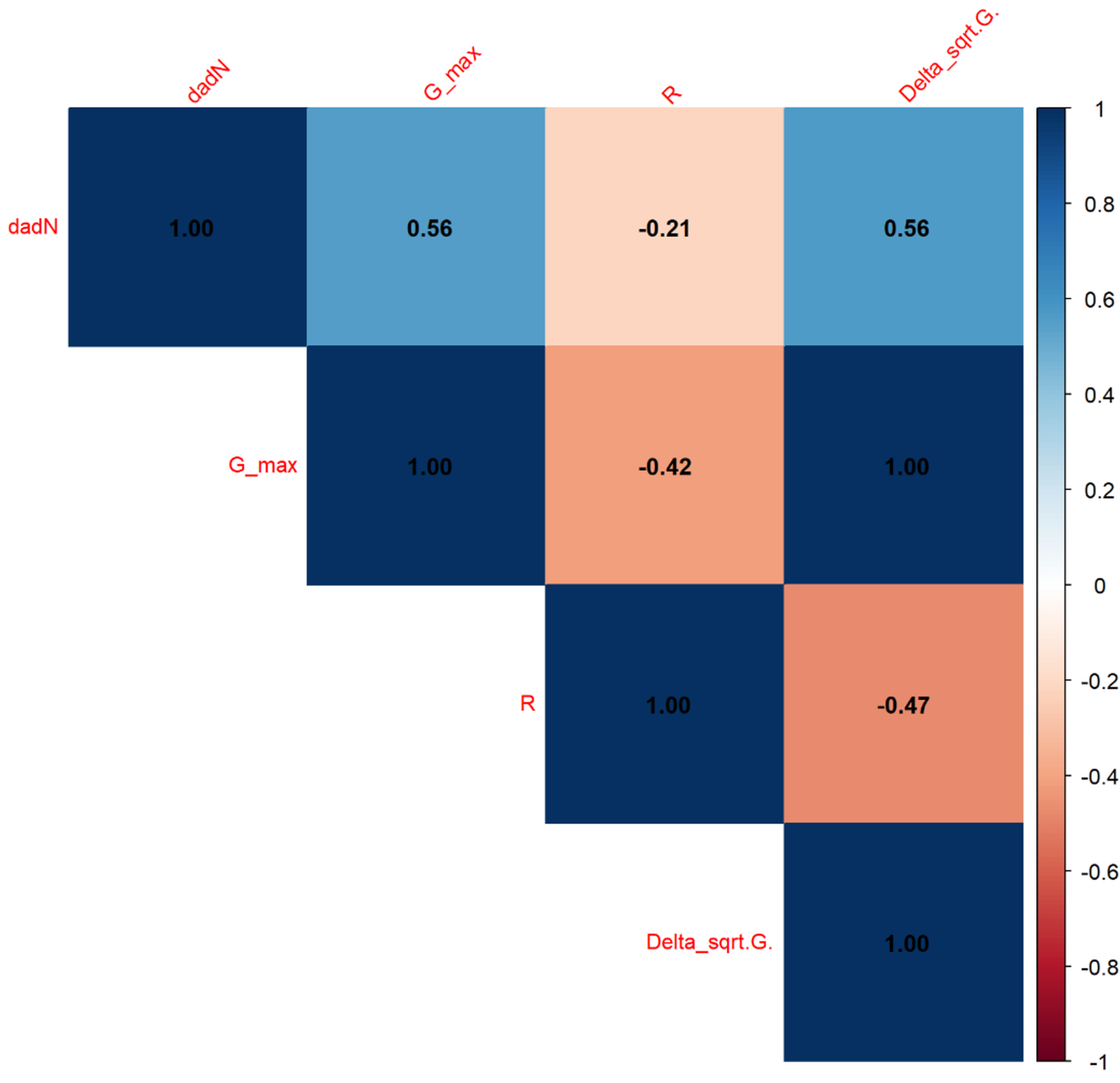
Boruta fetaure importance for da/dN.
This Boruta feature importance plot illustrates the relative importance of the Gmax, Delta_sqrt.G., and R features for explaining or predicting the target variable da/dN. Gmax has the highest importance, followed by Delta_sqrt.G. and R. All these features have been statistically confirmed by the Boruta algorithm as important for da/dN.
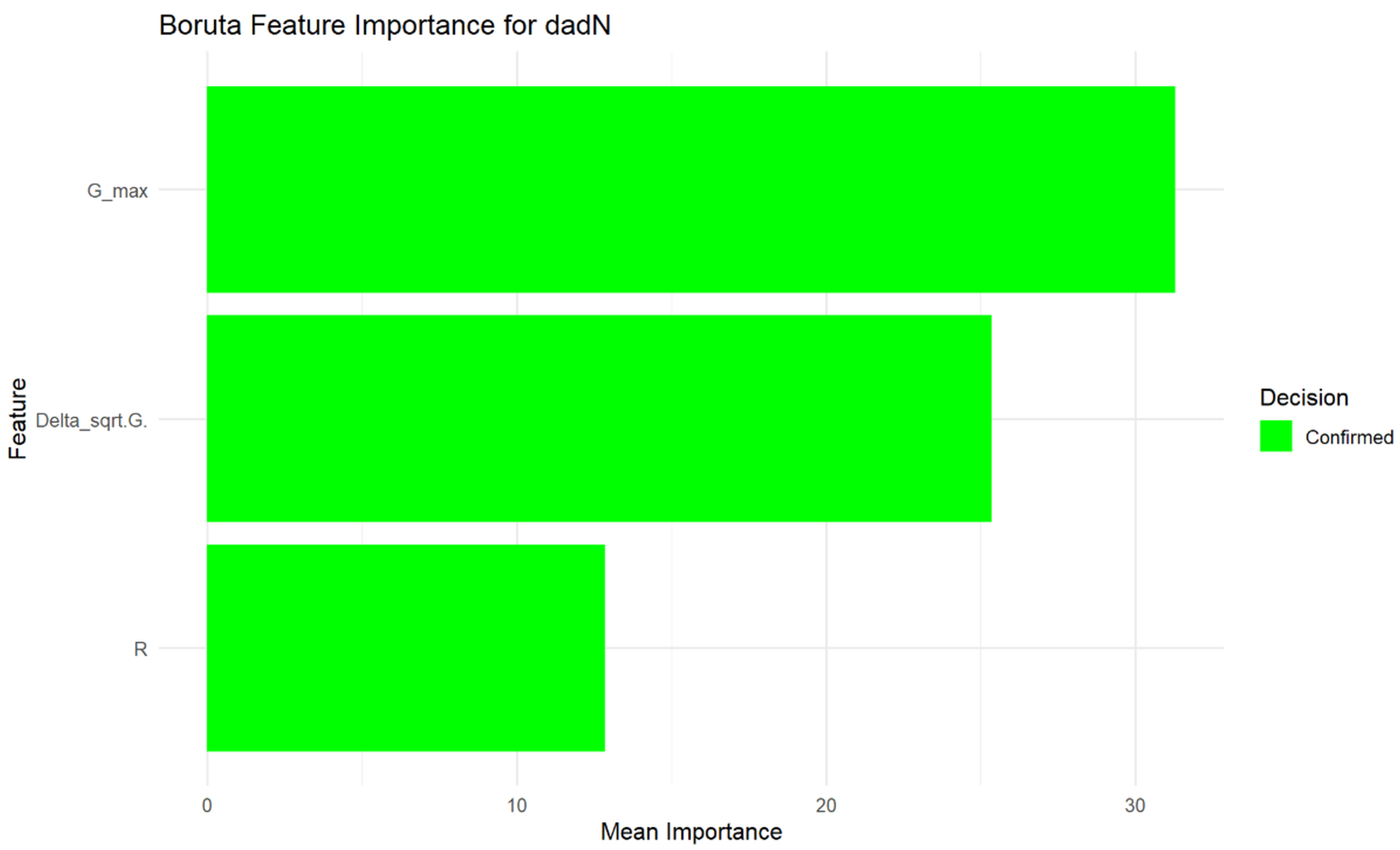
Model training times for da/dN.
This graph compares the training times of various machine learning models. Models on the far left (e.g., lm, pls) have very short training times, while models like gaussprRadial and qrnn have significantly longer training durations. This visualization is important for understanding computational costs when selecting a model for a specific application.
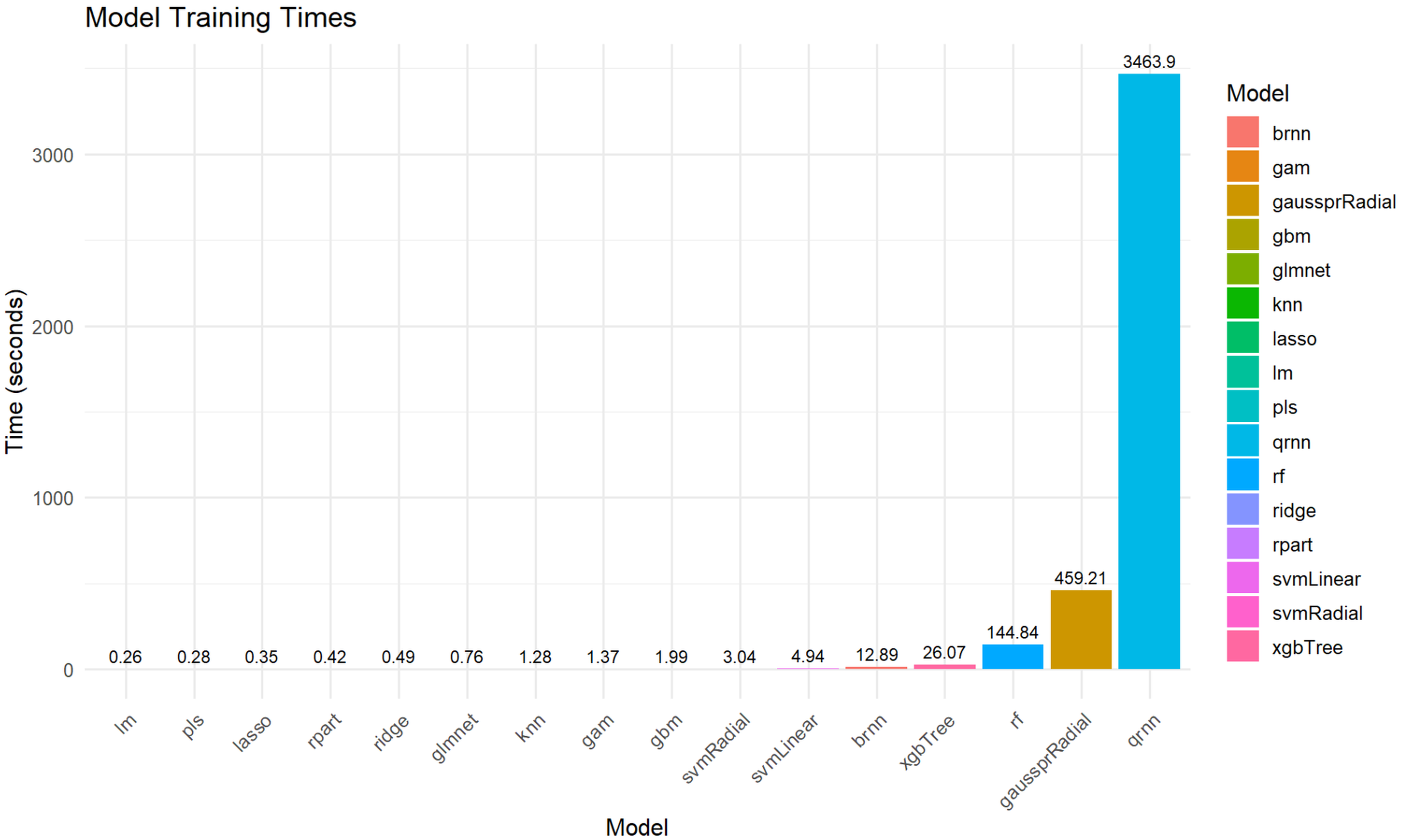
Distributions of Input Features (Variables).
This figure presents a series of histograms, each illustrating the distribution of a different input feature (C, F, N, R, Total_Energy, a, d) within the dataset. By examining these distributions, one can understand the range, central tendency, spread, and shape (e.g., normal, skewed, uniform, bimodal) of each variable. For instance, N appears to be uniformly distributed, while F and d show bimodal or discrete distributions, and C, R, Total_Energy, and a exhibit various forms of skewed distributions. This type of visualization is crucial for exploratory data analysis to gain insights into the data’s characteristics and to identify potential issues like outliers or imbalanced distributions that might affect model training.
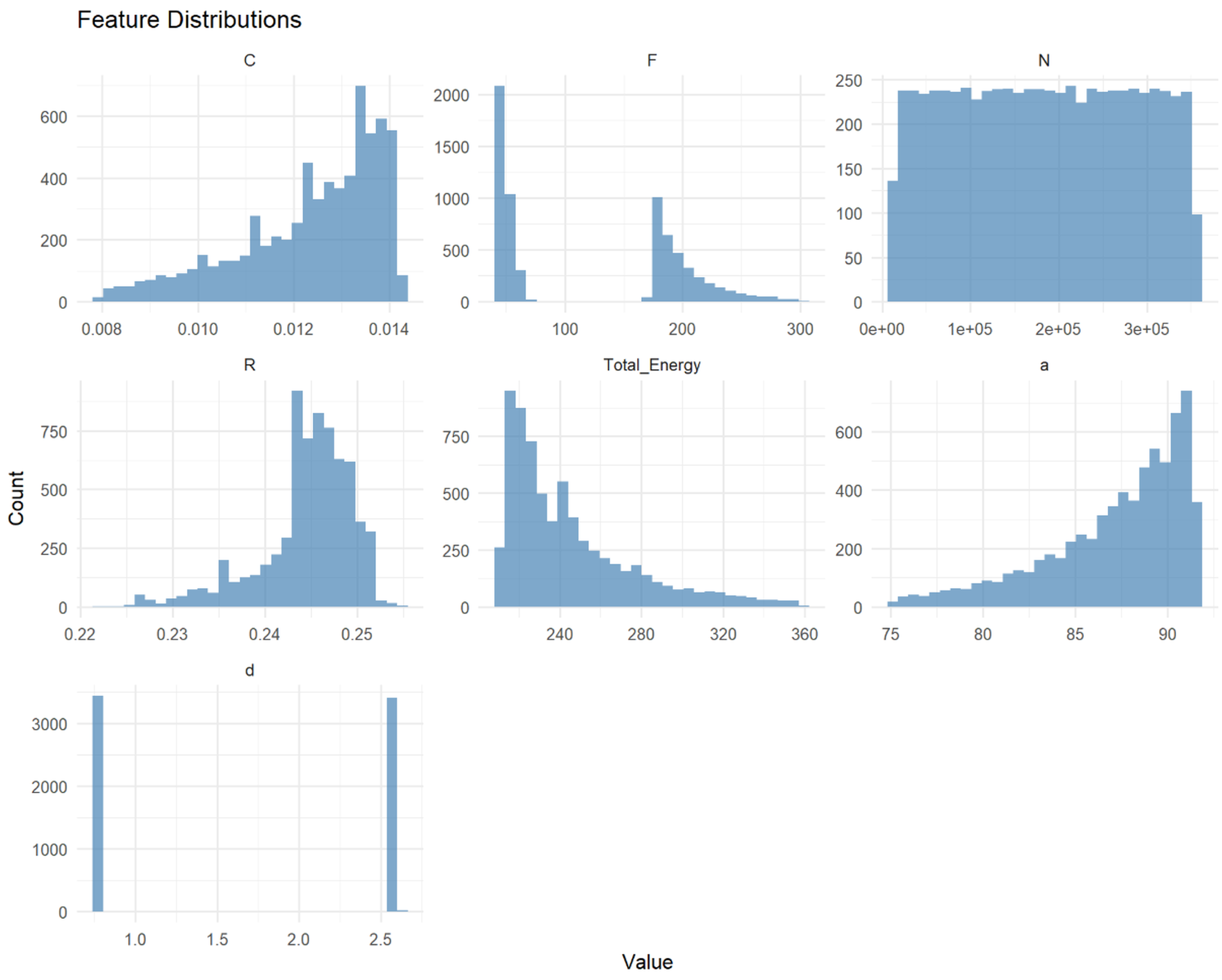
Correlation Matrix for Total_Energy and Relevant Predictors.
This correlation matrix displays the linear relationships among the Total_Energy, N, a, F, d, C, and R features. The strength and direction (positive or negative) of the correlation between any two variables are visually represented by the color of the cell and numerically by the coefficient within it.
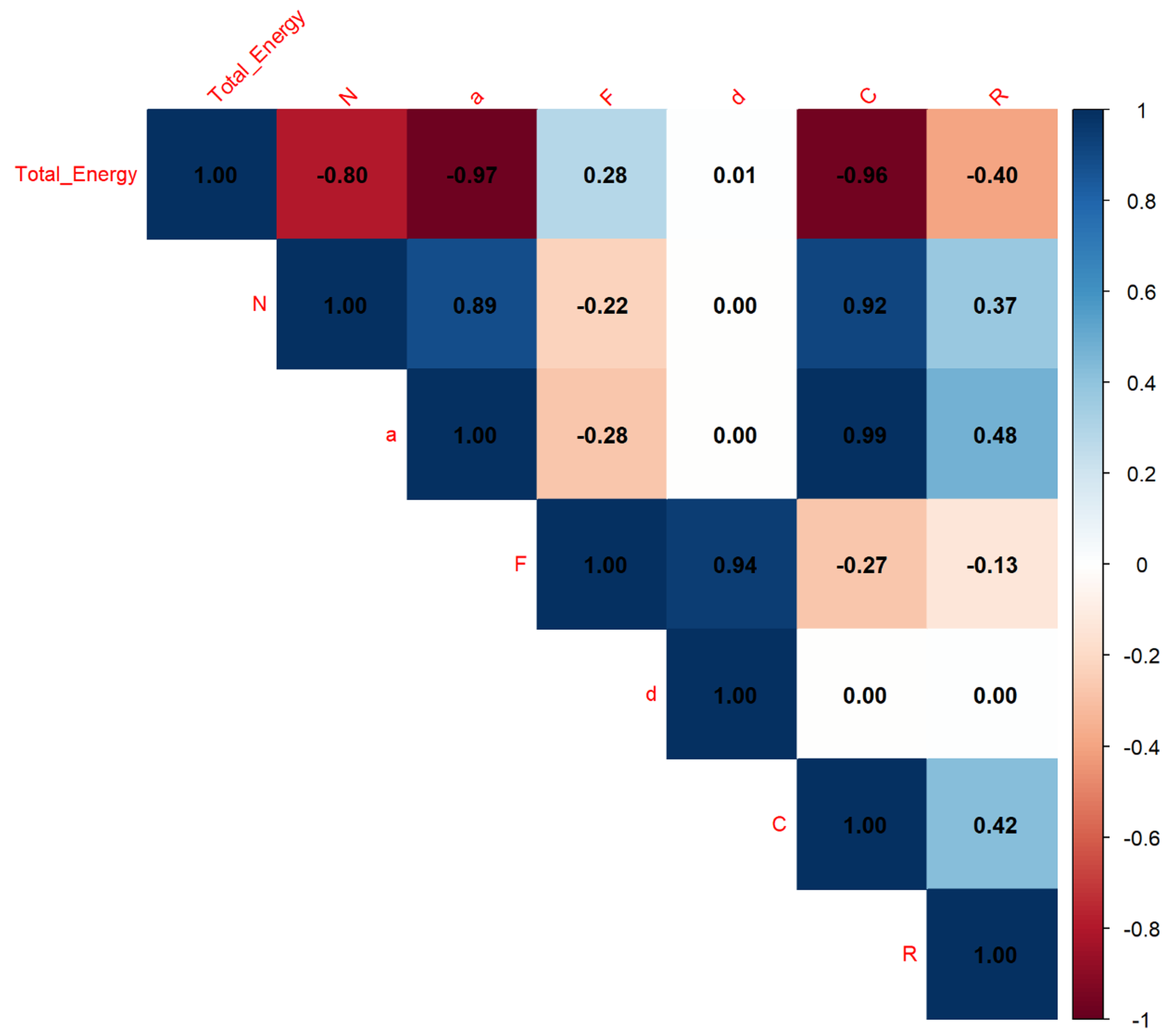
Boruta Feature Importance for Total_Energy.
This Boruta feature importance plot assesses and visualizes the relative significance of various features (N, a, C, F, R, d) in predicting the Total_Energy variable. The length of each bar reflects its mean importance score, with longer bars indicating more influential features. According to this analysis, N appears to be the most important feature for Total_Energy, followed by a and C, while d has the lowest importance among the confirmed features. The green color signifies that all these features have been statistically validated as relevant predictors by the Boruta algorithm.
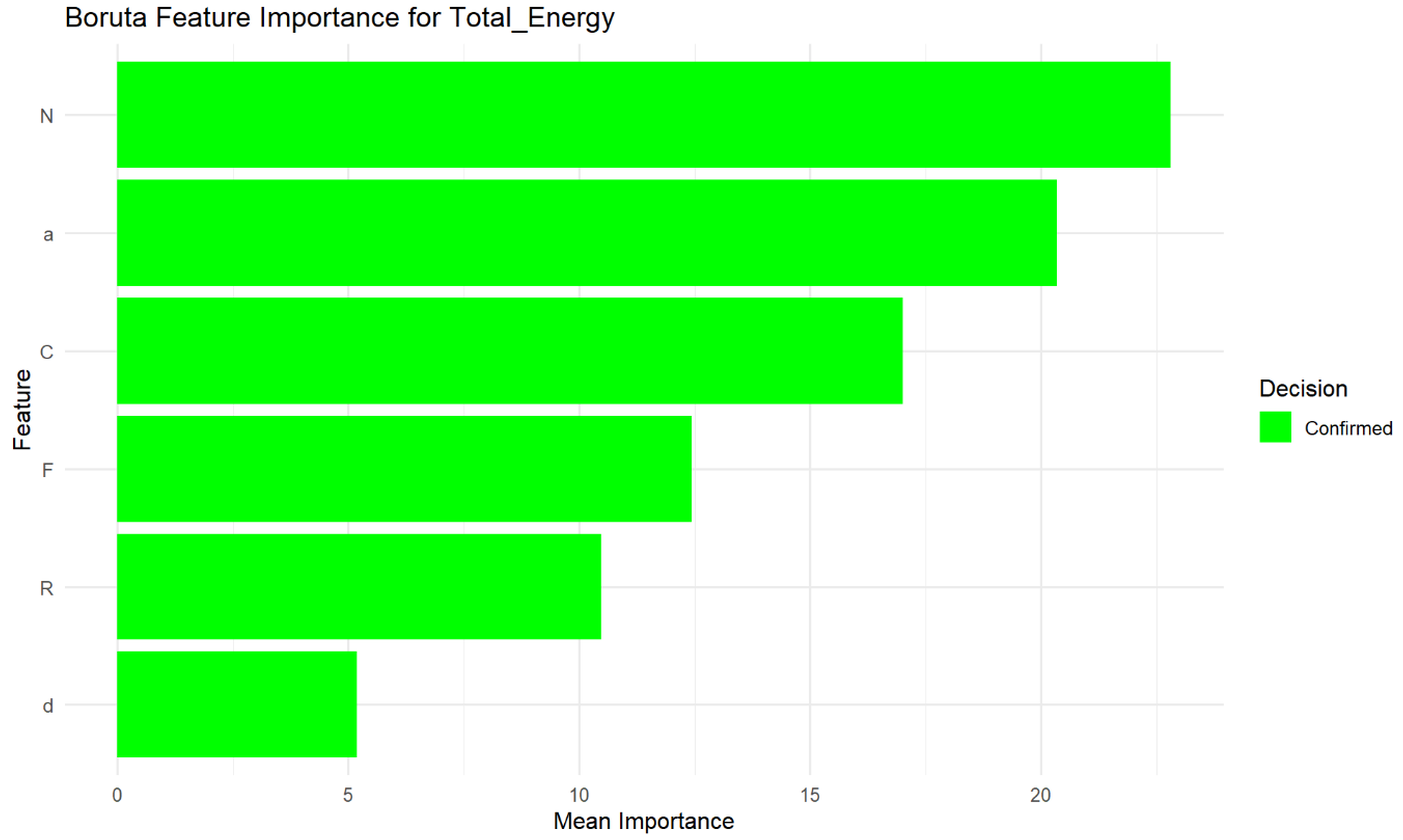
Model training times for Total_Energy.
This graph provides a visual comparison of the computational resources (specifically, time) required to train various machine learning models. Models are ordered by their training duration, revealing that some algorithms (like lm, lasso, pls) train very quickly, while others (such as gaussprRadial and qrnn) can take significantly longer. This visualization is essential for practitioners when selecting an appropriate model, as training time can be a critical factor, especially with large datasets or in scenarios requiring rapid model deployment or retraining.
Distributions of Input Features (Variables).
This figure presents histograms for three specific input features: F, Gmax, and a. By examining these distributions, one can understand the range, central tendency, spread, and shape of each variable. For instance, F shows a bimodal distribution with two distinct peaks, Gmax exhibits a right-skewed distribution where most values are clustered at the lower end, and a shows a left-skewed distribution with most values at the higher end. This type of visualization is essential for exploratory data analysis to gain insights into the characteristics of individual variables, identify potential outliers, or understand their underlying patterns, which can inform subsequent modeling decisions.
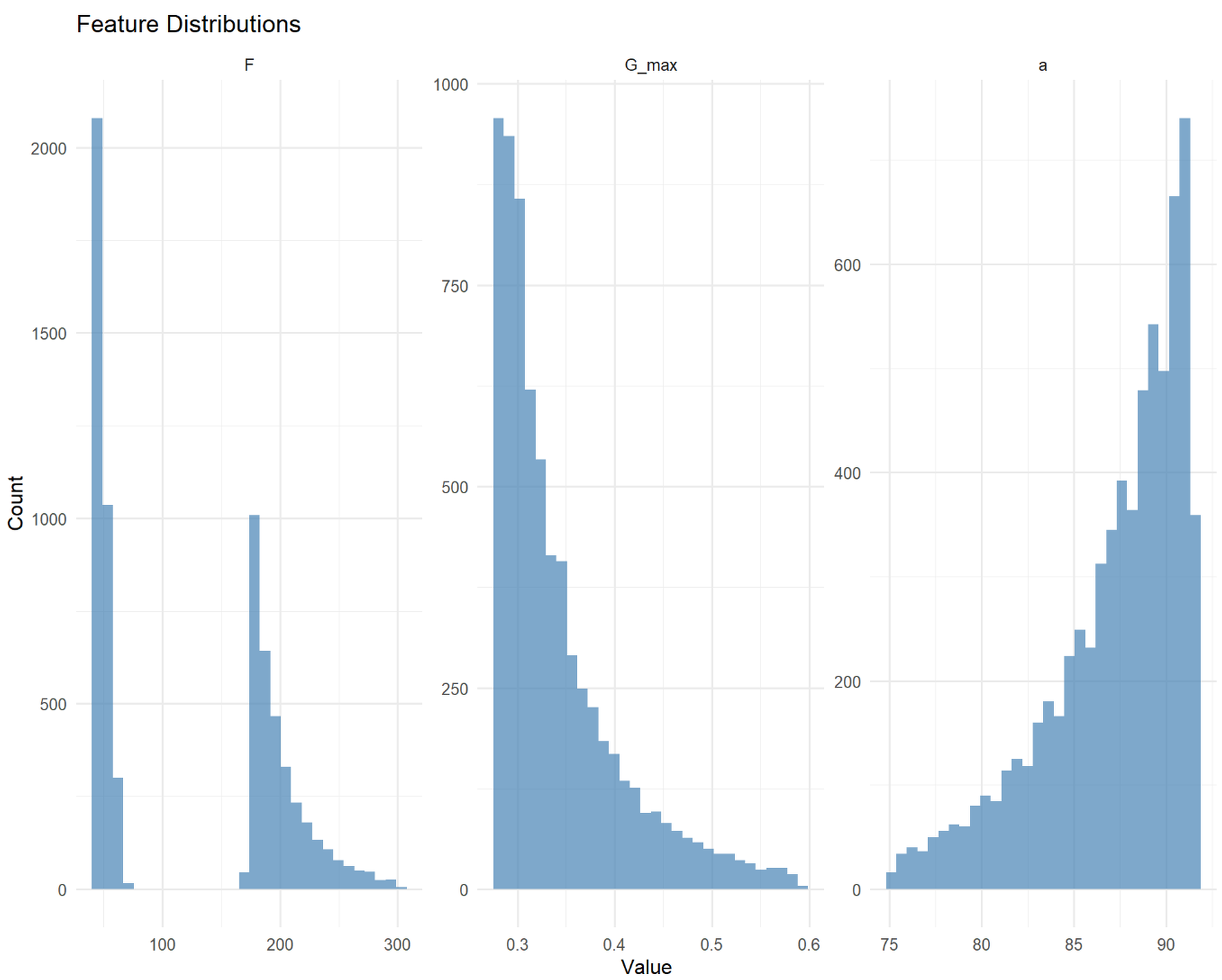
Correlation Matrix for Gmax and Relevant Predictors.
This correlation matrix provides a concise overview of the linear relationships among the Gmax, a, and F features. The color and numerical value within each cell directly indicate the strength and direction of the correlation between the paired variables. For example, Gmax and a show a very strong negative correlation (-0.96), meaning as one increases, the other significantly decreases. Conversely, Gmax and F have a weak positive correlation (0.28), while a and F have a weak negative correlation (-0.28). This type of visualization is useful for quickly identifying highly correlated or uncorrelated features, which can be important for feature selection or understanding multicollinearity in statistical modeling.
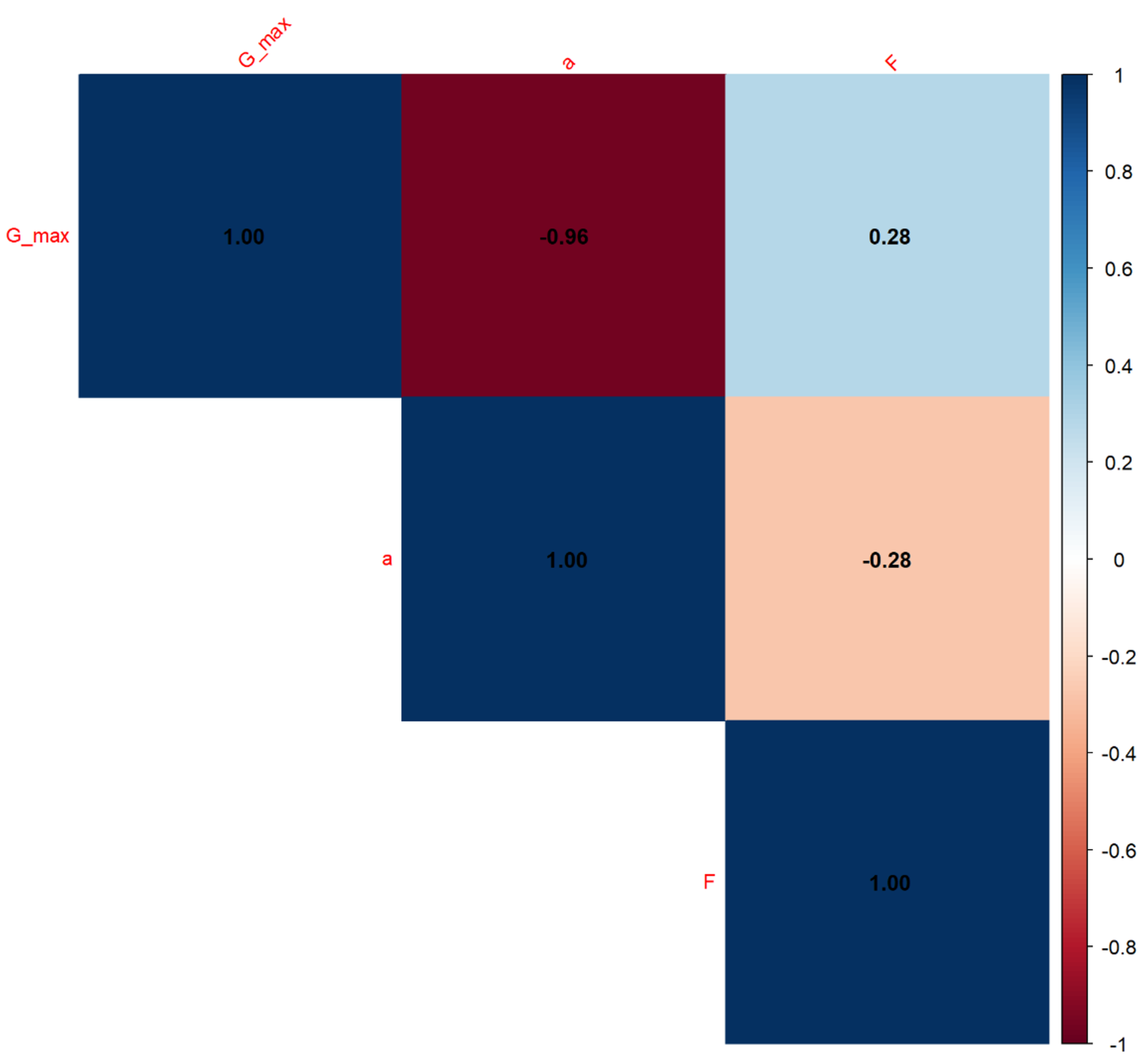
Boruta Feature Importance for Gmax.
This Boruta feature importance plot assesses and visualizes the relative significance of the a and F features in predicting the Gmax variable. The length of each bar reflects its mean importance score, with longer bars indicating more influential features. According to this analysis, a appears to be significantly more important than F for Gmax. The green color signifies that both a and F have been statistically validated as relevant predictors by the Boruta algorithm for Gmax.
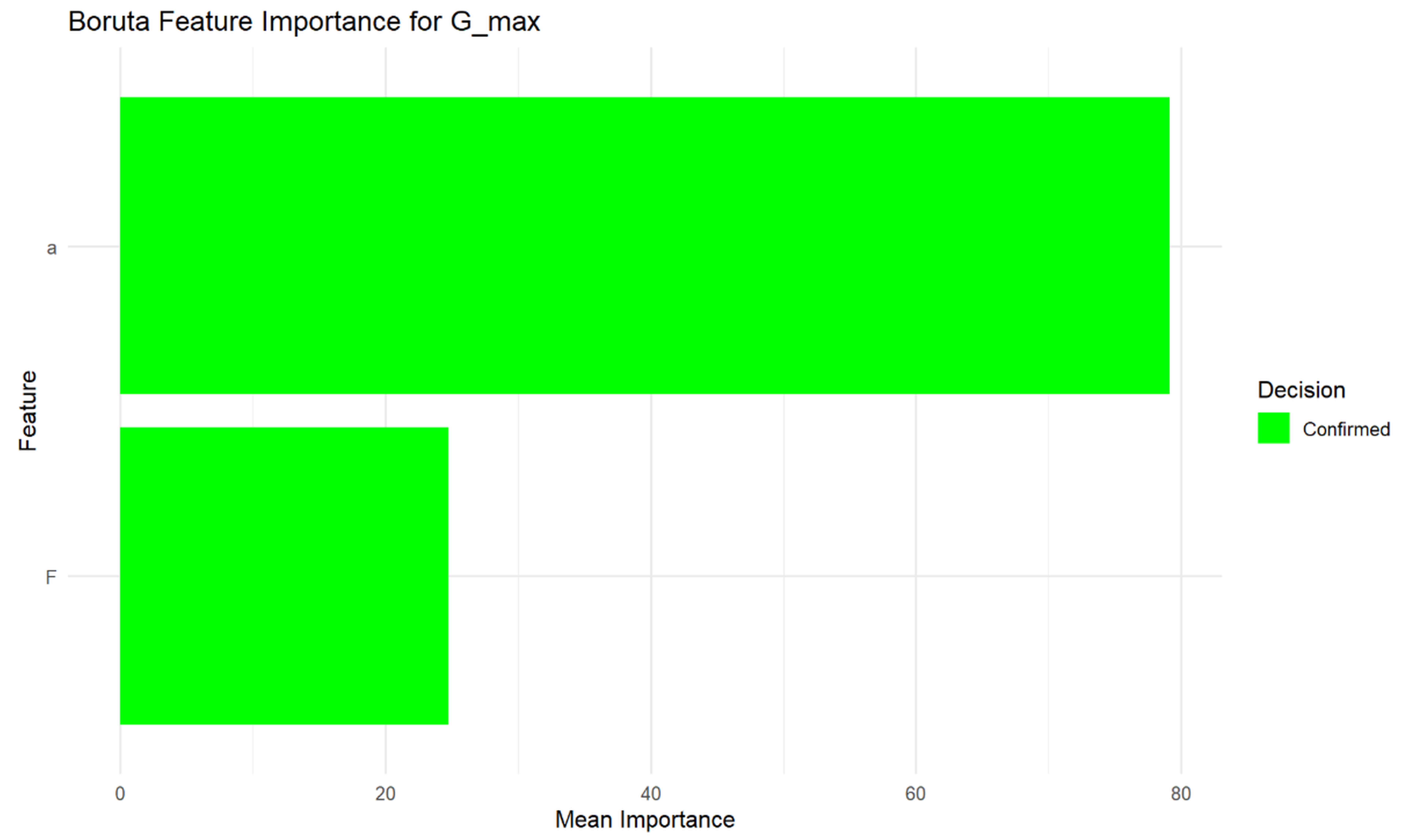
Model training times for Gmax.
This graph provides a visual comparison of the computational resources (specifically, time) required to train various ML models. Models are ordered by their training duration, revealing that some algorithms (like pls, lm, lasso) train very quickly, while others (such as gaussprRadial and qrnn) can take significantly longer. This visualization is essential for practitioners when selecting an appropriate model, as training time can be a critical factor, especially with large datasets or in scenarios requiring rapid model deployment or retraining.
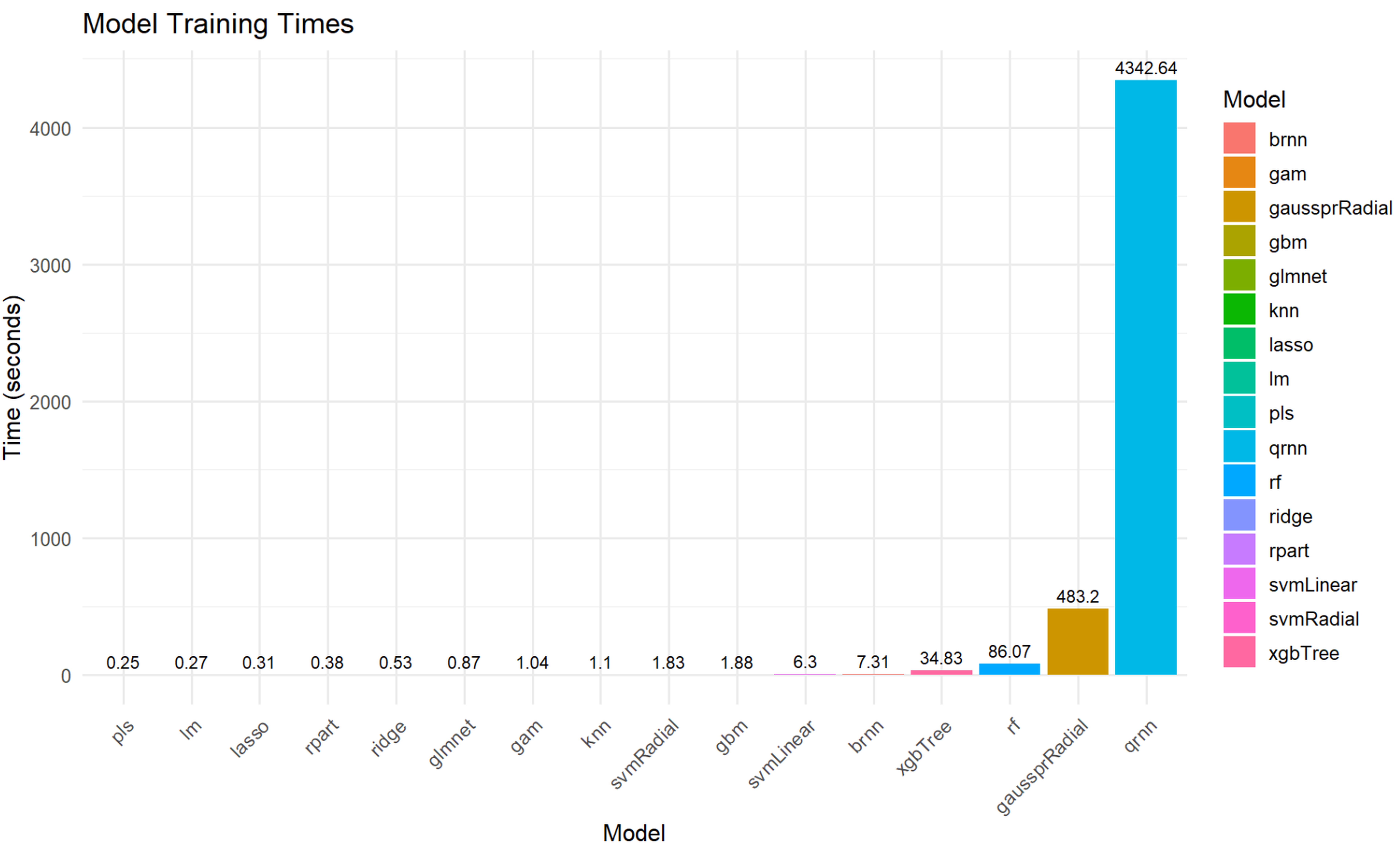
Training Set Metrics for da/dN Prediction Models.
This table provides a detailed comparison of the performance of sixteen different machine learning models on the training set for predicting da/dN. Key metrics such as RMSE, R-squared (R2), MAE, MAPE, MdAE, and RMSLE are reported for each model. For example, the rf model shows a very low RMSE of 4.00x10-07 and a high R2 of 0.9999219, suggesting excellent performance on the training data. Conversely, rpart has a higher RMSE of 1.74x10-05 and a lower R2 of 0.8253332, indicating comparatively weaker performance on the training set. This table is crucial for understanding the initial fitting capabilities of each model before evaluating their generalization to unseen data.
Test Set Metrics for da/dN Prediction Models.
The name of the ML algorithm used for prediction (e.g., lm, ridge, lasso, rf, gbm, knn).
RMSE (Root Mean Squared Error): A measure of the average magnitude of the errors. Lower values indicate a better fit.
R2 (Coefficient of Determination): Represents the proportion of the variance in the dependent variable that is predictable from the independent variables. Higher values (closer to 1) indicate a better fit.
MAE (Mean Absolute Error): The average of the absolute differences between predictions and actual observations. Lower values indicate better accuracy. MAPE (Mean Absolute Percentage Error): The average of the absolute percentage errors. Lower values indicate better accuracy, expressed as a percentage. MdAE (Median Absolute Error): The median of the absolute differences between predictions and actual observations. Less sensitive to outliers than MAE. RMSLE (Root Mean Squared Logarithmic Error): Measures the ratio between predicted and actual values. Useful when errors on smaller values are more important than on larger values. Lower values indicate a better fit.
Cross-Validation Metrics for da/dN Prediction Models.
To present the evaluation metrics for various ML models after k-fold cross-validation, specifically for predicting da/dN. These metrics provide a more robust estimate of how well each model is expected to generalize to unseen data. Model: The name of the machine learning algorithm used for prediction (e.g., lm, ridge, lasso, rf, gbm, knn). RMSE_CV (Cross-Validation Root Mean Squared Error): A measure of the average magnitude of the errors from cross-validation. Lower values indicate better fit and generalization. Rsquared_CV (Cross-Validation Coefficient of Determination): Represents the proportion of the variance in the dependent variable that is predictable from the independent variables, as estimated by cross-validation. Higher values (closer to 1) indicate a better fit and generalization.
Comparison Metrics for ML Models and Theoretical Model for da/dN Prediction.
To compare the predictive performance of various machine learning models against a theoretical model (implied ideal performance) for da/dN prediction, using specific evaluation metrics. Model_Type: The name of the machine learning algorithm used for prediction (e.g., brnn, gam, gaussprRadial, gbm, rf, knn). MAE (Mean Absolute Error): Measures the average magnitude of the errors between predictions and actual values. Lower values indicate better accuracy. R2 (Coefficient of Determination): Represents the proportion of the variance in the dependent variable that is predictable from the independent variables. Higher values (closer to 1) indicate a better fit. Correlation: Indicates the strength and direction of a linear relationship between the predicted and actual values. Higher values (closer to 1) indicate a stronger positive correlation and better alignment with the theoretical model.
Training Set Metrics for Total_Energy Prediction Models.
To present the evaluation metrics for various machine learning models trained to predict the Total_Energy. These metrics quantify how well each model performed on the training dataset.
Model: The name of the machine learning algorithm used for prediction (e.g., lm, ridge, lasso, rf, gbm, knn). RMSE (Root Mean Squared Error): A measure of the average magnitude of the errors. Lower values indicate a better fit. R2 (Coefficient of Determination): Represents the proportion of the variance in the dependent variable that is predictable from the independent variables. Higher values (closer to 1) indicate a better fit. MAE (Mean Absolute Error): The average of the absolute differences between predictions and actual observations. Lower values indicate better accuracy. MAPE (Mean Absolute Percentage Error): The average of the absolute percentage errors. Lower values indicate better accuracy, expressed as a percentage. MdAE (Median Absolute Error): The median of the absolute differences between predictions and actual observations. Less sensitive to outliers than MAE. RMSLE (Root Mean Squared Logarithmic Error): Measures the ratio between predicted and actual values. Useful when errors on smaller values are more important than on larger values. Lower values indicate a better fit.
Test Set Metrics for Total_Energy Prediction Models.
To present the evaluation metrics for various ML models trained to predict the Total_Energy. These metrics quantify how well each model performed on an unseen test dataset.
Model: The name of the machine learning algorithm used for prediction (e.g., lm, ridge, lasso, rf, gbm, knn). RMSE (Root Mean Squared Error): A measure of the average magnitude of the errors. Lower values indicate a better fit. R2 (Coefficient of Determination): Represents the proportion of the variance in the dependent variable that is predictable from the independent variables. Higher values (closer to 1) indicate a better fit. MAE (Mean Absolute Error): The average of the absolute differences between predictions and actual observations. Lower values indicate better accuracy. MAPE (Mean Absolute Percentage Error): The average of the absolute percentage errors. Lower values indicate better accuracy, expressed as a percentage. MdAE (Median Absolute Error): The median of the absolute differences between predictions and actual observations. Less sensitive to outliers than MAE. RMSLE (Root Mean Squared Logarithmic Error): Measures the ratio between predicted and actual values. Useful when errors on smaller values are more important than on larger values. Lower values indicate a better fit.
Cross-Validation Metrics for Total_Energy Prediction Models.
To present the evaluation metrics for various ML models after k-fold cross-validation, specifically for predicting Total_Energy. These metrics provide a more robust estimate of how well each model is expected to generalize to unseen data.
Model: The name of the machine learning algorithm used for prediction (e.g., lm, ridge, lasso, rf, gbm, knn). RMSE_CV (Cross-Validation Root Mean Squared Error): A measure of the average magnitude of the errors from cross-validation. Lower values indicate better fit and generalization. R2_CV (Cross-Validation Coefficient of Determination): Represents the proportion of the variance in the dependent variable that is predictable from the independent variables, as estimated by cross-validation. Higher values (closer to 1) indicate a better fit and generalization.
Comparison Metrics for ML Models and Theoretical Model for Total_Energy Prediction.
To compare the predictive performance of various ML models against a theoretical model (implied ideal performance) for Total_Energy prediction, using specific evaluation metrics.
Model_Type: The name of the machine learning algorithm used for prediction (e.g., brnn, gam, gaussprRadial, gbm, rf, knn). MAE (Mean Absolute Error): Measures the average magnitude of the errors between predictions and actual values. Lower values indicate better accuracy. R2 (Coefficient of Determination): Represents the proportion of the variance in the dependent variable that is predictable from the independent variables. Higher values (closer to 1) indicate a better fit. Correlation: Indicates the strength and direction of a linear relationship between the predicted and actual values. Higher values (closer to 1) indicate a stronger positive correlation and better alignment with the theoretical model.
Training Set Metrics for Gmax Prediction Models.
To present the evaluation metrics for various ML models trained to predict the Gmax. These metrics quantify how well each model performed on the training dataset.
Model: The name of the machine learning algorithm used for prediction (e.g., lm, ridge, lasso, rf, gbm, knn). RMSE (Root Mean Squared Error): A measure of the average magnitude of the errors. Lower values indicate a better fit. R2 (Coefficient of Determination): Represents the proportion of the variance in the dependent variable that is predictable from the independent variables. Higher values (closer to 1) indicate a better fit. MAE (Mean Absolute Error): The average of the absolute differences between predictions and actual observations. Lower values indicate better accuracy. MAPE (Mean Absolute Percentage Error): The average of the absolute percentage errors. Lower values indicate better accuracy, expressed as a percentage. MdAE (Median Absolute Error): The median of the absolute differences between predictions and actual observations. Less sensitive to outliers than MAE. RMSLE (Root Mean Squared Logarithmic Error): Measures the ratio between predicted and actual values. Useful when errors on smaller values are more important than on larger values. Lower values indicate a better fit.
Test Set Metrics for Gmax Prediction Models.
To present the evaluation metrics for various machine learning models trained to predict the Gmax. These metrics quantify how well each model performed on an unseen test dataset.
Model: The name of the machine learning algorithm used for prediction (e.g., lm, ridge, lasso, rf, gbm, knn). RMSE (Root Mean Squared Error): A measure of the average magnitude of the errors. Lower values indicate a better fit. R2 (Coefficient of Determination): Represents the proportion of the variance in the dependent variable that is predictable from the independent variables. Higher values (closer to 1) indicate a better fit. MAE (Mean Absolute Error): The average of the absolute differences between predictions and actual observations. Lower values indicate better accuracy. MAPE (Mean Absolute Percentage Error): The average of the absolute percentage errors. Lower values indicate better accuracy, expressed as a percentage. MdAE (Median Absolute Error): The median of the absolute differences between predictions and actual observations. Less sensitive to outliers than MAE. RMSLE (Root Mean Squared Logarithmic Error): Measures the ratio between predicted and actual values. Useful when errors on smaller values are more important than on larger values. Lower values indicate a better fit.
Cross-Validation Metrics for Gmax Prediction Models.
To present the evaluation metrics for various ML models after k-fold cross-validation, specifically for predicting Gmax. These metrics provide a more robust estimate of how well each model is expected to generalize to unseen data.
Model: The name of the machine learning algorithm used for prediction (e.g., lm, ridge, lasso, rf, gbm, knn). RMSE_CV (Cross-Validation Root Mean Squared Error): A measure of the average magnitude of the errors from cross-validation. Lower values indicate better fit and generalization. R2_CV (Cross-Validation Coefficient of Determination): Represents the proportion of the variance in the dependent variable that is predictable from the independent variables, as estimated by cross-validation. Higher values (closer to 1) indicate a better fit and generalization.