
Design and evaluation of an e-governance ICT solution to empower the non-literate vegetable market consumers
- Published
- Accepted
- Received
- Academic Editor
- Varun Gupta
- Subject Areas
- Human-Computer Interaction, Computer Education, Mobile and Ubiquitous Computing, Social Computing, Software Engineering
- Keywords
- ICT solutions, E-governance, Usability, ISO 9241-11, Non-literate
- Copyright
- © 2025 Shah et al.
- Licence
- This is an open access article distributed under the terms of the Creative Commons Attribution License, which permits unrestricted use, distribution, reproduction and adaptation in any medium and for any purpose provided that it is properly attributed. For attribution, the original author(s), title, publication source (PeerJ Computer Science) and either DOI or URL of the article must be cited.
- Cite this article
- 2025. Design and evaluation of an e-governance ICT solution to empower the non-literate vegetable market consumers. PeerJ Computer Science 11:e3150 https://doi.org/10.7717/peerj-cs.3150
Abstract
E-governance services often remain inaccessible to non-literate populations worldwide. This study proposes and evaluates an e-governance solution for non-literate users. The solution is designed to identify price discrepancies between government-regulated rates and actual market prices for fruits and vegetables. The system features a user-friendly interface that enables non-literate consumers to lodge complaints and track their resolution, thereby enhancing empowerment. Usability was assessed using ISO Standard 9241-11, comparing the effectiveness and efficiency of non-literate participants with a literate benchmark, assuming optimal interface use by the latter. Although non-literate participants did not achieve the literate benchmarkís performance, the differences were minimal. These findings support the adoption of the proposed solution and its core design elements such as customized icons and local-language audio instructions in future e-governance initiatives targeting non-literate populations.
Introduction
Information and communication technologies (ICTs) have significantly transformed developed countries, and developing nations are eager to adopt these innovations. However, many face challenges in implementing ICTs due to a large non-literate population. Although ICTs offer substantial benefits, their reliance on text-based interfaces poses significant barriers for non-literate individuals (Jan et al., 2020).
Approximately 754 million people worldwide are non-literate (UNESCO Institute for Statistics, 2024), making it difficult for them to access and benefit from digital tools. The widespread use of smartphones and increased internet access have revolutionized e-governance. However, non-literate populations struggle to engage with digital technologies because their needs are often overlooked in hardware and software design (Islam, Ahmed & Islam, 2020). This gap exacerbates the digital divide, making essential services less accessible to non-literate individuals. Complex application functions and user interfaces further limit their ability to interact with digital platforms.
This study focuses on expanding e-government services for non-literate consumers in Pakistan’s vegetable market, using Pakistan as a case study. The Pakistani government has launched several initiatives to enhance e-governance, including the Pakistan Citizen Portal (PCP), a smartphone application with over 5 million downloads. The PCP enables citizens to monitor government office performance and report discrepancies, promoting transparency and accountability. This aligns with a participatory approach, where organizations involve communities in designing and evaluating services to empower citizens (Lennie, 2005). However, with 44% of Pakistan’s population unable to access such services, this empowerment remains incomplete.
This research explores how e-governance can facilitate access to pricing information for fruits and vegetables and enable the identification of price discrepancies. While literate individuals can easily access updated pricing details online, non-literate populations face significant barriers. Research on ICT solutions for non-literate users remains limited globally. This study aims to bridge this gap by enabling non-literate individuals in Pakistan to voice their concerns. In this context, empowerment refers to gaining the confidence and knowledge to assert one’s rights, including understanding fair pricing and accessing a platform to express grievances. The research pursues three primary objectives:
Designing an ICT solution to provide non-literate and semi-literate vegetable market consumers with access to fruit and vegetable price lists.
Empowering consumers to report discrepancies in fruit and vegetable prices to governmental authorities through complaints.
Creating interfaces for tracking complaints and disseminating information about actions taken by the government.
Additionally, the study will evaluate the effectiveness, efficiency, and satisfaction levels of non-literate consumers, following ISO Standard 9241-11. The research adopts a User-Centered Design (UCD) methodology to achieve these objectives. The article is organized as follows: ‘Related Work’ reviews related work on ICTs for non-literate populations and e-governance solutions tailored for this demographic. ‘Design of the Solution’ outlines the solution’s design across multiple iterations. ‘Usability Evaluation and Results’ details the usability evaluations conducted and presents the findings. Finally, ‘Discussions’ offers a comprehensive discussion sub-section along with conclusions, limitations, and explores avenues for future research.
Related work
Globally, hundreds of millions of adults possess insufficient literacy skills to effectively engage with conventional text-based computing systems (Yang et al., 2025). This disparity often is referred to as the “digital divide” and is prominent in developing regions such as South and Southwest Asia, Sub-Saharan Africa. Over the past two decades, research has increasingly focused on strategies to make digital technologies more accessible to people without literacy skills and semi-literate users. Key approaches include replacing textual content with audio, images, symbols, and culturally familiar visual cues. Additionally, user-centred design methodologies have been employed to align interface design with users’ cognitive capacities, cultural backgrounds, and everyday practices.
Several recurring design patterns have emerged from this body of work. These include voice-based navigation systems, icon-driven or pictorial user interfaces, gamified or multisensory interactions, the use of multimedia (such as audio and video), and highly streamlined interaction models. These strategies have been applied across a range of domains such as employment services, education, health care, agriculture, and commerce, with context-specific adaptations tailored to local needs and constraints.
This section provides a detailed analysis of the prevailing themes, design solutions, and empirical findings drawn from the existing literature on accessible user interface design for low-literacy populations.
Universal design guidelines and considerations
Recent surveys have synthesized decades of research on user interface design for people without literacy skills and semi-literate populations. For instance, Islam et al. (2023) conducted a systematic literature review encompassing 45 studies focused on designing interfaces accessible to users with limited or no literacy. From this body of work, they identified 16 recurring design considerations, which they categorized into five thematic areas: text usage, interaction patterns, pictographic or multimedia integration, audio and video implementation, and information architecture.
Among the most frequently cited design principles were the following:
Minimize or eliminate textual content: since many people without literacy skills are unable to read, systems should aim to be entirely “text-free” or use minimal, contextually relevant language. Eight of the reviewed studies explicitly advocated for interfaces devoid of text, while others recommended using only localized languages when necessary.
Incorporate audio and speech-based features: nearly half of the studies (20 out of 45) integrated voice input or output in some form. Voice prompts, spoken menus, and auditory navigation were consistently highlighted as critical components for usability. Interfaces employing voice-based modalities such as voice-guided instructions or spoken feedback were found to significantly enhance intuitiveness. For example, farmers in India were able to access real-time market prices by interacting through voice commands in their native language (Somnath & Sunil, 2022).
Utilize pictorial and iconic elements: all reviewed systems employed visual components such as images, icons, or photographs. In every case analysed by Islam et al. (2023) graphical elements including sketches, illustrations, and photographs, were integral to the design. Research repeatedly demonstrates that such visuals often convey meaning more effectively than text. Notably, hand-drawn sketches were found to be more comprehensible to people without literacy skills compared to abstract icons or photographs (Khan et al., 2017; Rahman, 2019). Moreover, cartoon-like or culturally familiar imagery was shown to improve interpretability over generic stock graphics. Cultural relevance emerged as a key factor; designers were advised to use imagery aligned with users live experiences and environments (Rahman, 2019; Shah et al., 2015).
Prioritize local language and mnemonic aids: when textual or auditory content is included, it must be presented in the user’s native language (Islam et al., 2023). One study reported the successful use of mnemonic pictograms linked to familiar local cues such as a village landmarks (Rahman & Fukuda, 2015). This use helped in assisting people without literacy skills in self-identification without reliance on written text.
Taken together, these findings support the development of multi-modal user interfaces, combining spoken prompts with intuitive icon-based or animated menus, while minimizing or eliminating textual instructions. However, authors across the literature caution against overloading interfaces with excessive multimedia features, noting that overly rich designs can lead to confusion (Rahman, 2019). Instead, the ideal interface is described as clean, simple, and purposeful, with each screen presenting few items and clearly defined navigational signposts (Islam, Ahmed & Islam, 2020). Furthermore, user involvement through participatory design methods is emphasized throughout the literature. Engaging people without literacy skills directly in iterative prototyping cycles has been shown to surface critical usability issues and result in more effective, user-centred designs.
In summary, prevailing design guidelines converge on two core recommendations: the use of audio-visual interfaces and continuous usability testing. Restyandito & Chan (2015) further noted that people without literacy skills may exhibit differences in cognitive processing, including reduced memory capacity and challenges with abstract reasoning. As such, interfaces should avoid overwhelming users with excessive choices or demands on recall. Preferred approaches include direct manipulation and linear interaction flows, supported by multimodal cues such as voice, imagery, and sound. Ideally, interfaces should require little to no formal training, enabling users to learn through exploration and minimal orientation.
Voice and speech interfaces
Speech represents a natural and accessible interaction modality for individuals with limited or no literacy. Several studies have explored the use of voice-driven systems to bridge the digital divide. For example, a spoken dialogue system was developed in India to enable farmers to inquire about real-time commodity prices using voice input (Somnath & Sunil, 2022). Users could articulate their queries in Hindi or regional languages and receive vocal responses, thereby eliminating the need for any reading ability (Restyandito & Chan, 2015).
Research consistently highlights the potential of voice-based user interfaces (VUIs), including interactive voice response (IVR) systems and mobile voice menus, to make digital services accessible to populations lacking formal literacy. However, several challenges remain, particularly in rural settings where background noise can affect speech recognition accuracy and where users often rely on low-end mobile devices. Despite these limitations, pilot implementations have demonstrated promising results: field trials indicate that farmers are able to effectively retrieve market prices through spoken queries.
The application of voice-based interfaces extends beyond agricultural contexts. Traditional text-based communication tools, such as SMS, have also been reimagined to accommodate people without literacy skills. For instance, Iqbal (2021) redesigned an SMS application by replacing textual elements with audio recordings and graphical icons. In usability testing, participants found this audio-visual interface significantly more usable than a conventional text-based SMS app. The system allowed users to listen to voice clips and select messages via pictorial menus, enabling them to send and receive communications without typing. All participants expressed a strong preference for this “text-free” design. Islam et al. (2023) observed that nearly 44% of the systems reviewed in their systematic analysis incorporated voice input or output functionalities, underscoring the widespread adoption and perceived effectiveness of audio-based modalities in low-literacy contexts.
Based on such findings, best practices for designing effective voice-user interfaces include:
Using simple, clear spoken prompts at each step of the interaction.
Incorporating fallback mechanisms such as options to repeat instructions or slow down playback.
Providing auditory feedback for every user action.
Delivering content in a familiar dialect or accent to enhance comprehension.
Complementing audio with touchscreen buttons or soft keys labelled with intuitive icons, so that auditory instructions and visual symbols reinforce one another.
Graphical and pictorial interfaces
Where voice-based interfaces alone are insufficient, graphical elements serve as essential complements. User interfaces designed for people without literacy skills frequently employ icons, symbols, photographs, and sketches in place of textual content. Instead of traditional text-based menus, users are presented with grids of images that represent available actions or categories. For example, a job-search website for people without literacy skills used hand-drawn illustrations of different workplaces, such as farms, shops, and offices to classify job opportunities rather than relying on written descriptions (Khan et al., 2017; Rahman, 2019). At each interaction step, users simply selected the image that best matched their intent by tapping on it.
Empirical studies emphasize that both the choice and style of visual representations significantly affect usability. Research indicates that simple black-and-white line drawings often outperform detailed photographs, as they eliminate extraneous visual complexity and focus attention on core meaning (Khan et al., 2017; Jan et al., 2020). Animated icons or short video sequences i.e., an outline of a person performing an action can further enhance intuitiveness.
Some designs draw inspiration from familiar mobile phone paradigms. For instance, visual phonebooks have been implemented where each contact is represented by an image of the person, or menu layout resemble TV channel guides (Hayat, Rextin & Bilal, 2021). In a review of SMS user interfaces tailored for people without literacy skills, researchers found that graphic elements produce favourable outcomes particularly when combined with audio support (Iqbal, 2021).
However, it is important to recognize that icons are not universally interpretable. Cultural context plays a critical role in determining how visual symbols are understood. For example, an icon representing “medicine” might be depicted as a red cross in one country but may signify “hospital” in another (Kalyan, Rani & Shouri, 2024). Therefore, many studies stress the importance of co-designing interfaces with target communities to ensure cultural relevance and clarity.
In one e-commerce project targeting shopkeepers in Pakistan, researchers conducted ethnographic studies to identify locally meaningful imagery. The resulting interface included simple sketches such as a gas stove to represent cooking fuel, or a mango to symbolize fruit vendors, rendered in a style familiar to local users (Khan et al., 2016). The system was touchscreen-based to simplify input, and incorporated audio guidance in Urdu and Pashto. As a result, users were able to navigate and make purchases independently, without requiring external assistance.
In summary, pictorial user interfaces play a central role in making digital systems accessible to people without literacy skills. Studies recommend the use of “icons, digital photographs, and hand-drawn sketches with audio/video support” as preferred modalities. Data consistently show that text-free layouts, especially those featuring large, clear icons, significantly improve usability compared to any text-only design. When textual elements must be included, they should be displayed in large font size, presented in the user’s native language, and accompanied by audio cues for clarity and accessibility.
Interaction and navigation patterns
Beyond content representation, interaction style plays a crucial role in the usability of digital interfaces for people without literacy skills. Research indicates that such users perform most effectively with simple, linear navigation structures and large interactive elements. Chaudry et al. (2012) conducted an evaluation of various graphical user interface (GUI) widgets with low-literacy adults in a health-related context. The study found that users could interact successfully with non-textual elements such as icons and images. However, they achieved the highest efficiency with large radio-button-style selectors. Furthermore, participants preferred a shallow, linear navigation flow. Such flow is analogous to progressing sequentially through pages rather than navigating through deep multi-level menu systems. These findings underscore the importance of uncluttered screen layouts and step-by-step guidance in interface design for this user group.
Mobile interfaces often avoid complex interaction patterns. For instance, an SMS application tailored for people without literacy skills replaced scrolling text with a hierarchical picture-based menu system. Similarly, banking ATMs designed for low-literacy populations have adopted button-driven navigation flows, where each screen presents a limited set of pictorial options. Subsequent choices are based on prior selections, thereby minimizing cognitive load and simplifying decision-making (Cremers, de Jong & van Balken, 2008).
Touch-based input methods such as tapping large buttons or icons on a touchscreen are universally favoured over typing or executing complex gestures. Islam et al. (2023) observed that touch-button navigation was a common feature across mobile user interfaces targeting people without literacy skills, while menu-based designs were generally avoided due to their complexity. When menus cannot be eliminated, labelling strategies and interface constraints significantly improve usability. For example, in the design of an e-government portal for low-literacy users, screens were limited to a small number of topic icons accompanied by voice labels, and advanced search fields were disabled to prevent confusion. In another study involving ATM interface design, the use of standardized symbols such as a money icon for cash withdrawal and spoken prompts led to a substantial reduction in user errors (Rahman, 2019).
Finally, error recovery mechanisms are essential in interfaces for people without literacy skills. When a user accidentally selects an incorrect icon, they may not be able to read a textual “undo” option. To address this, some systems incorporate safety net features, such as visual highlights, auditory feedback, or confirmation sounds upon selection. Others require a double-tap action for irreversible operations. While few systems fully implement such safeguards, the literature identifies these as best practices and notes their absence in many existing solutions.
User-centred design methods
User-centred design methodologies have been consistently shown to enhance the effectiveness of interface development for low-literacy populations. Iterative prototyping and participatory design practices allow designers to identify and resolve usability issues at early stages (Gulliksen et al., 2003). A substantial body of literature underscores the critical importance of participatory design involving target users, particularly when designing interfaces for people without literacy skills or semi-literate populations. Given the diversity among such populations in terms of culture, age, and prior experience with technology, designers are advised to begin by conducting field studies or interviews to elicit user needs and preferences.
For instance, Islam, Ahmed & Islam (2020) conducted focus group discussions with 40 people without literacy skills and semi-literate participants in Bangladesh to understand their requirements and usability expectations. From these insights, the researchers identified a set of core design principles such as the use of native language interfaces, voice prompts, symbolic icons, and minimal textual content. Similarly, Iqbal (2021) engaged SMS users without literacy skills in comparative evaluations of text-based vs icon- and voice-enhanced user interfaces. The findings revealed a strong preference for the icon-driven interface, further reinforcing the value of multimodal, non-textual designs. Other projects have employed ethnographic methods, such as observing how villagers recognize local landmarks to inform the design of culturally relevant icons (Rahman & Fukuda, 2015). Similarly, Somnath & Sunil (2022) studied farmers’ terminology for agricultural commodity prices to shape the structure of a voice-based dialogue system. These examples illustrate that direct user involvement often leads to valuable insights regarding visual legibility, auditory clarity, and the feasibility of required training.
In addition to qualitative feedback, researchers frequently employ standardized usability metrics to measure effectiveness. These metrics include task success rate, error frequency, and task completion time. For example, Rahman & Fukuda (2015) while evaluating an e-learning application found that 13 out of 15 participants without literacy skills successfully completed a given task using an improved user interface, compared to only eight out of 14 using the baseline version. This improvement translated into a 26% reduction in average task completion time, demonstrating the tangible benefits of tailored, user-centred design. Such empirical evaluations, often based on direct observation of people without literacy skills interacting with prototypes, are essential for validating design decisions and ensuring real-world applicability.
State of the art
Despite multitude of research, a handful of systems attempted to present market price information via voice or image processing. Some examples include a MIS (Mantena et al., 2011), Fruit/Vegetable Recognition (Muhtaseb, Sarahneh & Tamimi, 2012), and Vegeshop (Sakai et al., 2016). Nevertheless, linguistic limitations (e.g., MIS’s use of Telugu), poor background handling in image recognition, and the absence of non-textual feedback often hinder them.
None of these applications address the complete e-governance interaction loop, such as filing complaints, tracking responses, or ensuring accountability. This omission is particularly problematic, as information access without enforcement mechanisms perpetuates power asymmetries rather than resolving them. There is also limited discussion on scalability, particularly how these systems can be adapted to diverse regions with limited infrastructure and device variability. An overview of the limitations of the existing work can be viewed in Table 1 below.
| Reference | Design considerations/Interfaces | Context | Language | Application type |
|---|---|---|---|---|
| Yang et al. (2025) | Audio, images, symbols, culturally familiar visual cues | Non-literate populations, global (South and Southwest Asia, Sub-Saharan Africa) | Not specified | Not specified |
| Islam et al. (2023) | Text-free, audio/speech-based, icons, multimedia, simplified information architecture | Non-literate populations, global | Native languages (e.g., Bengali) | Mobile application |
| Somnath & Sunil (2022) | Voice-based navigation, spoken dialogue system | Non-literate farmers, India | Hindi, regional languages | Call-based system |
| Khan et al. (2017) | Hand-drawn sketches, pictorial interfaces | Non-literate job seekers, Pakistan | Text-free | Web interface |
| Rahman (2019) | Hand-drawn sketches, cartoon-like imagery | Non-literate populations, Pakistan | Text-free | Not specified |
| Rahman & Fukuda (2015) | Mnemonic pictograms, audio, culturally relevant cues | Non-literate populations, global | Text-free | Mobile application |
| Restyandito & Chan (2015) | Voice-based navigation, simplified interfaces | Non-literate populations, global | Not specified | Not specified |
| Iqbal (2021) | Audio recordings, graphical icons, text-free SMS | Non-literate populations, global | Text-free | Mobile application |
| Jan et al. (2020) | Simple black-and-white line drawings | Non-literate populations, global | Text-free | Not specified |
| Hayat, Rextin & Bilal (2021) | Visual phonebooks, TV channel guide-inspired menus | Non-literate populations, global | Text-free | Mobile application |
| Kalyan, Rani & Shouri (2024) | Culturally relevant icons | Non-literate populations, global | Not specified | Not specified |
| Khan et al. (2016) | Hand-drawn sketches, audio guidance, touchscreen input | Non-literate shopkeepers, Pakistan | Urdu, Pashto | Mobile application |
| Chaudry et al. (2012) | Large radio buttons, icons, linear navigation | Low-literate and chronically ill, United States | English | Mobile application prototype |
| Cremers, de Jong & van Balken (2008) | Button-driven navigation, pictorial options | Low-literate populations, global | Text-free | ATM interface |
| Gulliksen et al. (2003) | User-centered design, iterative prototyping | Non-literate populations, global | Not specified | Not specified |
| Mantena et al. (2011) | Audio, speech-based interactions | Non-literate farmers, India | Telugu | Call-based system |
| Muhtaseb, Sarahneh & Tamimi (2012) | Audio, icons, fruit/vegetable recognition | Non-literate populations, global | Text-free | Mobile application |
| Sakai et al. (2016) | Text-based, natural language | Domestic users, global | English | Mobile application |
Design of the solution
The proposed solution, an Android application named FVMHA, aims to address the three objectives outlined in the introduction. The research methodology integrates qualitative and quantitative methods. Qualitative methods, including observations and interviews, were employed to examine non-literate users’ interactions with the designed prototypes. These observations informed the refinement of requirements and design strategies, following the principles outlined by Hazzan et al. (2006).
Initially, data were collected through document analysis, observations, and unstructured interviews with non-literate consumers in their work environment, the vegetable market. The collected data were analysed using an inductive approach, guided by the research objectives. This approach derives insights from participants’ experiences to facilitate analysis (Azungah, 2018).
The design process adhered to the user-centred design (UCD) methodology, as advocated by Fu et al. (2022). The interfaces were evaluated for efficiency, effectiveness, and satisfaction in accordance with ISO Standard 9241-11. This comprehensive approach ensures that the FVMHA application is tailored to the needs and preferences of non-literate consumers, enhancing usability and effectiveness.
The development of FVMHA proceeded through several phases. First, icons for the prototype design were selected, as described in the subsection “Study Procedure for Icon Assessment.” The “Observational Study” section provides insights into designing the prototypes. The “Design of FVMHA” section details the final prototype design. The entire process is illustrated in the following swim lane diagram (see Fig. 1).
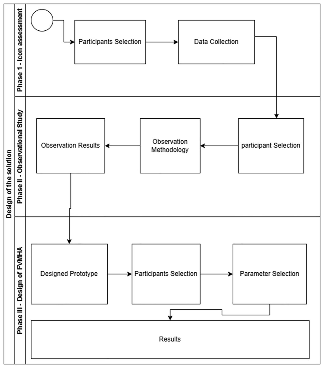
Figure 1: Swim lane diagram: design of the solution.
Study procedure for icon assessment
Icons for the FVMHA application were selected through document analysis, drawing from various internet sources and open-source software documentation. This process identified 56 icons representing actions such as face recognition, identification number entry, and audio assistance. These icons and their corresponding action descriptions are detailed in Appendix A.
In addition to the 56 action-specific icons, a cross icon was included to indicate when none of the four primary icons adequately represented an action. The assessment of these icons in the FVMHA application proceeded through interviews conducted in two phases:
-
1.
Participant selection and profile collection.
-
2.
Data collection and study procedure.
These phases were executed sequentially to ensure a comprehensive evaluation and refinement of the icon selection process for the FVMHA application, as elaborated below.
Participant selection and profile collection
The participant selection phase aimed to identify icons that most effectively enhance interface usability for the FVMHA application. As this was an early stage of prototype development, Nielsen’s (2012) recommendations were followed, which suggest that testing with five users can uncover approximately 80% of usability issues. Due to the principle of diminishing returns, the likelihood of identifying new issues decreases significantly after the initial users. To ensure robustness, however, 35 participants (26 males and nine females) were interviewed in the first phase of icon assessment. In the second phase, 30 participants (21 males and nine females) were engaged to further refine and identify the most suitable icons.
The male participants included drivers, shopkeepers, security guards, factory workers, sweepers, and farmers. The female participants were primarily stay-at-home spouses, with three employed as nursing home assistants. In the first phase, the participants’ average age was 43 years, ranging from 27 to 86 years. In the second phase, the average age was 41 years, ranging from 29 to 61 years. Of the 65 total participants, 21 could read and write in Urdu and recognize numbers, while 44 could neither read nor write in Urdu but could recognize numbers. A detailed breakdown of the participants’ demographics is provided in Table 2.
| Participants’ statistics | Literacy statistics | ||||
|---|---|---|---|---|---|
| Demographic area | Mansehra KPK, Pakistan | Without Education (able to recognize numbers) | 1st phase | 2nd phase | |
| 22 | 22 | ||||
| 1st Phase | 2nd Phase | Primary and middle grade | 13 | 8 | |
| Number of participants | 35 | 30 | Mobile phone usage statistics | ||
| Males | 26 | 21 | Smart phone consumers | 65.7% (23) | 66.6% (20) |
| Females | 9 | 9 | Basic phone consumers | 34.2% (12) | 33.3% (10) |
| Mean age | 43 years SD = 13.151 | 41 years SD = 7.7690 | |||
| Age range in years | 27–86 | 29–61 | |||
| Participants occupation statistics | 1st phase | 2nd phase | |||
| Drivers | 4 | Security guards | 3 | ||
| Fruit sellers | 4 | Factory workers | 3 | ||
| Security guards | 2 | Fruit seller | 2 | ||
| Shop keepers | 8 | Shop keepers | 5 | ||
| Farmers | 3 | Farmers | 2 | ||
| Housewives | 6 | Housewives | 7 | ||
| Nursing home helpers | 3 | Property dealers | 2 | ||
| Factory workers | 3 | Driver | 2 | ||
| Gardener | 1 | Cook | 1 | ||
| Cook | 1 | Sweeper | 2 | ||
| Babysitter | 1 | ||||
| Total | 35 | 30 | |||
Data collection and the study procedure
The experimental procedure, including all ethical considerations, was approved by the Departmental Project & Research Ethics and Evaluation Committee (DPREEC) at COMSATS University Islamabad, Abbottabad Campus, Pakistan, under approval number CUI/ATD/CS/MS/23/005. Prior to data collection, a consent form was read aloud to participants to ensure informed consent.
In the first phase, the 35 participants were presented with the icons selected in the initial assessment (see Appendix A). They were instructed to choose the single icon they believed best represented each task. The responses were analysed, and the icons were ranked based on the number of votes received. The two icons with the highest votes were selected, as detailed in Appendix B.
In the second phase, the two highest-voted icons from the first phase were presented to 30 participants. They were asked to recommend the most suitable icon from these options. The icon receiving the most votes was selected and subsequently integrated into the FVMHA application’s design. This process ensured that the chosen icon was widely accepted and deemed most effective by participants, thereby enhancing the application’s usability and effectiveness.
Observational study
The selected icons were used to develop a prototype of the FVMHA application to evaluate the following usability aspects:
-
1.
User preferences for two authentication methods: picture passwords vs text-based passwords.
-
2.
Differences in usage with and without audio instructions.
-
3.
Differences in usage with and without image icons.
-
4.
Ability to identify currency notes.
-
5.
Natural behaviour when interacting with the built-in camera without instructions.
-
6.
Natural behaviour when interacting with the numeric input device without instructions.
Participant selection
Following Nielsen’s (2012) recommendation for usability studies, a subset of five participants was selected from the target community. A convenience sampling method was employed, with participants screened based on two criteria: being over 15 years of age and unable to read or write. The first author visited participants’ workplaces and homes, conducting interviews in the native language of the area, Hindko.
The interview procedure was as follows: the research purpose was verbally explained to each participant, and informed consent was obtained through thumb impressions on individualized consent forms. Demographic information, including age, education level, occupation, type of mobile phone used, and mobile usage experience, was collected verbally and recorded by the researcher on the corresponding consent forms. Participants were informed that their data would be aggregated to ensure anonymity and that they could request data deletion within 1 year of collection.
Observations methodology
Participants were observed interacting with sellers or buyers in real-world settings and engaging with various FVMHA prototypes. Screen recordings captured their interactions with the prototypes for subsequent analysis. Through these recordings and on-site observations, participants’ actions, reactions, errors, and challenges during prototype interactions were analysed.
Participants’ numeracy skills were assessed by observing their interactions with numbers in practical scenarios, such as handling money or measuring items. Following prototype use, participants were interviewed to gather insights into their experiences and preferences, particularly regarding mobile applications and prototype usability. The interview questions were as follows:
-
1.
What was your experience using mobile applications?
-
2.
When using a new app, what helps you understand its functionality best: text instructions, images, or other elements?
-
3.
Did you use audio-based instructions or guidance while interacting with the prototype?
-
4.
How comfortable are you with recognizing and using numbers, such as telling time, measuring, or counting fruits or vegetables during buying or selling?
-
5.
What challenges, if any, do you face when dealing with numbers while buying or selling vegetables?
These questions were designed to elicit participants’ perspectives on their experiences, preferences, and challenges related to mobile application usage and their comfort with numeracy skills in vegetable market transactions.
Observations/Results
The following observations were recorded from the study procedure:
Numeric interfaces
A key finding was that textual interfaces should be avoided in Android applications designed for non-literate consumers, as simplicity enhances usability. However, interviews revealed that participants could understand numeric values (e.g., 0, 1, 2), enabling their use in the consumer interface for entering National Identification Card (NIC) numbers and displaying prices.
Audio instructions
The use of audio aids was identified as a critical design principle for all functional units to support non-literate consumers. Previous studies have shown that audio instructions encourage application use by evoking joy and excitement (Parikh, Ghosh & Chavan, 2002; Cuendet et al., 2013). Accordingly, clear audio instructions in the local language, Hindko, were incorporated across all screens and icons of the FVMHA application.
Face recognition authentication
Face recognition was found to be an effective authentication method for non-literate users, as capturing a photo for a one-time login is simpler than other security methods. This approach also streamlines complaint registration by automatically including login credentials (NIC number and face recognition image) as identity verification, eliminating the need for users to re-enter personal information. However, non-literate users require assistance from a literate individual during initial registration.
Final prototype design
The fully functional prototype, FVMHA, was developed to achieve the study’s objectives, incorporating icons selected from the initial assessment (see Appendix A) and insights from the observational study. The prototype includes several key interfaces: a login interface, a fruit and vegetable recognition interface, a complaint registration interface, and a complaint tracking interface. Each interface features audio instructions in Hindko, familiar icons recognized by the target consumers, a minimal number of screens to reduce complexity, and no textual interfaces, adhering to the “simple is better” principle derived from the study findings.
The subsequent section elaborates on the interfaces within the FVMHA prototype, detailing how each component enhances the application’s usability and effectiveness.
The design of FVMHA
The FVMHA application is a multimodal solution comprising five modules, with the first four designed to achieve the study’s three objectives and a fifth module serving as an admin panel. The modules and their descriptions are as follows:
Login module
The login module facilitates one-time registration and enhances security (see Appendix D, Fig. 1). Consumers enter their National Identification Card (NIC) number into a text field for registration. This text-based interface was included for two reasons:
Interviews indicated that most semi-literate and non-literate consumers can recognize numbers.
Participants unfamiliar with numbers can seek assistance from a literate individual for this one-time activity, as subsequent logins are automatic.
An audio icon provides instructions in Urdu for NIC input and guidance on seeking help. A face recognition icon employs image processing to match the consumer’s face with stored facial features linked to the NIC, eliminating the need for repeated NIC or password entry. An action button at the bottom of the interface completes the registration process and navigates to the next screen.
Fruit and vegetable rate list access module
This module enables consumers to access fruit or vegetable prices by recognizing items via the smartphone’s built-in camera while in the market (see Appendix D, Fig. 2). Upon login, this interface appears as the initial screen, displaying the item’s name and government-adjusted price. Audio instructions in Hindko, playable via an audio aid button, describe the screen’s functionality and available features. Consumers can photograph a fruit or vegetable, and a background image classifier identifies the item and displays its price on the pricing and complaint button (PCB) interface (see Appendix D, Fig. 3). If classification accuracy is below 80%, an image gallery of fruits and vegetables is displayed for manual selection (see Appendix D, Fig. 4), which also directs to the PCB interface. The PCB interface includes a complaint button to navigate to the complaint registration (CR) interface (see Appendix D, Fig. 5) and a tracking icon button to access the complaint tracking (CT) interface (see Appendix D, Figs. 10a and 10b).
Complaint registration (CR) interface
The CR interface enables non-literate consumers to register complaints about price discrepancies (see Appendix D, Fig. 5). It includes a video recording feature (red camera icon) and an audio recording feature (green microphone icon). Clicking the price discrepancy option navigates to the controversial price entry and selection (CPES) interface. Date and location are automatically inserted. A save button (floppy icon) stores complaints, and an action button submits them. An audio aid icon provides repeatable instructions in Hindko for each interface element.
Video recording (VR) interface
The video recording (VR) interface supports video recording with play, save, and directional icons, accompanied by audio assistance (see Appendix D, Figs. 6a and 6b). Re-recording automatically overwrites previous recordings, as does audio recording.
Audio recording (AR) interface
The audio recording (AR) interface includes icons for starting, stopping, playing, and saving audio recordings, with audio assistance provided at each step (see Appendix D, Fig. 7).
Controversial price entry and selection (CPES) interface
The CPES interface supports consumers with limited numeracy skills (see Appendix D, Fig. 8). Users enter controversial prices by tapping currency note and coin icons, with associated values announced audibly and displayed in a text box. Incorrect entries can be reset to zero by pressing the button again.
Complaint registered successfully interface
This interface confirms successful complaint registration (see Appendix D, Fig. 9).
Complaint tracking (CT) interface
The CT interface tracks complaints regarding discrepancies between market and government prices (see Appendix D, Figs. 10a and 10b). It provides step-by-step information on complaint submission to food department authorities, including status updates and remarks on acceptance or rejection, delivered via audio in Hindko. Audio instructions, automatically played upon screen appearance, detail the screen’s functionality, complaint status, and available features. All navigation within the prototype is illustrated in Appendix D, Fig. 11.
Admin panel
The admin panel enables food department authorities to view and respond to registered complaints, including adding audio-based decisions or comments.
The application was developed using Android Studio 4.2.1, with Native Java and XML for programming and interface design. Firebase, an online database, was used to store and update rate lists and complaints.
Usability evaluation and results
The usability of the FVMHA application was evaluated in accordance with ISO Standard 9241-11, which defines usability as the effectiveness, efficiency, and satisfaction with which users achieve specified goals. This section outlines the evaluation procedures, including participant selection, study procedure, tasks, and usability evaluation results.
Study procedure and data collection
The usability evaluation was conducted using an OPPO F17 smartphone with non-literate participants. The following steps were implemented for each participant:
-
1.
Participants were informed about the research purpose and their role in the study. Specifically, they were told that the study aims to evaluate the software’s ease of use, not their performance, to ensure they feel comfortable, behave naturally, and provide honest feedback on the FVMHA application’s functionality.
-
2.
Demographic information was collected from each participant.
-
3.
Five tasks were designed to assess the functionality of the four main modules, and each participant performed these tasks individually.
Steps 2 and 3 are detailed in the following subsections.
Participants selection
A total of 40 non-literate participants were selected for the usability evaluation, guided by methodological best practices and contextual relevance. Nielsen (2012) suggests that testing with five users can identify approximately 80% of usability issues due to the principle of diminishing returns. However, for complex or diverse user groups, such as non-literate consumers in rural Pakistan, a larger sample is necessary to capture variability in behaviours and needs.
The selection of 40 participants aimed to achieve saturation in usability feedback while ensuring diversity in gender, age, and mobile phone experience within the non-literate population. Participants were purposively sampled from the Mansehra district in Khyber Pakhtunkhwa (KPK), a region with a significant non-literate demographic. The sample included both basic and smartphone users, male and female participants, and individuals with varying levels of numeracy and Urdu language comprehension.
Verbal consent was obtained from each participant and recorded via thumb impressions on individualized consent forms. Participants were informed that they could request data deletion within 1 year of collection. Although this sample size does not ensure statistical generalizability across the entire non-literate population, it represents the study’s target group: non-literate and semi-literate adults in rural Pakistan who face systemic exclusion from digital services. The demographic diversity of the sample informs interface design recommendations by reflecting a realistic spectrum of consumer needs and experiences. A detailed overview of the participants’ demographics is provided in Table 3.
| Category | Subcategory | Count | Percentage (%) |
|---|---|---|---|
| Gender | Male | 31 | 77.5% |
| Gender | Female | 9 | 22.5% |
| Age | Youngest participant | 21 years | – |
| Age | Oldest participant | 86 years | – |
| Age | Mean age | 43 years | – |
| Literacy level | No schooling; cannot read/write Urdu | 27 | 67.5% |
| Literacy level | Can read/write Urdu; have number knowledge | 13 | 32.5% |
| Phone usage type | Smartphone users | 23 | 57.5% |
| Phone usage type | Basic phone users | 17 | 42.5% |
Task selection
All available functionalities of the FVMHA application were presented to participants as individual or combined tasks for execution. These tasks were mapped to the study’s objectives, with Table 4 illustrating the alignment between each task, the corresponding objective, and the rationale for their association.
| Task | Module | Mapped objective (s) | Justification/Reasoning |
|---|---|---|---|
| Task 1: Logging into the application | Module 1 | Not directly mapped | Logging in is a necessary usability function but does not directly address any of the core objectives. It enables access to system features that fulfil the objectives. |
| Task 2: Recognition of any fruit/vegetable and taking results about their price | Module 2 | Objective 1 | This task directly enables users to obtain price information, thus fulfilling the aim of improving access for non-literate/semi-literate users. |
| Task 3: Accessing built-in gallery | Module 2 | Objective 1 | Supports the recognition of fruits/vegetables visually, enhancing accessibility of price data for users who cannot read. |
| Task 4: Register complaints on finding price discrepancy | Module 3 | Objective 2 | Empowers users to act by reporting discrepancies, directly aligned with the second research objective. |
| Task 5: Finding out any previously registered complaint and to tell the researcher about their complaint status | Module 4 | Objective 3 | This task supports transparency and keeps users |
Parameter selection
The usability of the FVMHA prototype was evaluated based on ISO Standard 9241-11 parameters: effectiveness, efficiency, and user satisfaction. Each session was screen-recorded for subsequent analysis. To establish a baseline for comparison, the effectiveness and efficiency of non-literate participants were compared with those of a literate user. It was hypothesized that a literate user would navigate the simplified interface with perfect effectiveness and greater efficiency. The first author tested this hypothesis by completing all tasks with maximum effectiveness, and their task completion time was recorded as the optimal efficiency benchmark, assuming literate users would perform tasks faster than non-literate or semi-literate participants.
Data collection
The usability of the FVMHA prototype was evaluated using ISO Standard 9241-11 parameters: effectiveness, efficiency, and user satisfaction. Effectiveness was assessed by measuring whether participants completed tasks on their first attempt, with any additional attempts recorded as errors. The following actions were classified as errors for each task:
Task 1 (Login Module):
Rewriting the National Identification Card (NIC) number.
Clicking on the admin panel.
Task 2 (Fruit and Vegetable Rate List Access Module):
Taking an incorrect image (e.g., blurred, unrecognizable by the system), requiring participants to retake the image, is counted as an error.
Task 3 (Gallery Selection):
Clicking on an incorrect icon instead of the gallery.
Task 4 (Complaint Registration):
Tapping an incorrect icon instead of the complaint registration icon.
Recording audio or video more than once.
Exiting the screen without registering a complaint.
Task 5 (Complaint Tracking):
Tapping an incorrect icon instead of the complaint tracking icon.
Failing to recognize their registered complaint or its status.
Efficiency was measured using three parameters: the number of times participants listened to audio instructions, the total time taken to complete each task, and the frequency of requests for assistance. User satisfaction was evaluated using the System Usability Scale (SUS) questionnaire, adapted for non-literate participants through verbal administration in the local language, Hindko.
Participants were assigned a task and instructed to complete it. Upon completion, instructions for the next task were provided verbally in Hindko. A dedicated data recording module was developed to log user interactions with the FVMHA application automatically. This module generated a separate log file for each screen, capturing the following details:
Current screen (e.g., login interface).
Type of event (e.g., tap).
Control interacted with (e.g., button).
Name of the control (e.g., “Sign In”).
The log recorded the start time when a participant entered an interface and the stop time when they completed the task by interacting with a completion control (e.g., tapping the login button). Unsuccessful attempts, such as failed logins, were logged as error entries for the respective interface. Manual observations by the first author complemented the automated data collection, with details such as the number of button presses recorded in a logbook alongside the corresponding participant and screen.
Results
The results involved calculating the interfaces’ effectiveness, efficiency, and consumer satisfaction with the final prototype. The details of the results are as follows:
Effectiveness
Effectiveness is defined by ISO Standard 9241-11 as the accuracy and completeness with which users achieve specified goals. It was evaluated by analysing task completion rates, tapping behaviour, and the number of attempts required to complete tasks in the FVMHA application. A total of 40 non-literate participants completed five tasks each, resulting in 200 task completions. However, the completion rate for each task varied based on the number of attempts. Effectiveness was calculated using the formula provided below whereas the overall effectiveness across multiple attempts is provided in Table 5.
| Attempt number | Tasks completed | Effectiveness (%) |
|---|---|---|
| 1st attempt | 132 | 66% |
| 2nd attempt | 56 | 28% |
| 3rd attempt | 9 | 4.5% |
| 4th attempt | 2 | 1% |
| 5th attempt | 1 | 0.5% |
| Total | 200/200 | 100% |
Furthermore, Table 6 summarizes the effectiveness of the prototype based on the number of attempts and tapping behaviour:
| Evaluation metrics | Parameters | Modules | Tasks | Optimal value | Average value |
Min value | Max value |
|---|---|---|---|---|---|---|---|
| Effectiveness | Tapping behavior | Module 1 | Task 1 | 3 | 5.5 | 3 | 8 |
| Module 2 | Task 2 | 1 | 3.15 | 1 | 2 | ||
| Task 3 | 1 | 1.425 | 1 | 2 | |||
| Module 3 | Task 4 | 12 | 17.825 | 12 | 31 | ||
| Module 4 | Task 5 | 2 | 3.625 | 2 | 7 | ||
| Number of attempts | Module 1 | Task 1 | 1 | 1.65 | 1 | 3 | |
| Module 2 | Task 2 | 1 | 1.35 | 1 | 3 | ||
| Task 3 | 1 | 1.025 | 1 | 1 | |||
| Module 3 | Task 4 | 1 | 1.725 | 1 | 5 | ||
| Module 4 | Task 5 | 1 | 1.35 | 1 | 3 | ||
| Efficiency | Task completion time | Module 1 | Task 1 | 30 s | 1:50 s | 1:5 s | 2:45 s |
| Module 2 | Task 2 | 30 s | 1:25 s | 59 s | 1:47 s | ||
| Task 3 | 17 s | 30 s | 18 s | 41 s | |||
| Module 3 | Task 4 | 2 min | 3:14 s | 2:22 s | 3:2 s | ||
| Module 4 | Task 5 | 30 s | 44 sec | 30 s | 59 s | ||
| Number of times consumer listened voice instructions | Module 1 | Task 1 | 0 | 0.375 | 0 | 3 | |
| Module 2 | Task 2 | 0 | 0.4 | 1 | 3 | ||
| Task 3 | 0 | 0.575 | 0 | 2 | |||
| Module 3 | Task 4 | 0 | 3.875 | 1 | 9 | ||
| Module 4 | Task 5 | 0 | 0.3 | 1 | 2 | ||
| Number of times consumer ask for help | Module 1 | Task 1 | 0 | 0.575 | 0 | 3 | |
| Module 2 | Task 2 | 0 | 0.575 | 0 | 1 | ||
| Task 3 | 0 | 0.7 | 0 | 1 | |||
| Module 3 | Task 4 | 0 | 0.125 | 0 | 3 | ||
| Module 4 | Task 5 | 0 | 0.4 | 0 | 1 | ||
| Satisfaction | Overall satisfaction | 68.0625 Grade “B” | |||||
Key insights derived from the effectiveness evaluation (see Table 6) are as follows:
-
1.
All participants completed all tasks, achieving 100% overall effectiveness.
-
2.
The average number of attempts per task never exceeded twice the optimal, indicating strong usability.
-
3.
Task 4 (Complaint Registration) was the most complex, requiring the highest number of attempts and taps.
-
4.
Tasks 3 (Gallery Selection) and 5 (Complaint Tracking) demonstrated performance closest to the optimal benchmark, suggesting higher intuitiveness.
Efficiency
Task completion time:
Task completion time analysis, as presented in Table 6, provides insights into the efficiency of non-literate participants’ interactions with the FVMHA prototype. Key findings include:
-
Efficiency Gap Across All Tasks: all tasks exceeded their optimal completion times, indicating a learning curve or usability challenges for non-literate participants. Nevertheless, all participants completed every task, reinforcing the prototype’s effectiveness.
Most Efficient Task–Task 3 (Gallery Selection): Task 3 exhibited the least deviation from the optimal completion time (average: 30 s vs. optimal: 17 s), supporting the “simple is better” principle. This suggests that icon recognition and direct visual access are well-suited for non-literate users.
Most Challenging Task–Task 4 (Complaint Registration): Task 4 had the highest average completion time (3 min 14 s vs. optimal: 2 min), indicating greater cognitive load or navigation complexity in the complaint registration module. However, the least efficient participant required only 74 s more than the literate benchmark, suggesting that the interface remains accessible, with additional time reflecting cautious, learning-based interactions rather than fundamental usability flaws.
Task 1 (Login) and Task 2 (Fruit and Vegetable Rate List Access): both tasks showed significant deviations from optimal times, indicating a need for further simplification or enhanced audio assistance at these critical entry points.
Task 5 (Complaint Tracking): Task 5 showed minimal deviation from the optimal time, suggesting strong usability for information retrieval tasks.
Time-Based Efficiency (TBE) was calculated using the following equation.
Here,
N = total number of tasks
R = total number of users
nij = whether user j successfully completed task i (1 = success, 0 = failure)
tij = time taken by user j to complete task i.
Efficiency results per task, therefore, can be calculated as follows:
Task 1 = 0.37/40 = 0.009297
Task 2 = 0.48/40 = 0.01219005
Task 3 = 1.43/40 = 0.035795
Task 4 = 0.24/40 = 0.00609
Task 5 = 0.94/40 = 0.02355425.
Overall Efficiency:
By summing the efficiencies for all tasks:
Total Efficiency = 0.0093 + 0.0122 + 0.0358 + 0.0061 + 0.0236 = 0.087 tasks/sec.
This means users completed approximately one task every 11.5 s on average.
Overall Relative Efficiency (ORE):
Total relative efficiency was determined by comparing the task completion times of participants who completed each task with the aggregate completion times of all participants. This metric is expressed through the equation provided below.
The total time taken by the 40 non-literate participants to complete all five tasks was 17,352 s. As all tasks were completed, regardless of the number of attempts, the denominator for the relative efficiency calculation was 17,352 s, resulting in a 100% relative efficiency. Figure 2 illustrates that Task 3 (Gallery Selection) had the shortest completion time, while Task 4 (Complaint Registration) had the longest, with both tasks showing comparable variability in completion times.
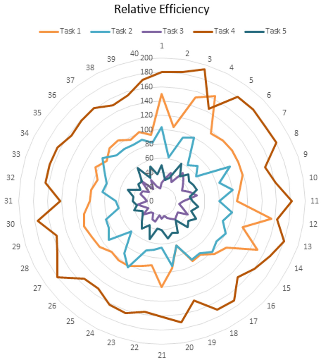
Figure 2: Relative efficiency.
Number of times a consumer asks for help
An efficient prototype enables participants to complete tasks without assistance. In this study, a “best case” value of 1 was defined, indicating no assistance required. However, non-literate participants requested assistance ranging from 0 to 9 times per task. The average number of assistance requests per task was as follows:
Task 1 (Login): 1.6 times
Task 2 (Fruit and Vegetable Rate List Access): 0.5 times
Task 3 (Gallery Selection): 0.25 times
Task 4 (Complaint Registration): 2.1 times
Task 5 (Complaint Tracking): 0.6 times.
On average, participants requested assistance less than once for three tasks (Tasks 2, 3, and 5) and approximately twice for the remaining two (Tasks 1 and 4). These results suggest that the FVMHA interface was clear, intuitive, and accessible for non-literate users, requiring minimal external support.
Satisfaction
User satisfaction, defined as users’ comfort and positive attitudes toward the application (Bose & Dipin, 2012), was assessed using the System Usability Scale (SUS). The SUS comprises 10 questions, with responses ranging from “strongly agree” to “strongly disagree” on a five-point scale. To accommodate non-literate participants, the questions were translated into Urdu and administered verbally (see Appendix C). An overview of the satisfaction evaluation results is presented in Table 6.
Formula for calculating satisfaction from the SUS scale:
Answers to odd number questions = X
Answers to even-numbered questions = Y.
Satisfaction = ((X - 5) + (25 – Y)) * 2.5.
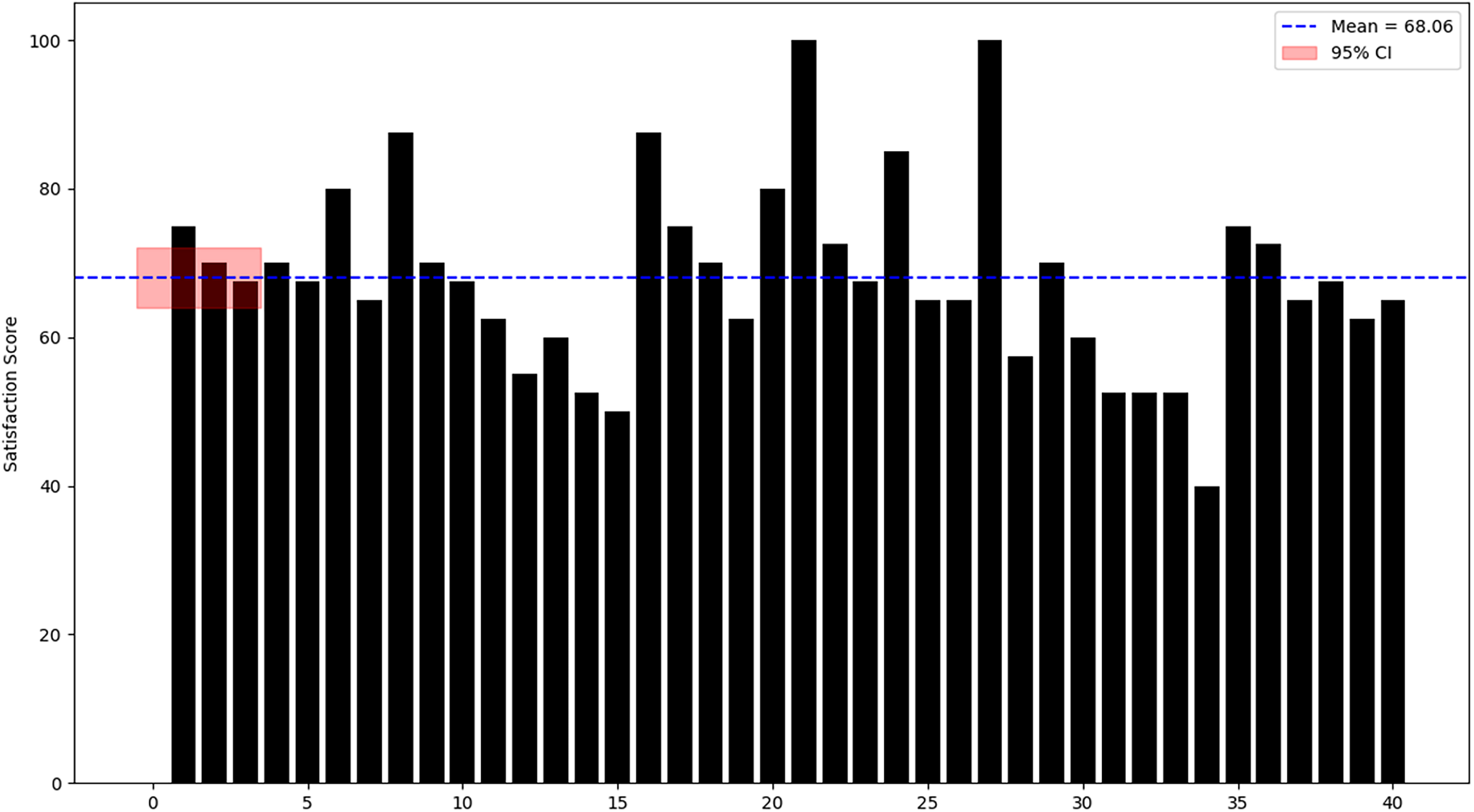
The overall satisfaction score was calculated to be 68.06 with a confidence interval range of 64–72, as shown in Fig. 3. This indicates a threshold of above-average usability as indicated by Brooke (1996).
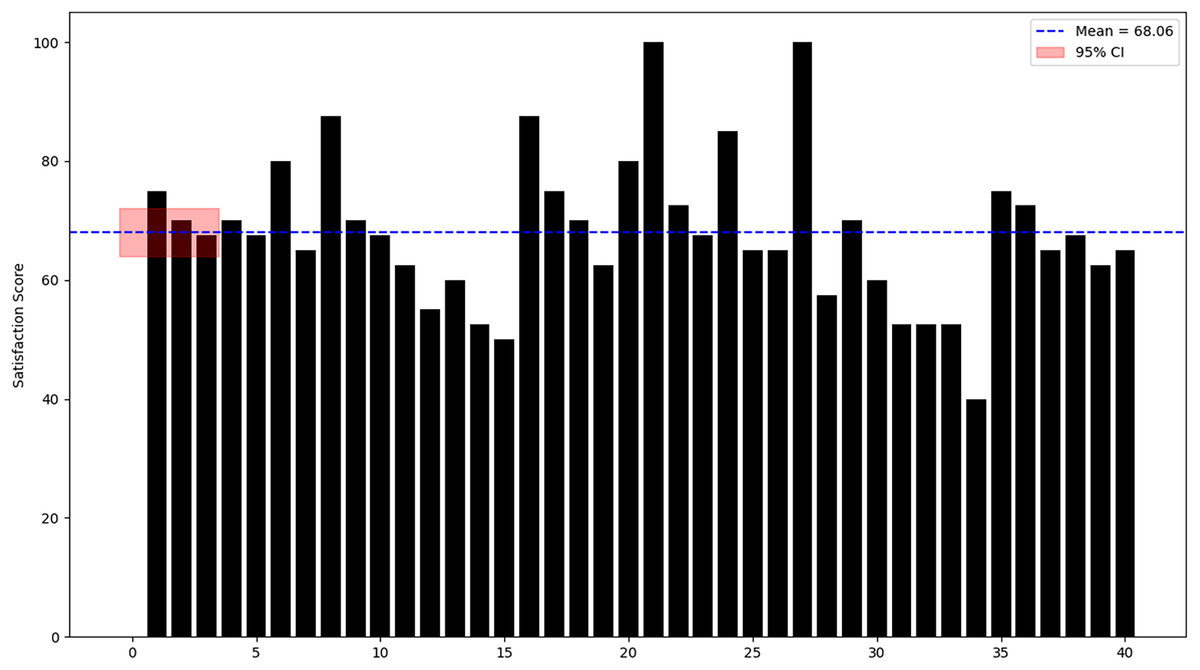
Figure 3: Participant satisfaction score with 95% CI.
Discussions
Across all metrics, our results comport with existing research on low-literacy user interface (UI) design. As noted, graphical and voice-based designs consistently outperform text-heavy ones for non-literate users (Islam et al., 2023). Our high completion rate and low help requests mirror Medhi et al.’s (2011) conclusion, that well-designed graphical interfaces achieve the highest task success, while spoken dialogs can make interactions faster. Likewise, Islam et al. (2023) emphasize that a mix of icons, audio, and minimal text makes interfaces usable for people without literacy skills–a principle we applied, and which the users confirmed by their performance.
Moreover, the minimal gap we observed between our non-literate users, and the idealized (literacy “perfect”) performance is noteworthy. This echoes Kalsoom et al. (2019), who found no significant differences in task success or satisfaction between non-literate and low-literate participants using a similar system. In short, our findings reinforce and extend the literature: with thoughtful design, low-literate consumers can nearly match literate users in achieving goals through mobile applications.
The usability evaluation shows that the prototype met the ISO-9241-11 criteria for non-literate users. All tasks were eventually completed (100% success), and users generally reported positive attitudes toward the system. We examine effectiveness, efficiency, and satisfaction in turn, relating our findings to prior literature on low-literacy interface design.
Effectiveness
All participants succeeded in every task, yielding a 100% overall completion rate. In practice, users seldom needed more than two tries per task, indicating that the interface was learnable and intuitive. This high success aligns with prior work showing that well-designed graphical, audio-enhanced interfaces enable low-literacy users to achieve their goals (Medhi et al., 2011). For example, Medhi et al. (2011) found that a graphical (text-free) mobile UI gave the highest task-completion rates for novice, low-literacy users. Our findings echo this: the simplest, icon-driven tasks (Tasks 3 and 5) were completed nearly optimally, whereas the most complex task (Task 4, complaint entry) required the most attempts and taps. Such patterns are expected given other studies that highlight the challenge of multi-step data entry for non-literate users (Islam et al., 2023). In summary, the interface’s success at getting every user to goal completion, with only a few attempts, indicates high effectiveness, consistent with design guidelines that recommend linear, consistent navigation flows for low-literacy audiences (Parikh, Ghosh & Chavan, 2002; Medhi et al., 2011). Overall, the 100% completion rate and low number of extra attempts indicate that the design effectively supports non-literate users in accomplishing their goals, in line with earlier findings on similar systems (Medhi et al., 2011).
Efficiency (Time-on-task and help)
Every task in the study took longer than its “optimal” benchmark, reflecting the expected learning curve for first-time users. This is consistent with prior research: textual or multi-step tasks typically slow novice users even in well-designed graphical systems (Ahmed et al., 2015). In our data, Task 3 (Gallery Access) was most efficient, averaging ~30 s vs an optimal 17 s. This small gap suggests that simple icon recognition is very effective–a result aligned with the principle that “simple is better” for low-literacy interfaces (Islam et al., 2023). Conversely, Task 4 (Complaint Registration) averaged ~3 min 14 s (optimal 2 min), the longest of any task. This substantial delay likely reflects the cognitive load of entering information; indeed, other studies note that form-filling is the most time-consuming step for non-literate users (Khan et al., 2016). Tasks 1 (Login) and 2 (Price Inquiry) also exceeded optimal times by a significant margin, suggesting that even these basic tasks could benefit from further simplification or audio guidance. By contrast, Task 5 (Status Check) was only slightly above optimal, indicating that straightforward retrieval tasks are quite accessible.
Finally, we observed how often users asked for help. Encouragingly, assistance requests were low: on average <1 help request per user for three of the five tasks, and about two requests for the two most difficult tasks (Login and Complaint). In practical terms, most users managed almost all tasks without needing intervention. This minimal need for assistance indicates that the interface cues (icons, audio in Urdu, clear layout) were generally sufficient. This outcome supports the design philosophy that a properly crafted, text-minimal UI can eliminate the need for external help or training (Islam et al., 2023). Indeed, Medhi et al. (2011) have similarly emphasized providing help (or voice guidance) on-screen, and our results suggest that this strategy was largely effective.
Satisfaction
User satisfaction was good. The mean System Usability Scale (SUS) score was 68.06 (95% confidence interval (CI) [64–72]). According to standard SUS benchmarks, a score around 68 is roughly average, with scores above 68 considered above average (Soegaard, 2024). In other words, our users found the system “ok” to “good” in usability. This matches qualitative feedback: participants reported feeling comfortable with the app and confident in using it, as reflected by the SUS score and comments. For comparison, Kalsoom et al. (2019) found that non-literate participants were “satisfied and motivated” to reuse a similarly designed job-search website. Thus, the satisfaction level we observed is in line with prior studies where thoughtful audio/visual interfaces led to positive reactions from low-literacy users.
Importantly, reaching a SUS score of ~68, just above the “average” cut-off, indicates usability above the threshold of mere acceptability. It suggests that non-literate users felt the system was helpful and not frustrating. Given the novelty of the technology and lack of formal training, this is a strong result. It also leaves room for improvement (e.g., pushing the score into the “good” range >80), perhaps by further refining the hardest tasks. Overall, however, the satisfaction findings reinforce that our core design choices (icons, native-language audio, minimal text) resonate well with users.
Limitations and future work
Some findings from this study may be generalizable to populations with diverse cultural and technological backgrounds. For instance, the use of meaningful, customized icons for buttons and interface elements could be effective across different regions. Similarly, audio and video instructions in local languages may have broad applicability. However, caution is warranted when generalizing these results to broader populations without further validation. Cultural differences, varying levels of technology exposure, and diverse iconographic interpretations may influence usability outcomes in other contexts. Future studies should replicate and extend these assessments across varied geographic, cultural, and technological contexts to enhance the external validity of the findings.
This study has several limitations. First, the fruit and vegetable recognition module included only 15 recognizable items. Expanding the module to include all available fruits and vegetables could enhance functionality but may increase interface complexity, potentially requiring a new study to evaluate its impact on non-literate users (Kalsoom et al., 2019). Additionally, the usability evaluation was limited to 40 participants from a single region (Mansehra, Khyber Pakhtunkhwa). Future research should involve larger and more regionally diverse samples to improve generalizability.